
For Satu Maaranen, the soft neutrals of her historic downtown Helsinki apartment are a welcome counterpoint to the vibrancy of professional life at Marimekko. Her love affair with neutrals began with a coveted beige blazer.
It’s early and the downtown Helsinki streets are empty. People are still at home, drinking their morning coffee and fashion designer Satu Maaranen is no exception. She appreciates tranquil design in a home that always feels good to come back to.
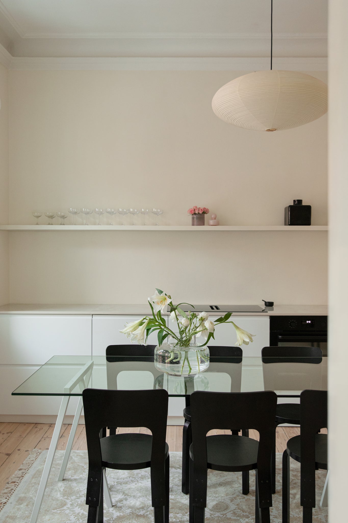
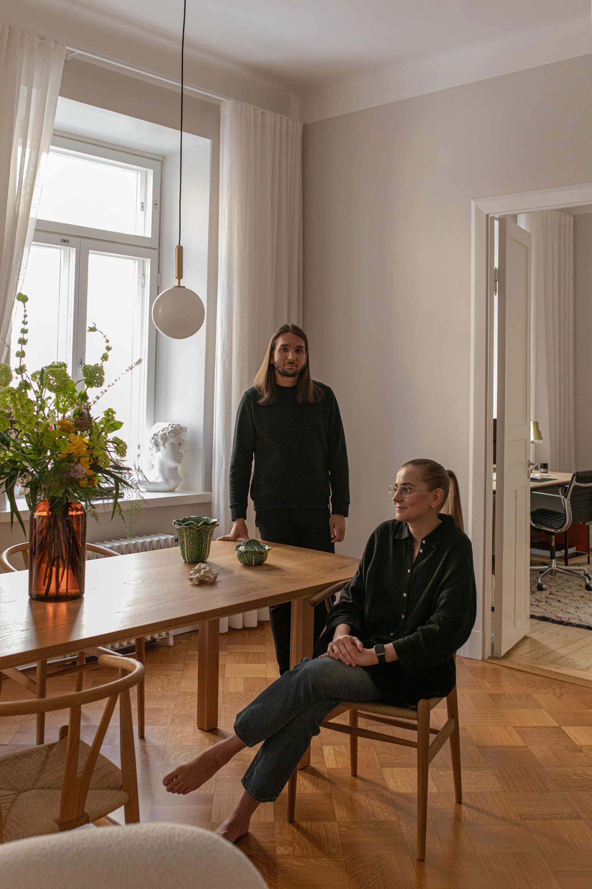
Satu’s home smells of flowers and perfume. Roses, lilies and carnations are arranged on the shelf in small Marimekko vases and on the table in a large Urna. Friends are coming for dinner tonight, but the flowers would be there even if they weren't – they add color to the neutral decor.
Satu, one of two Head Designers for the coveted Marimekko brand, searched long and patiently for her first home. She scouted new lofts in Kruunuvuorenranta, apartment buildings in Koivusaari and even ventured deep into the outskirts of Helsinki in her quest to find something that felt just right. Satu imagined life in new neighborhoods, but always returned to the beloved milieu of South Helsinki.
"It was hard to imagine my life anywhere else, city life feels so natural – there are evening walking routes, lots of friends and new restaurants," she explains.
For me, home is first and foremost a place where I can relax and unwind. The second most important thing is cooking, so I wanted a kitchen with plenty of space to prepare meals with friends.
After almost a year of touring apartments, Satu was charmed by this pink building, built in 1887. She knew it was right the second she saw it.
"This home was the first one that instantly made me fall in love. There was an agonizingly long bidding war for the apartment and I gave my final offer from the Maldives on New Year's Eve," Satu recalls.
The apartment finally her own, Satu started renovations, which lasted from May until Christmas. On New Year's Eve, her new home was christened with a party among friends.
“For me, home is first and foremost a place where I can relax and unwind. The second most important thing is cooking, so I wanted a kitchen with plenty of space to prepare meals with friends," Satu says.
Interestingly, with its soft colors and neutral materials, her home is the opposite of the colorful and patterned world of Satu’s workplace. This is no coincidence. It was important to her that her home had a calming atmosphere and that patterns were kept to a minimum.
“I leave this space in the morning to work in a visually strong and rich firework of colors,” she says. “When I come home, I want to feel a change in mood."
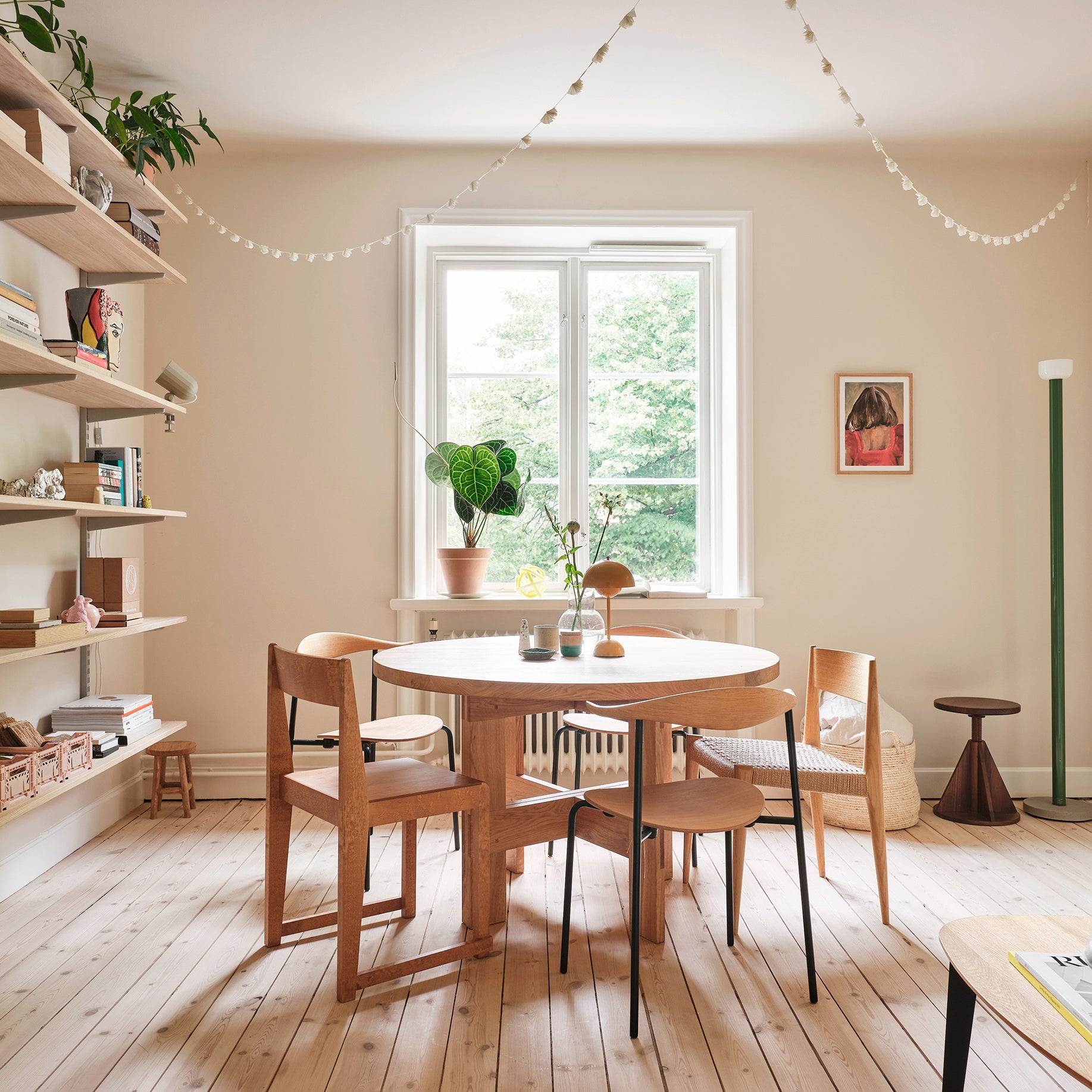
The home's interior is built around soft tones and a sense of looseness, and the 40-square-meter home does not give the traditional impression of a small two-room apartment; there is no bed on display and no visible fridge or range hood in the kitchen. The sleeping loft is built on top of the hallway and the appliances are integrated into the fixed furniture, giving space to relax.
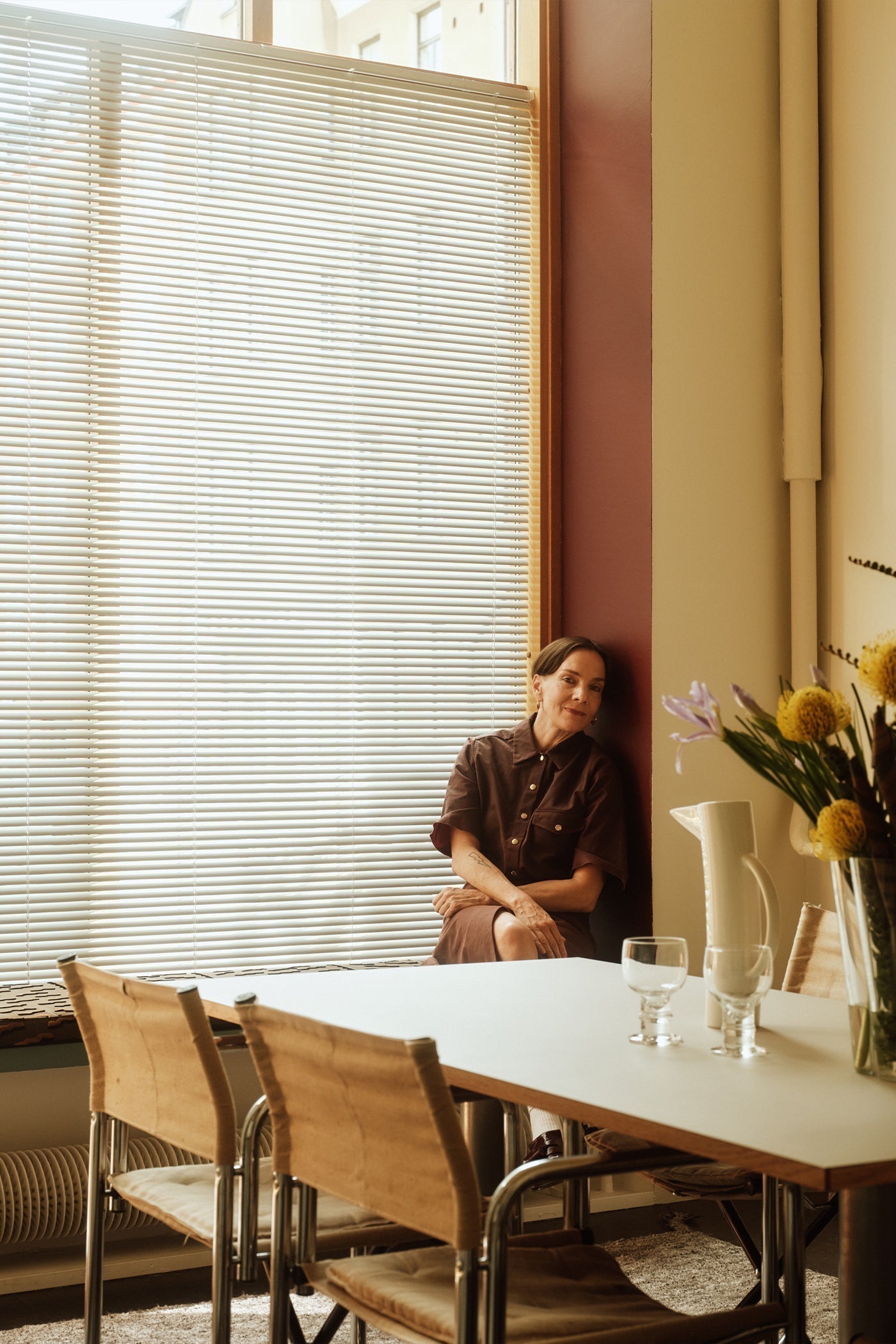
In the spring sunshine, the red house across the street turns almost neon pink, glowing in the sun.

As a decorator, Satu is thoughtful and precise. After the renovations, she wanted to feel the mood of the home before she made lasting interior design decisions. As the sun glides past the house, it changes the color of the houses opposite, reflecting their different shades onto the walls of her home. In the spring sunshine, the red house across the street turns almost neon pink, glowing in the sun. When your vision is clear, sometimes it’s worth waiting and observing so you know how to make it come to life.
“I like to combine the old and the really modern in my interior design. At the moment I'm dreaming of a glass vitrine in the kitchen that would blend in with the material of the kitchen table, and in the living room I dream of a minimalist, modern, abstract piece that could borrow colors from the houses across the street. But my partner pointed out that it might be worth painting it myself. He said it would be quicker and more certain that I would get a piece I liked," she laughs.
“This is because sometimes that ‘thoughtful precision’ means going through every flower shop in Helsinki before you've found what you're looking for," Satu’s partner adds from the doorway, with a twinkle in his eye.
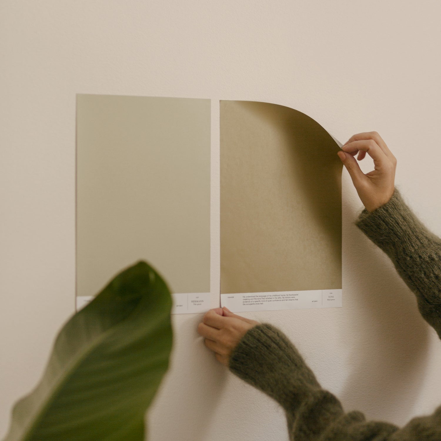
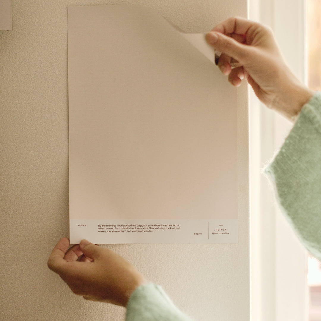
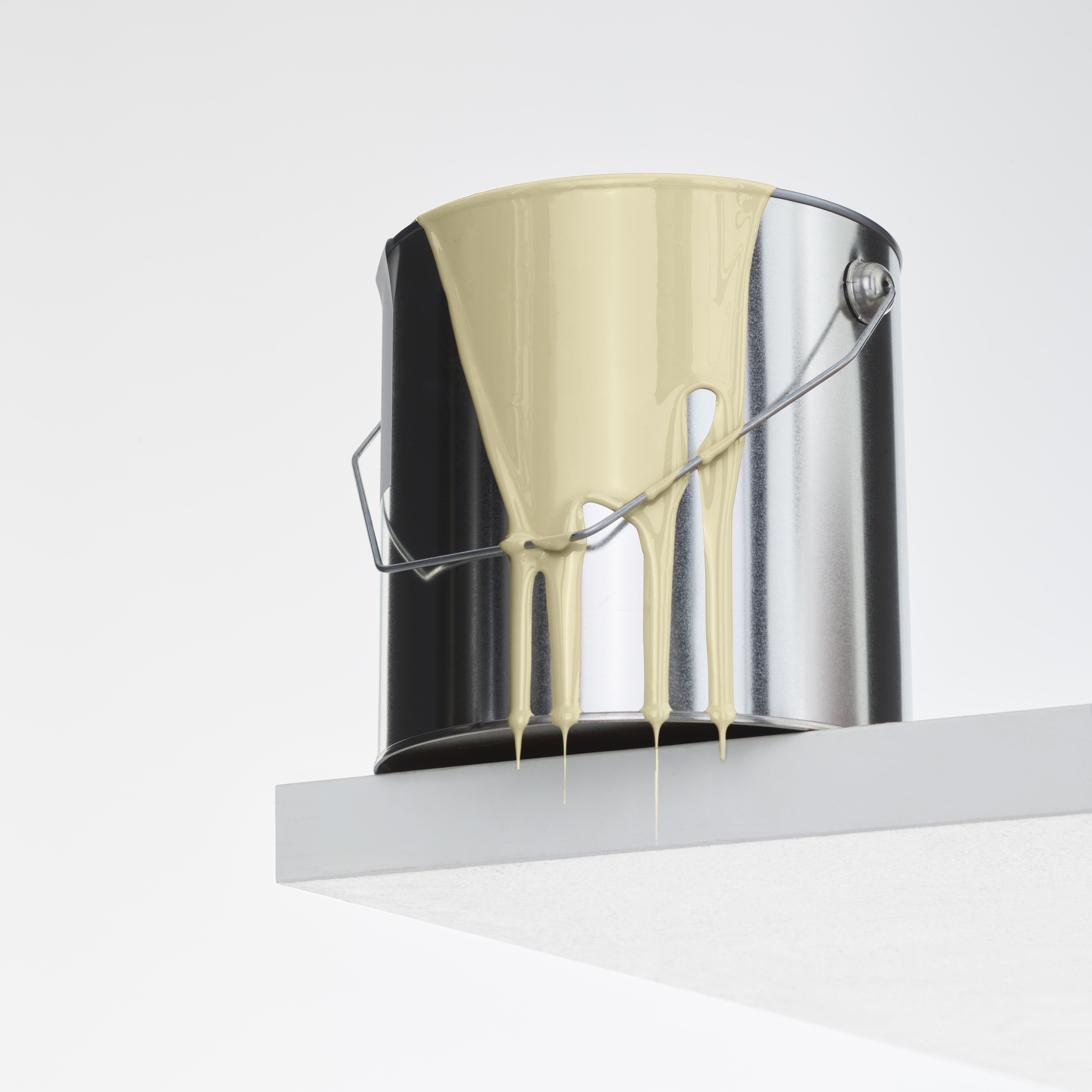
I carried Cover Story's samples with me and searched for the closest shades to the blazer, making the kitchen wall color decision from my seat!
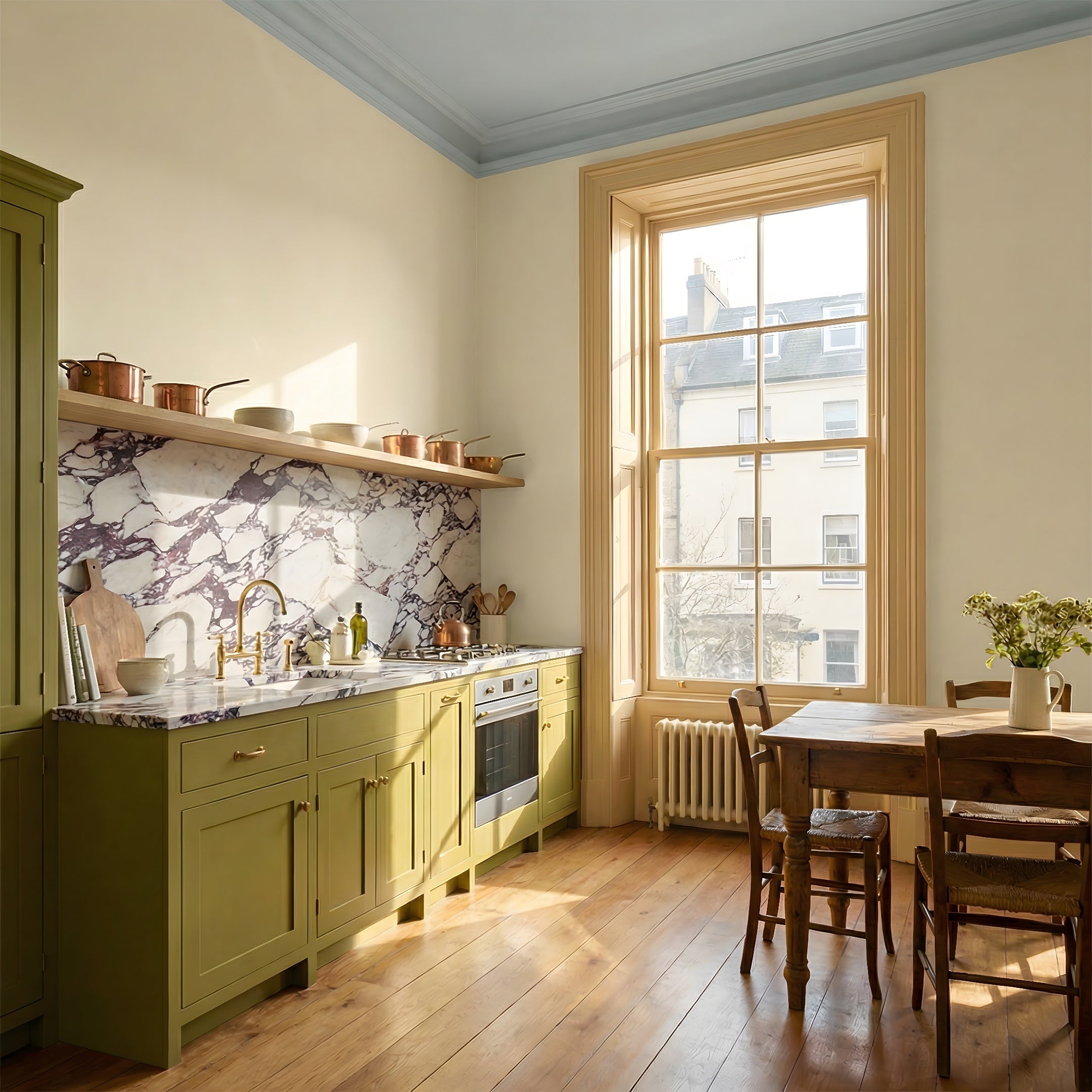
The light shades of the rooms work together, yet cleverly create two different atmospheres. The warm off-white in the kitchen has a delicate feel that fits perfectly with the light cabinets and a long shelf painted in the same shade. The color also inspired the choice of the kitchen counter, which is a mix of postilene, glass and quartz. In choosing the color of the wall itself, Satu relied on what’s most familiar: fabric.
“We were with the Marimekko design team at the afterworks and I fell in love with my colleague's beige blazer. I carried Cover Story's samples with me and searched for the closest shades to the blazer, making the kitchen wall color decision from my seat! In fact, clothes and materials in fashion inspired several of the decisions I made," Satu laughs. "When I saw the shade on a large surface and on fabric, I understood the nature of the color and I didn’t second-guess its creaminess."
The choice of shade for the kitchen turned out to be perfect for the spirit of the old house. It also happened to be exactly the same as the apartment's old moldings and doors. The classic warm tone matches the beautifully sanded pine floor and the white of the adjacent room.
I have favorite color seasons. That's why I wanted shades on the walls that would provide a background to which I could bring colors as moving parts.
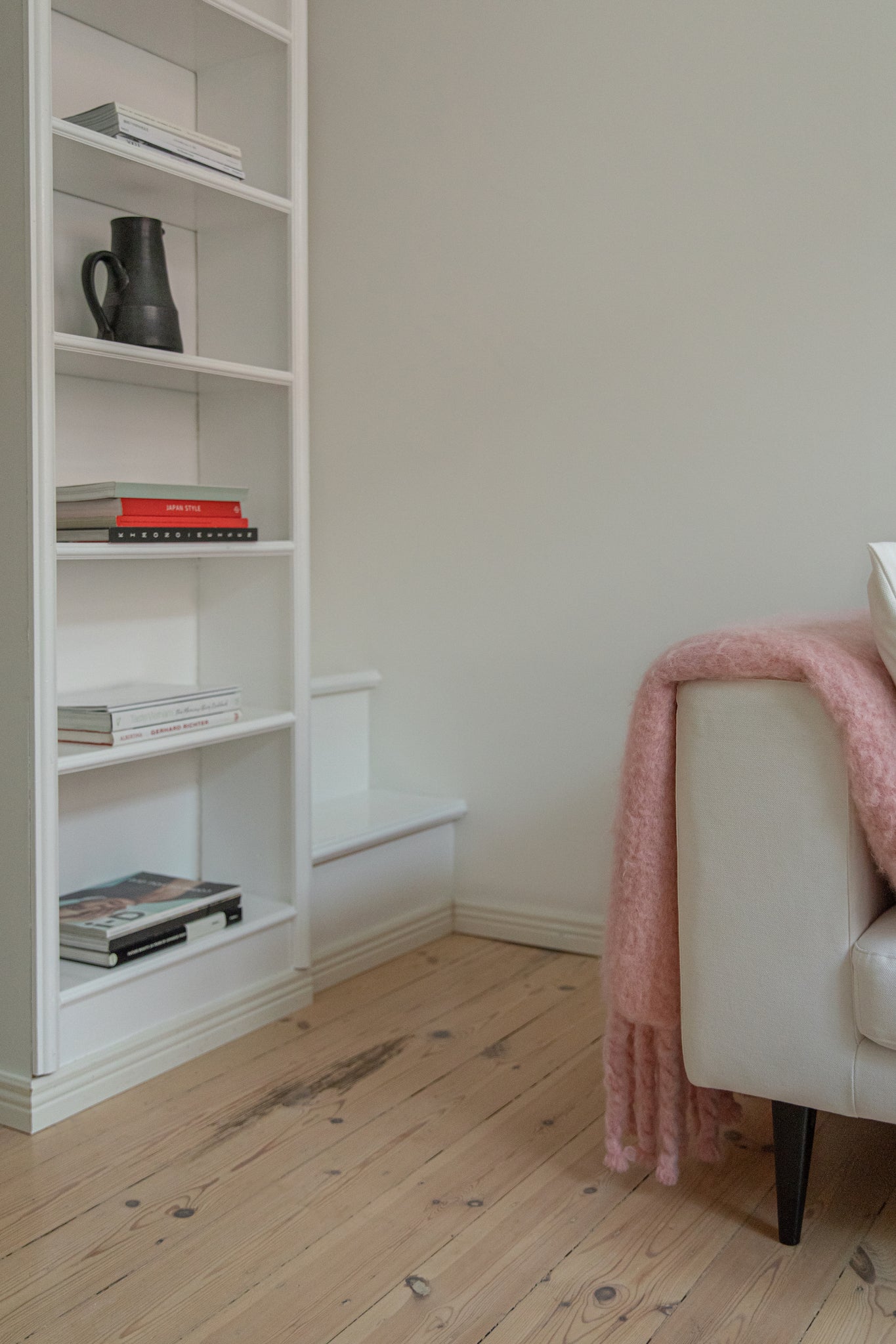
To complement the warm kitchen, Satu wanted a clean, white living room to create a backdrop for the favorite colors she brings into her home in the form of textiles, flowers and art. In the old home it was mint green, but now, for her, pink is in season.
"I have favorite color seasons. That's why I wanted shades on the walls that would provide a background to which I could bring colors as moving parts," says Satu.
As such, the neutral, pale colors don't make the atmosphere of the home feel dull or monotonous. In the understated environment, individual splashes of color are highlighted; the lemons at kitchen level are more yellow, and the roses resting in a vase are more pink. Glossy black accents are highlighted against warm tones and the strong colors of the house opposite feature through the two large windows.
The sense of space and the three-and-a-half meter high ceiling still charms her every time Satu walks through the door. After a working day immersed in bold patterns and vivid colors, her home is a refuge that allows room for rest and inspiration. Creativity requires time and space to breathe, and this is a home that offers just that.