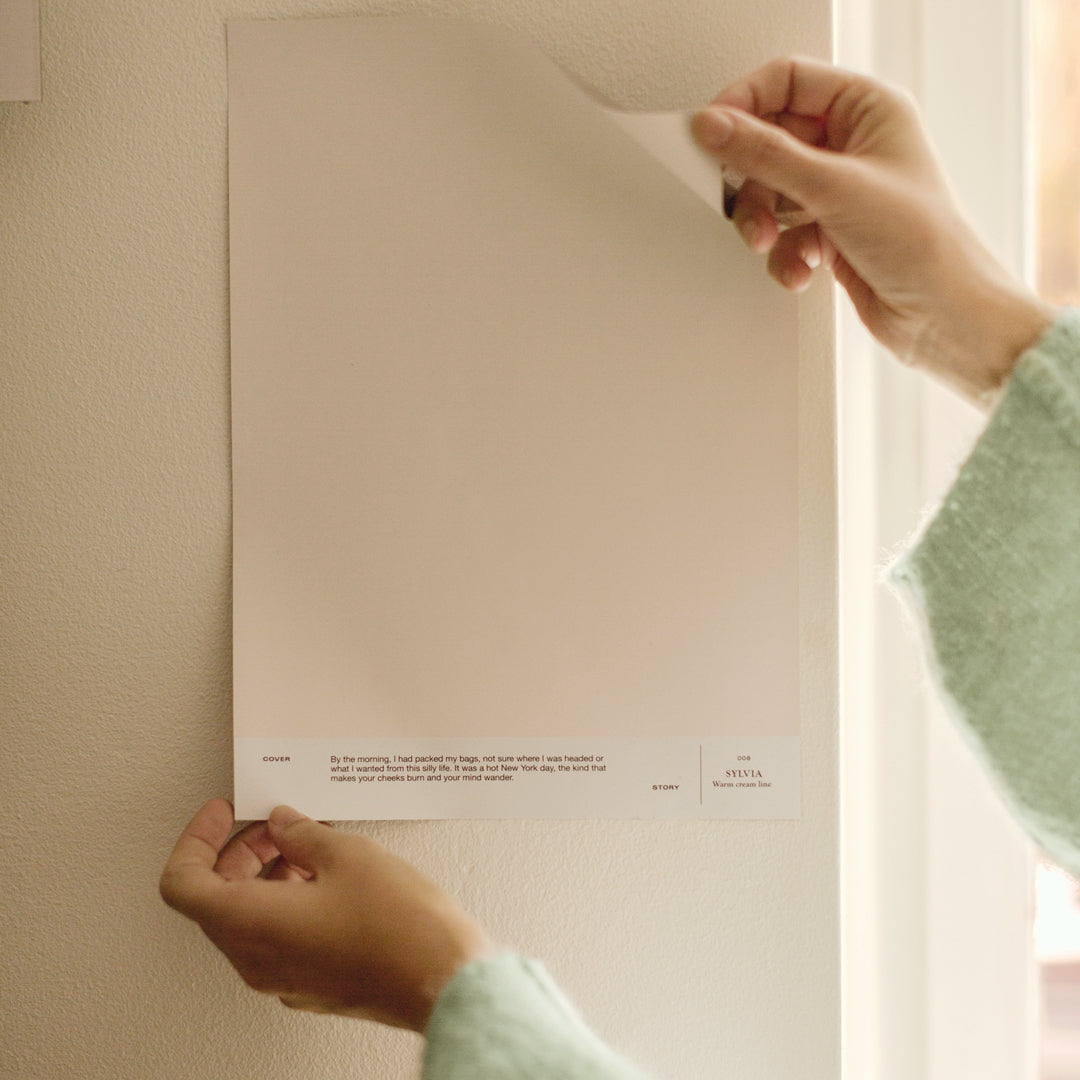


The atmosphere of a home is created by the objects, furniture, colors and surroundings that decorate it. Within the Finnish Design Shop's Turku showroom, a captivating display on the upper floor showcases the harmonious interplay of diverse colors and materials, resulting in a warm and inviting atmosphere. FDS’s Interior architect Maija Rasila shares her expert tips on combining colors and textiles for balanced home decor.

 What color-material pairs are you currently inspired by? Tell us your favorite colors for the late summer.
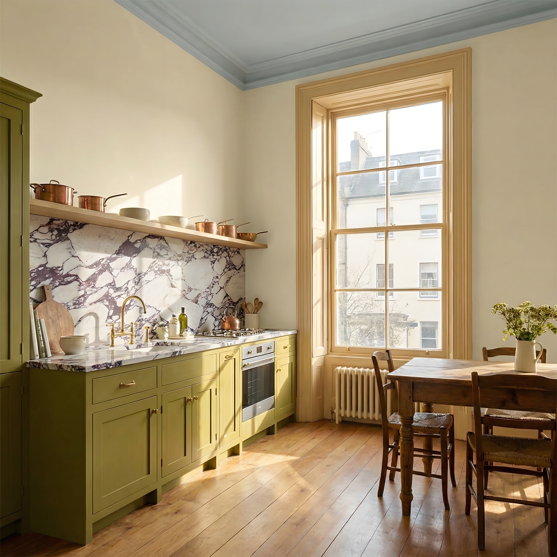
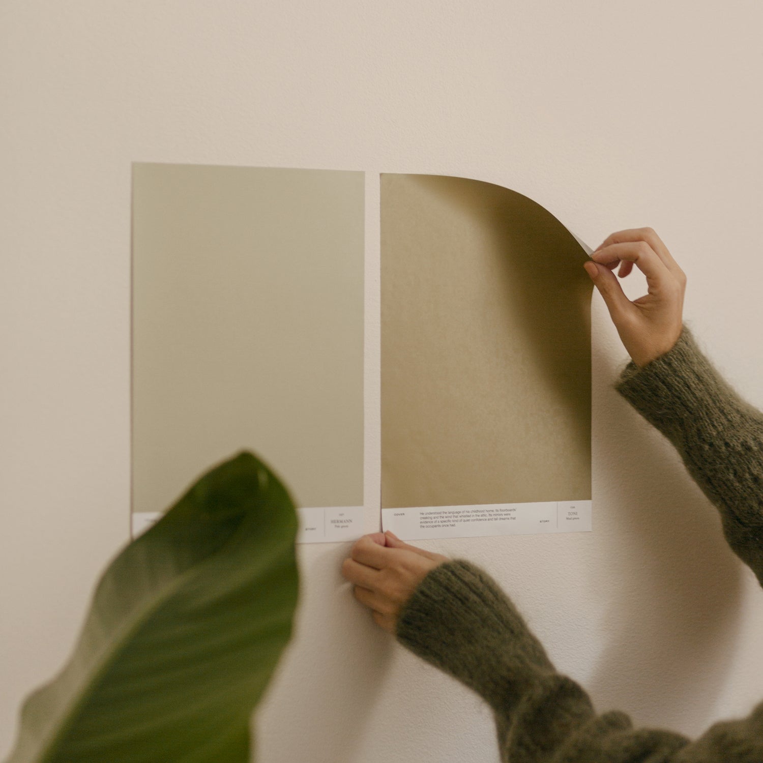
I'm particularly interested in contrasts at the moment. They make different materials and shades stand out more effectively. For example, a warm and soft wall tone gets a nice boost from a cool metallic, while a bright red accent color brings light, blending cream tones to life. I often try to avoid perfect and coordinated ensembles until the very last drawing. Often, it's the little bits that break these up that make the whole interesting and personal.

I think my favorite shade for the late summer is a pale favorite blue in the spirit of the i05 LAILA shade we use in our spaces. This shade is incredibly versatile and pairs beautifully with light and soft natural tones. But it's not afraid of sharp black or the bright accent colors that are now on trend. Just a hint of this light shade will instantly create a fresh, summery feel to a space.

How to combine textiles with different colored walls? What should you consider when designing?
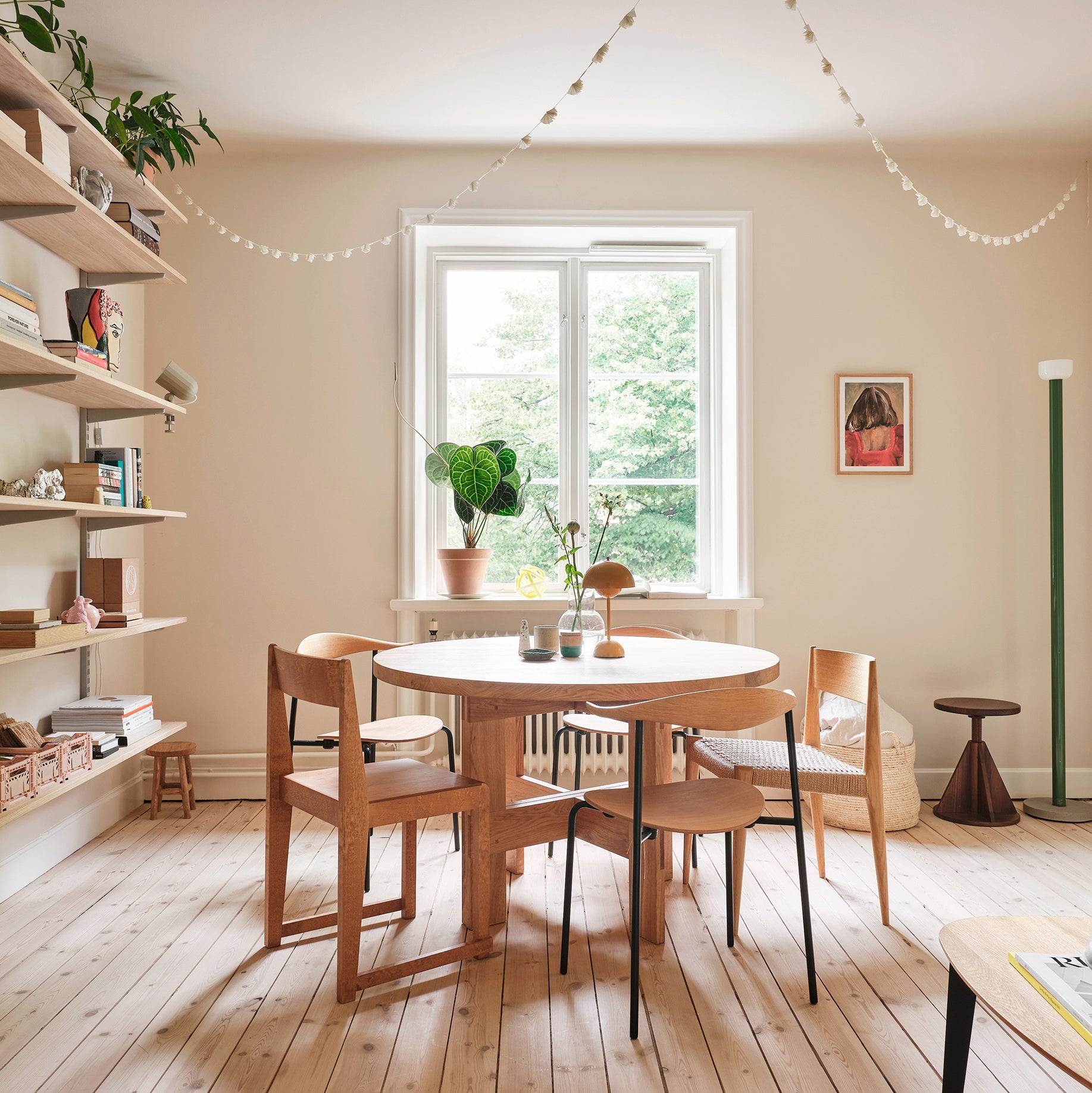
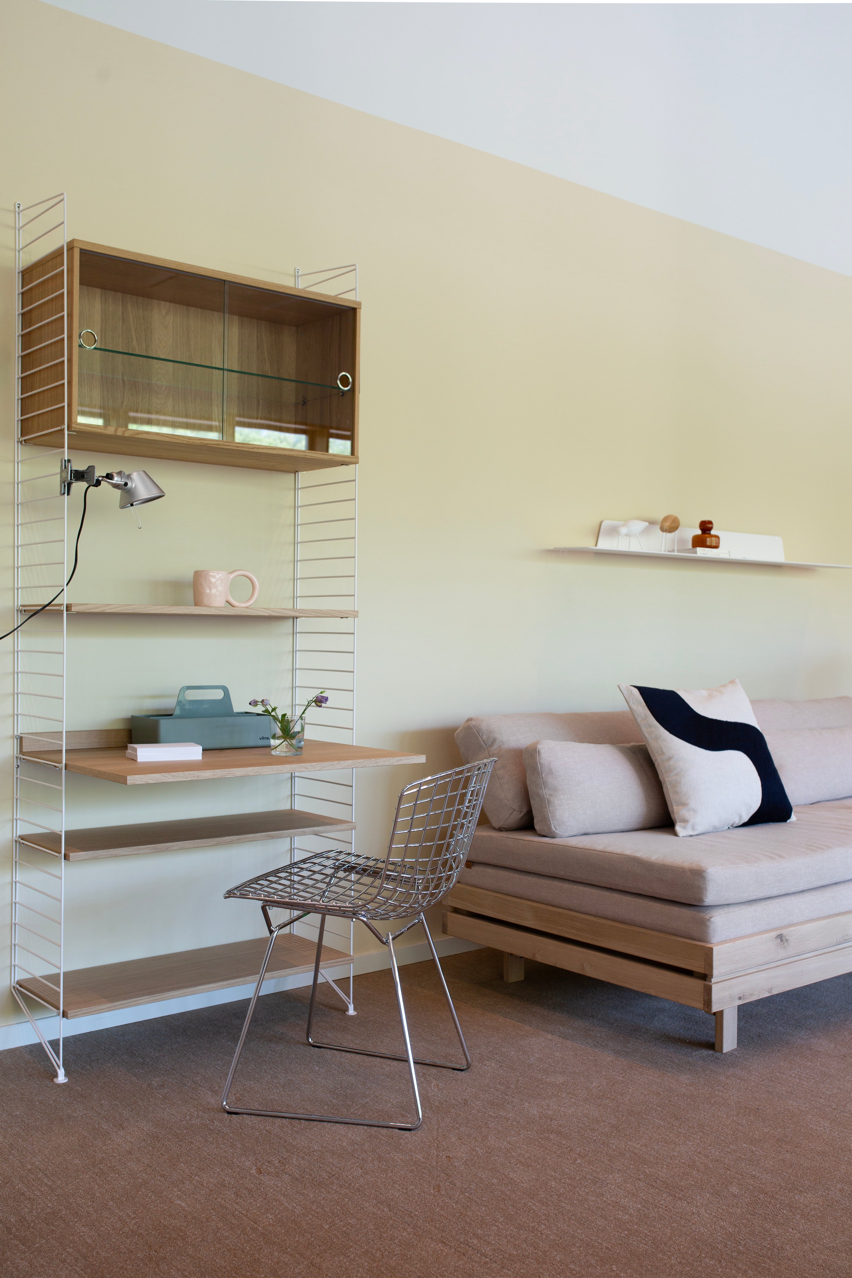
It's worth starting with the biggest elements, which in a living room, for example, are usually a sofa and a rug. In a bedroom, a bed and a possible bed headboard can make a big difference to the mood of the room. When it comes to textiles, a little contrast often works best. For example, the sofa often stands out best, and the color scheme looks most beautiful when the upholstery is a couple of shades different from the wall. You can go either lighter or darker, but it's important that the shades are not too close together. This can easily make the result look monotonous. If you want to create a seamless white-on-white atmosphere, pay particular attention to the way the shades slide and the textures of the different textiles. Using and combining them in a variety of ways can make even a sparse color palette look lively and interesting.

Tell us about the design of this space, specifically from the point of view of colors and textiles.
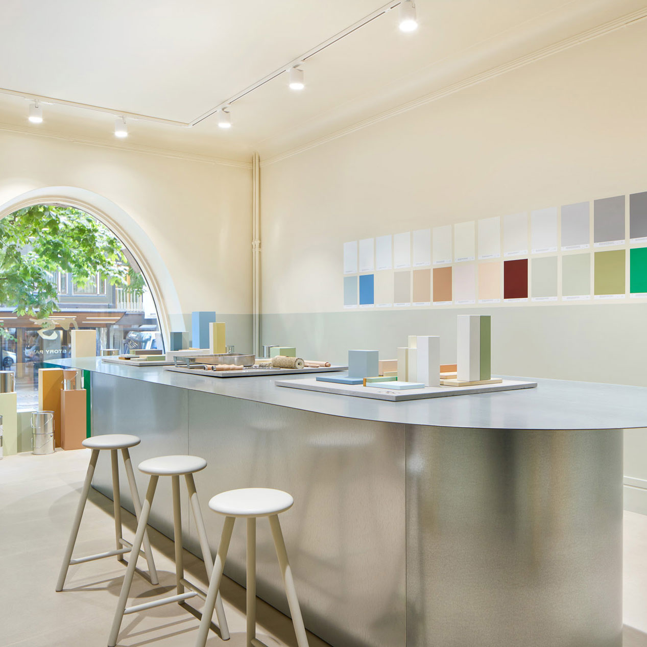
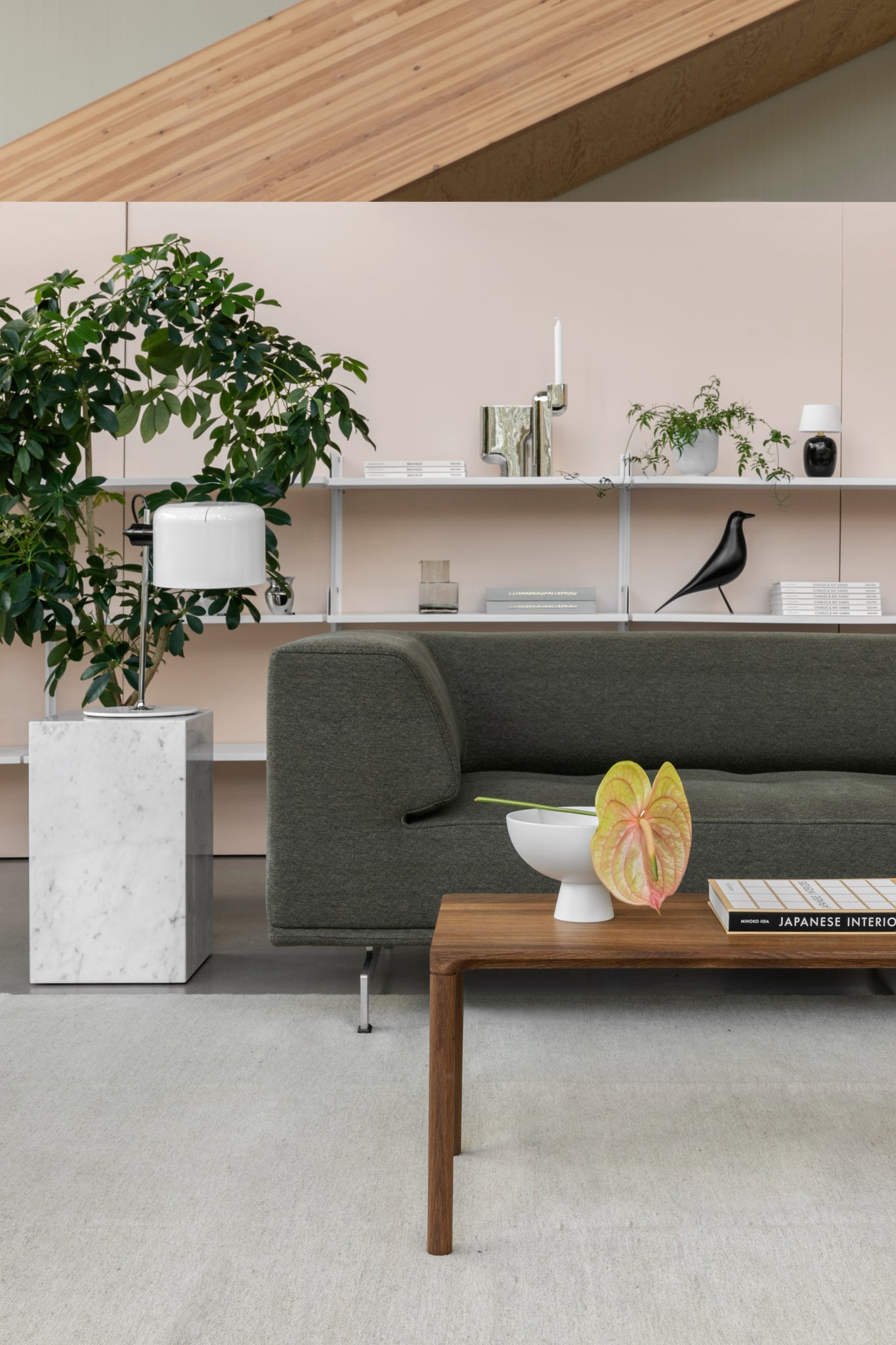
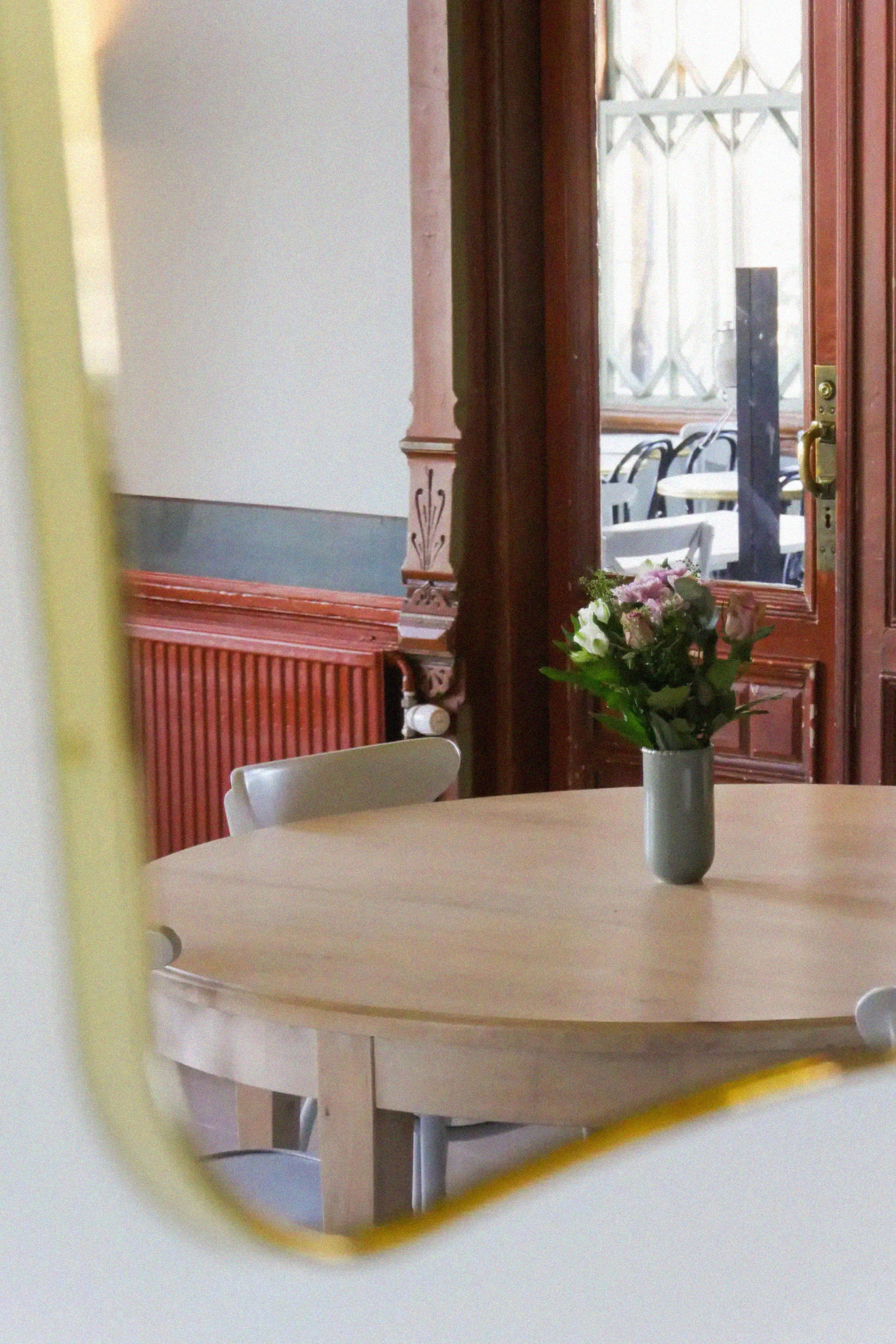
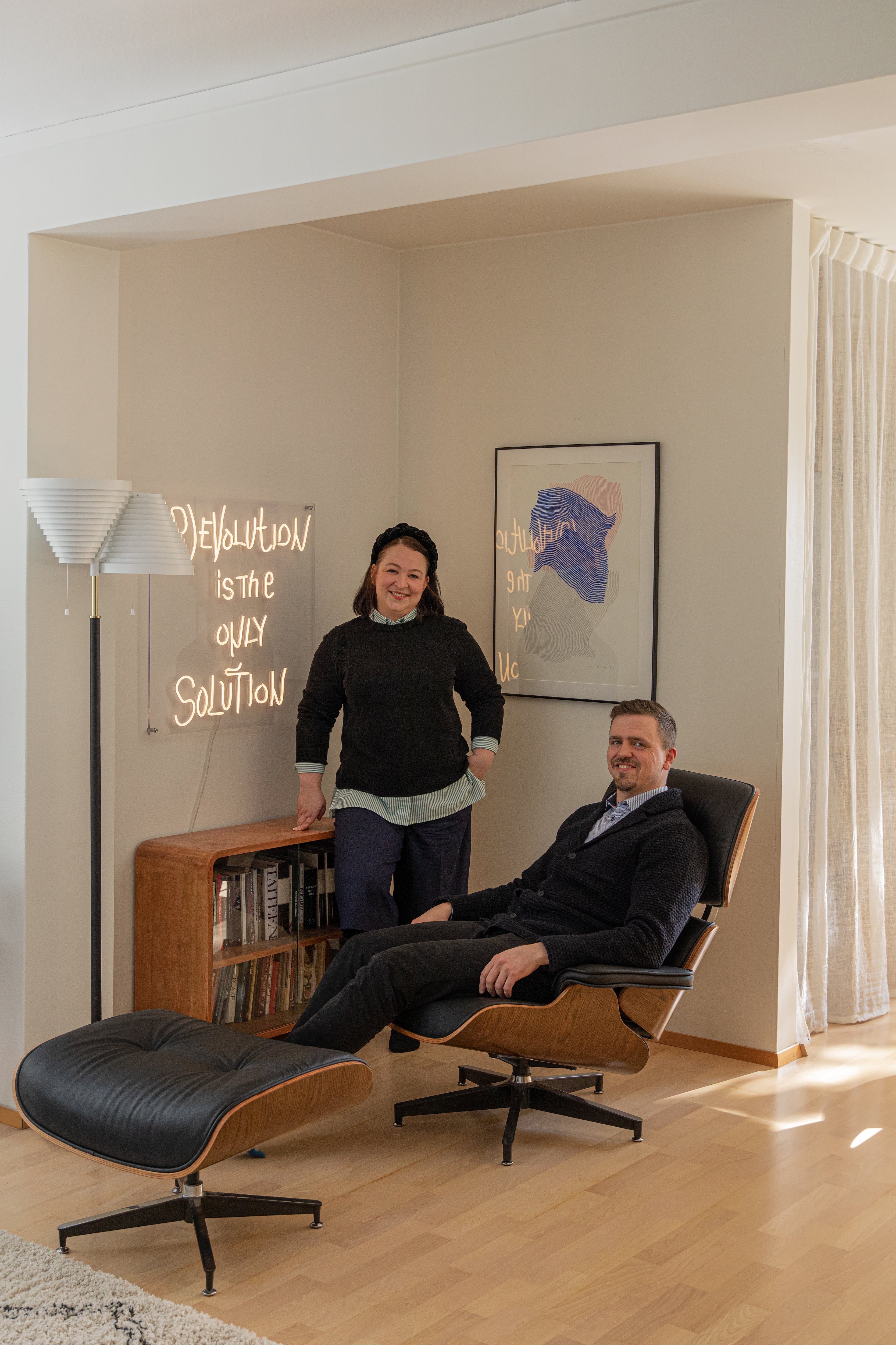
Our upstairs showroom is large, open, and bright, with a spacious floor area and large windows. As there are hardly any partitions or other delimiting elements, I tried to visually divide the space with different paint colors. The few intact walls are given a lift by light shades of i05 LAILA, 031 CHARLES, and i01 EEVA, against which the furniture stands out beautifully. I think my favorite pair is the pale greenish-yellow 031 CHARLES, which gets a boost from the electric green Hay’s Mags sofa upholstered in Kvadrat's Balder fabric - sometimes more is more! The long view and our lighting department are divided by horizontal and vertical paint shades, which structure and interlink the different ceiling, wall, and floor luminaires. Against these shades, different materials such as glass, brass, and chrome are brought out to their best advantage. The existing sisal-colored floor carpeting also contributed to the choice of shades - this works well with the fresh, light-colored choices and the more neutral i01 EEVA shade, which tones down to linen.

Tell us about the inspiration for this space and why you chose these materials.
Our new upstairs showroom space has actually served us in the past as an office space. The existing materials and layout were originally designed with office work in mind. However, new telecommuting practices and strong demand from customers allowed us to turn these spaces into a showroom. This expansion means that our showroom, which has been open for 1.5 years, now offers an even more comprehensive range of products. Our premises, which were originally designed to be adaptable, were easily converted to showroom use with a minimum of intervention. Although the purpose of the space changed, there was little need to change the surface materials. However, the bright colors painted on the walls.

