

Cover Story’s Design Director Päivi Häikiö reflects on the fluid beauty of colored glass. How can we capture such mercurial beauty in our interior design?
As a designer, I’m inspired by Iittala’s interpretation of color, particularly how it is embodied in glass, the material that best captures the changeable nature of color. In colored glass, colors are never still, they are constantly changing depending on the environment, the thickness of the glass and the surrounding light conditions. Just like color on walls – they too are the sum of their environment.
It is endlessly interesting to study the different natures of color on different surfaces and materials. It is a beautiful idea that color is never permanent, never set. We can name colors, but we cannot know how they live in changing contexts or how other people perceive them. Colors are always individual, their nature and sensation changing according to the perceiver and the environment.


This ever-changing experience of color is, I think, one of the most beautiful aspects of Iittala glass. We can imagine how a yellow vase looks in the light of the first, bright rays of spring, or how the light filtering through the leaves of a tree plays and creates new shades on the surface of a painted wall. The experience of space, mood and moment created by color creates powerful experiences and memories.
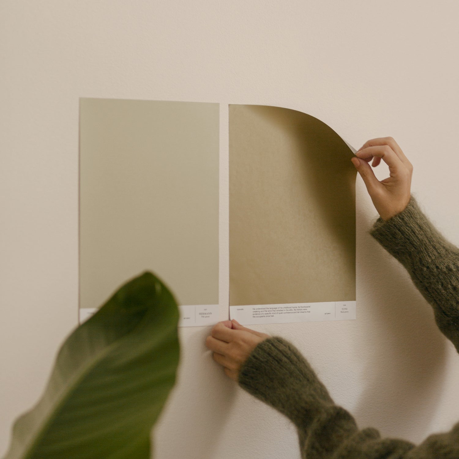
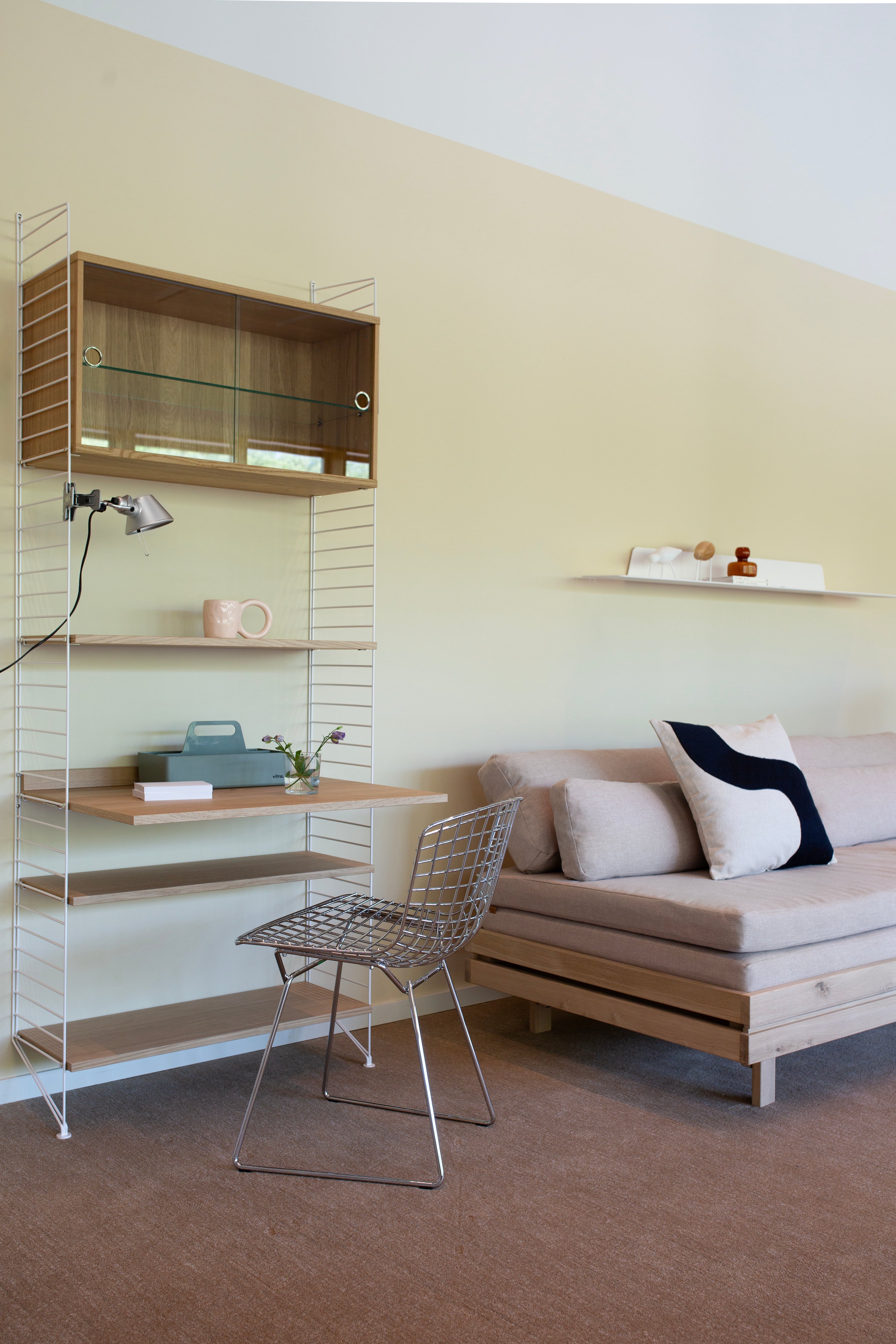
This is also fascinating as an interior design strategy. Spatially, the same objects take on a new life depending on the shade of the wall. After all, colors are always in dialogue with other colors in a space. They look different depending on what is around them. A color can be really beautiful on a sweater, but it doesn't work on a wall surface and the feel of the surface needs to be taken into account in the design. When designing shades, I test how they appear in both summer light and winter light, warm and cold – our northern light where the light conditions are extreme. The shades I design come alive with the atmosphere of the season.

In these new collaborative shades, we didn’t intend to replicate the colors of the glass products. For example, Iittala’s copper Aalto vase is the perfect shade as a vase, but as a wall color, the interpretation of the color is an interpretation of the vision and mood, rather than a pure reproduction of that shade. On walls, colors need to work on a hard surface and not all colors will bend in that environment.
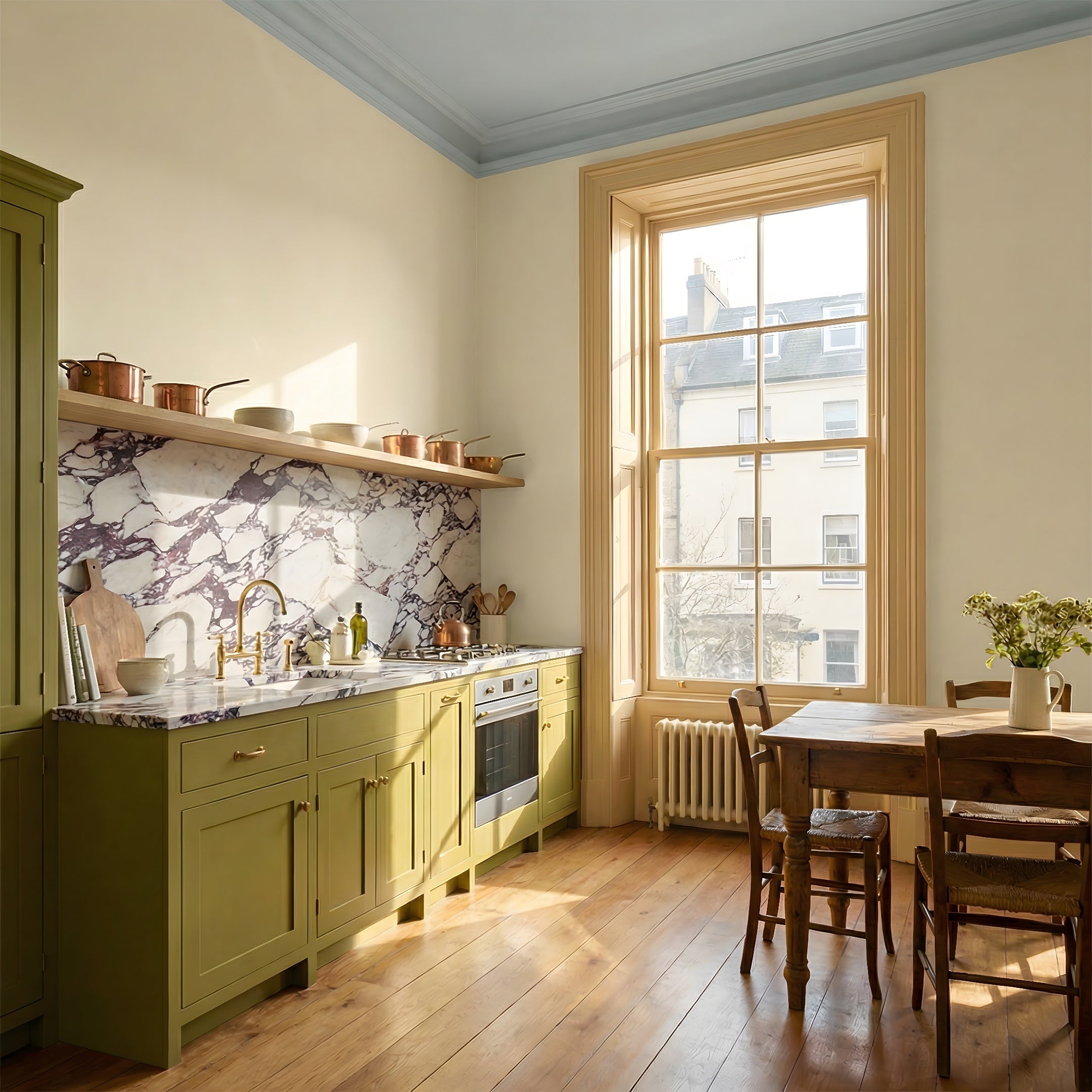
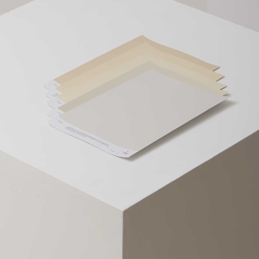
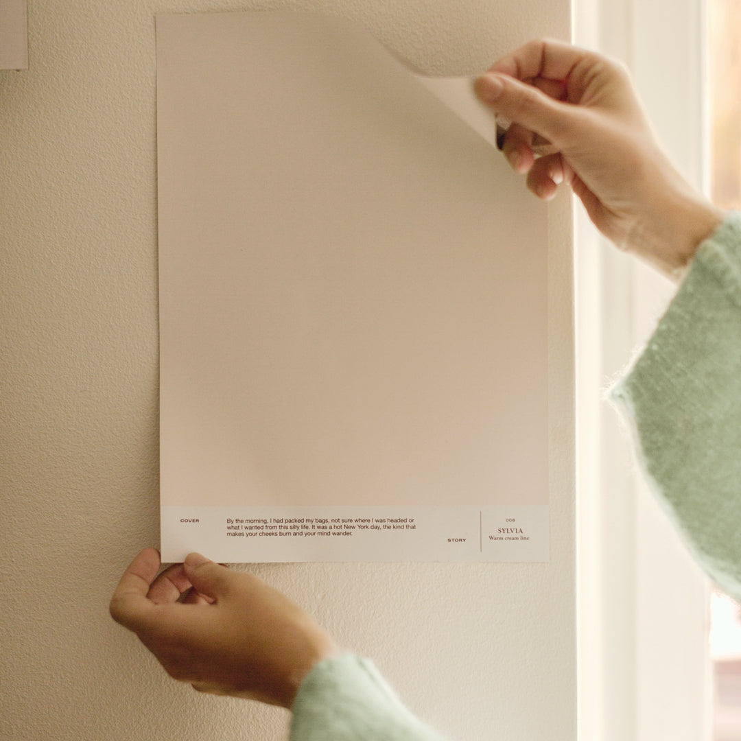
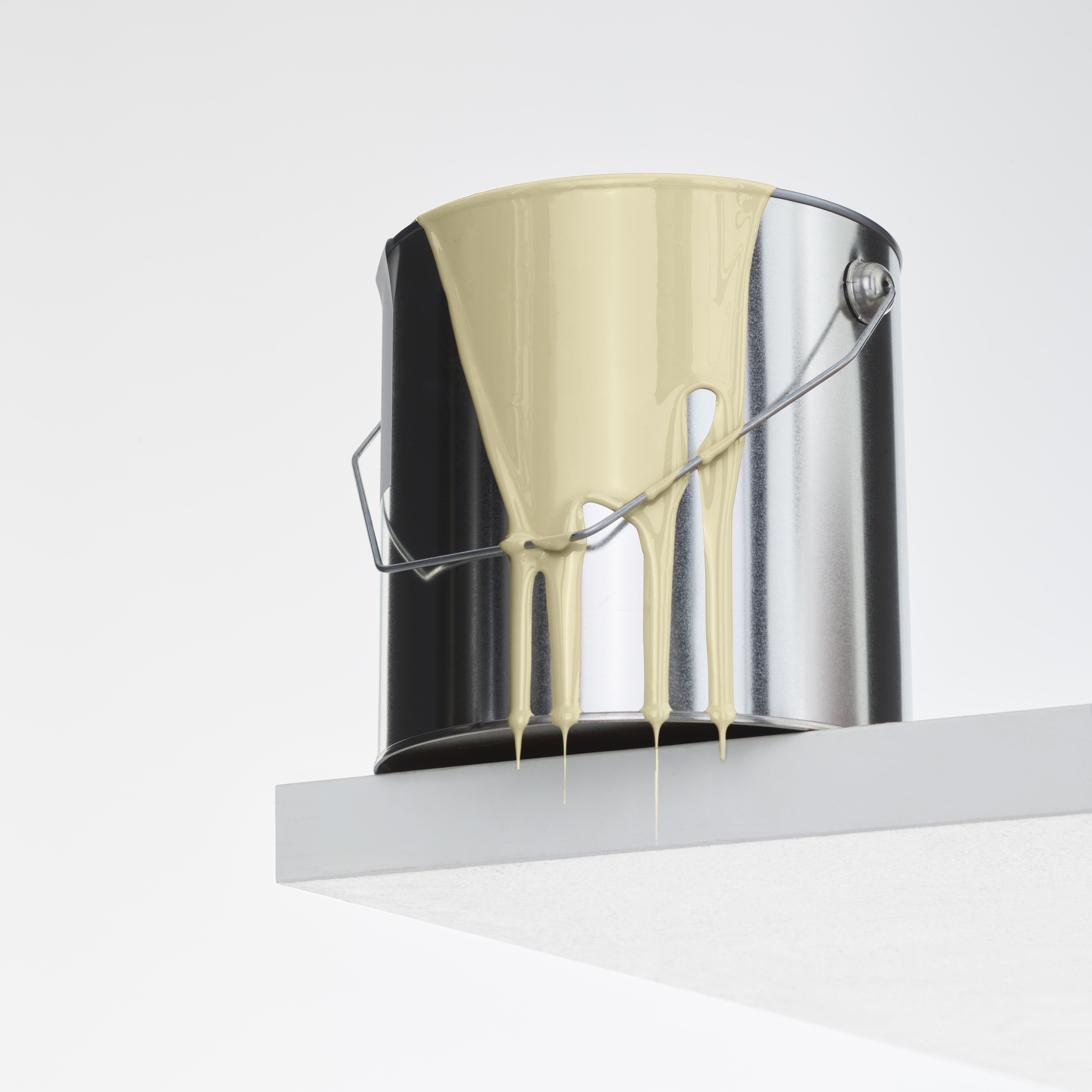
Designing the Cover Story x Iittala spatial color collection was a daunting task, as Iittala is a renowned master of colored glass and Iittala's color library is very large and wonderful. The color collection is inspired by the stories and history behind Iittala's classics. The collection consists of four colors, which we designed by learning about the designers and history of Iittala, as well as the Iittala color library.


My first thought was that I wanted a yellow shade for the collection, inspired by the playfulness of Oiva Toikka. As an interior color, yellow has become part of Finnish homes through Iittala and Arabia, for example in breakfast plates and vases, making it a very natural choice for this interior paint shade collection. The playfulness represented by Oiva Toikka is encouraging to me personally as a designer – everything is not so serious. Cheerfulness and playfulness don't make design worse.
I am a big fan of Kaj Franck in many ways. I admire his world view – humanism, democracy, open-mindedness. Some time ago I read Kaj Frank's letters from Japan to his mother, which reveal Franck as an observer and explorer, going from country to city, observing the little details of people and nature with a gentle and democratic eye. From his travels in Japan, he often describes his fascination with all things brown: Japanese architecture, bamboo, nature. His classic glasses, carafes or vases from the 1950s were often in brown, which is also found in Teema's original version of Kilta. The combination of this history and Iittala’s copper colored glass inspired the collection's brown shade.


Blue was also an obvious choice. The influence of Tapio Wirkkala is most powerfully felt in Iitala’s portfolio in the inspired dark blues of Northern nature and mysticism. I was thinking of the deep blue of nature – an ice fishing hole in Inari, the deepest point of the rapids, the mental image of water as a rupture in the ice. The mystical dark atmosphere of a glass cabin seemed a natural part of the collection.
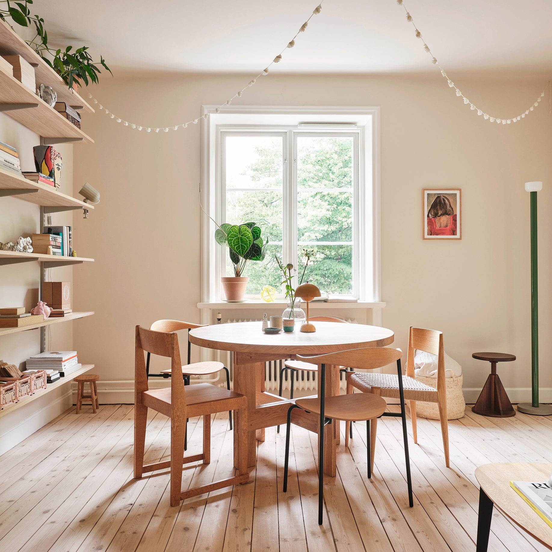
The timeless linen shade was inspired by the ever-inspiring, contemporary work of Aino Aalto. It is subdued and ambient. The glassware in Aino Aalto's Iittala products was originally very much utilitarian, its coloring not by design but by practicality. That's what this linen shade is – it doesn't get old and it works with everything.

When designing the interior of your home, I encourage you to think about the moods you feel comfortable in. They can be found on walks, in friends' homes, on travels, in nature – spaces that make you feel like there's something wonderful here. Then you're in the presence of something that makes for a good atmosphere for you. Different moods, colors and materials have their place and can be chosen according to personal preference. There is no one taste that is just right to aim for. Feeling good and the atmosphere of your home is enough. Home is an individual experience.
I would also encourage you to think of interior design as a home being created gradually over time and not something you should try to complete all at once. The most beautiful and soulful homes are created as time passes and the home is lived in. That's how a space becomes a home, not just a place to live.

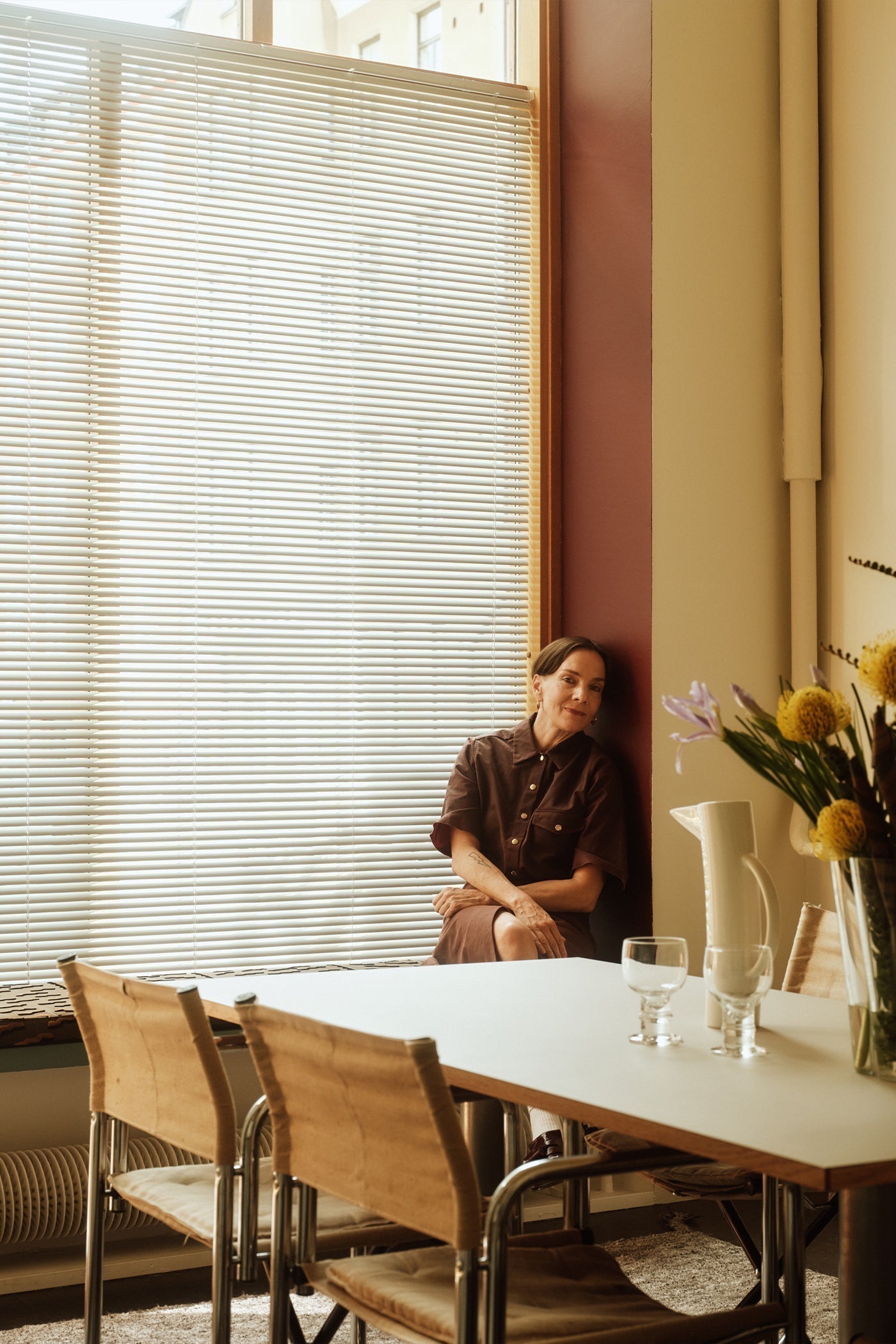
Designer Päivi Häikiö is Cover Story's Design Director, who delved into Iittala's glass color collection, designers and history when designing the four new paint shades for the collaborative collection.
