
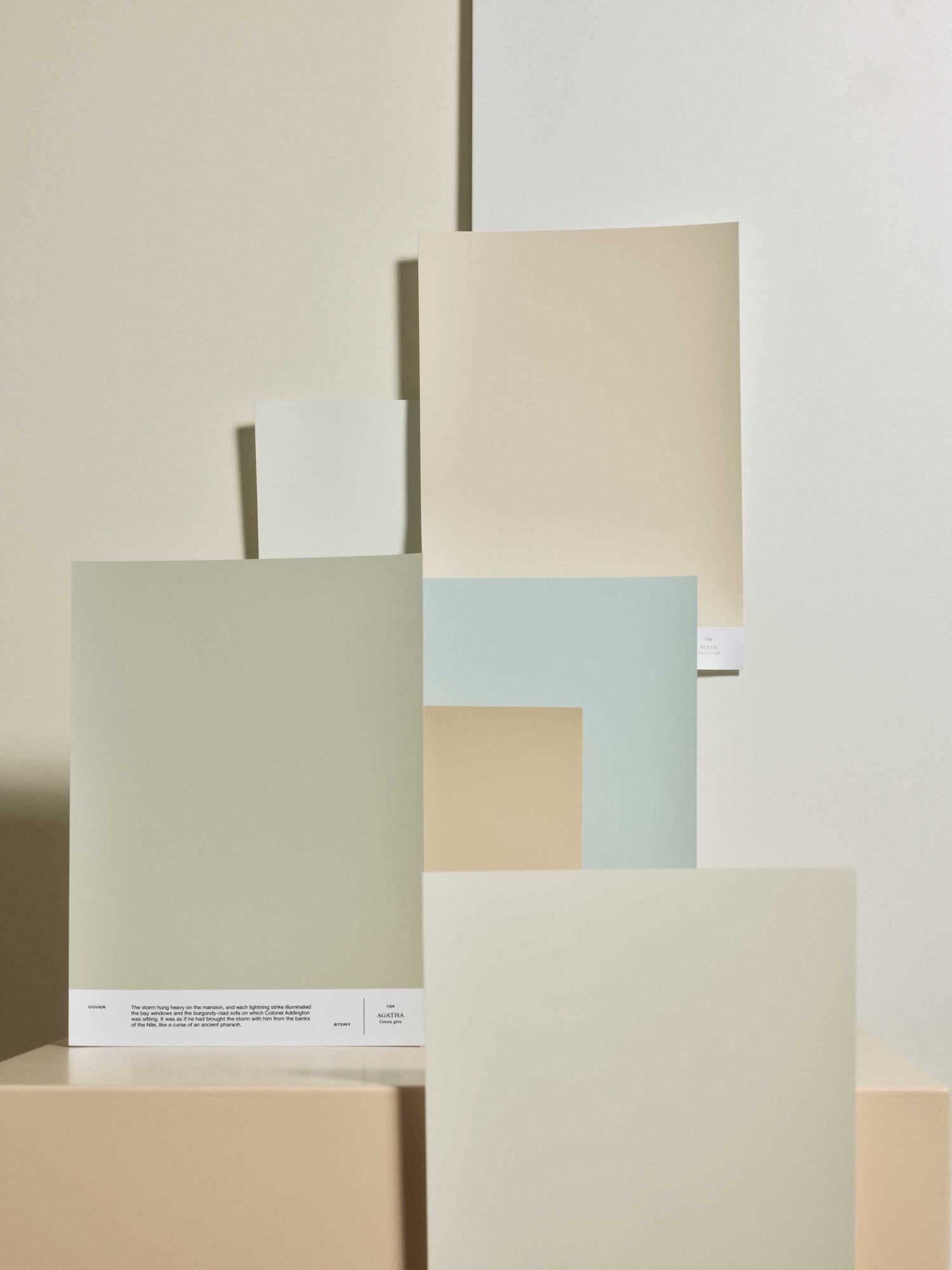
Mattila & Merz architect Laura Mattila compiled her favorite palette from our color chart, transporting you from sandy beaches to the bliss of the forest. Explore this six-tone palette to create harmony in your home.
Walls:
 019 MAYA: Living room, bedroom
LB6 SIMONE: Hallway, bedroom, study
026 AGATHA: Bedroom, study
Ceilings and complimentary colors:
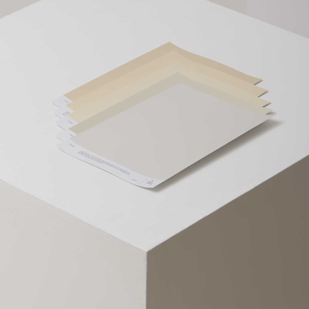
004 JOAN: Warm white for painted ceilings and white walls; 006 ENID: An alternative to 019 MAYA or 004 JOAN as the lightest wall color; LB1 AUGUST: A light blue works as an alternative to 026 AGATHA

What is important to you when planning the color palette of a home?
In all design, including color design, it’s important for me to be aware of and take into account the characteristics of the building and spaces, such as the period and materials of construction, the intended use, lighting conditions and proportions. I think of the home as a whole, a continuum of spaces. I choose shades that work together and support each other even if they are not visible at the same time. The color palette should form a balanced entirety, with different spaces having their own appropriate roles.
How do these shades work with different wood tones?
Wood is a central material in all my work and by default, perhaps partly intuitively, I choose shades that work well with different wood tones. Personally, I like to use wood as natural as possible, even without any surface treatment. However, in doing so, I have to accept that there will be marks on the surface and that I need to allow time for a beautiful patina to develop. For example, a swamp spruce floor is one of my favorites and blends beautifully with the shades I’ve chosen.
How do these shades work spatially with other colors?
The shades I've chosen are all muted, almost “non-colors”, and I think they work well as a backdrop for a variety of stronger, both muted and pure tones, plus I think they allow for a very free use of other colors. For example, I've paired Vuokko's fresh white and yellow Lento curtains with sandy LB6 SIMONE. At its best, the whole is more than the sum of its parts.

You're good with two-tone walls and effect borders. Where should you draw the line between two different paint colors, and in which rooms is a two-tone wall particularly suitable?
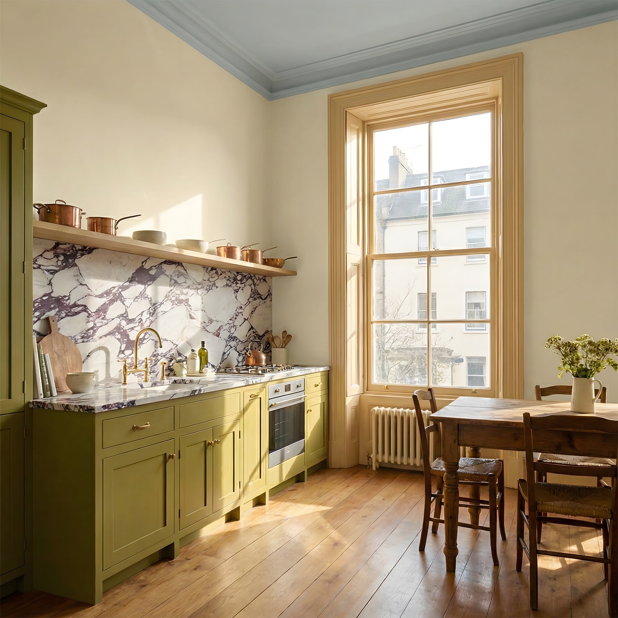
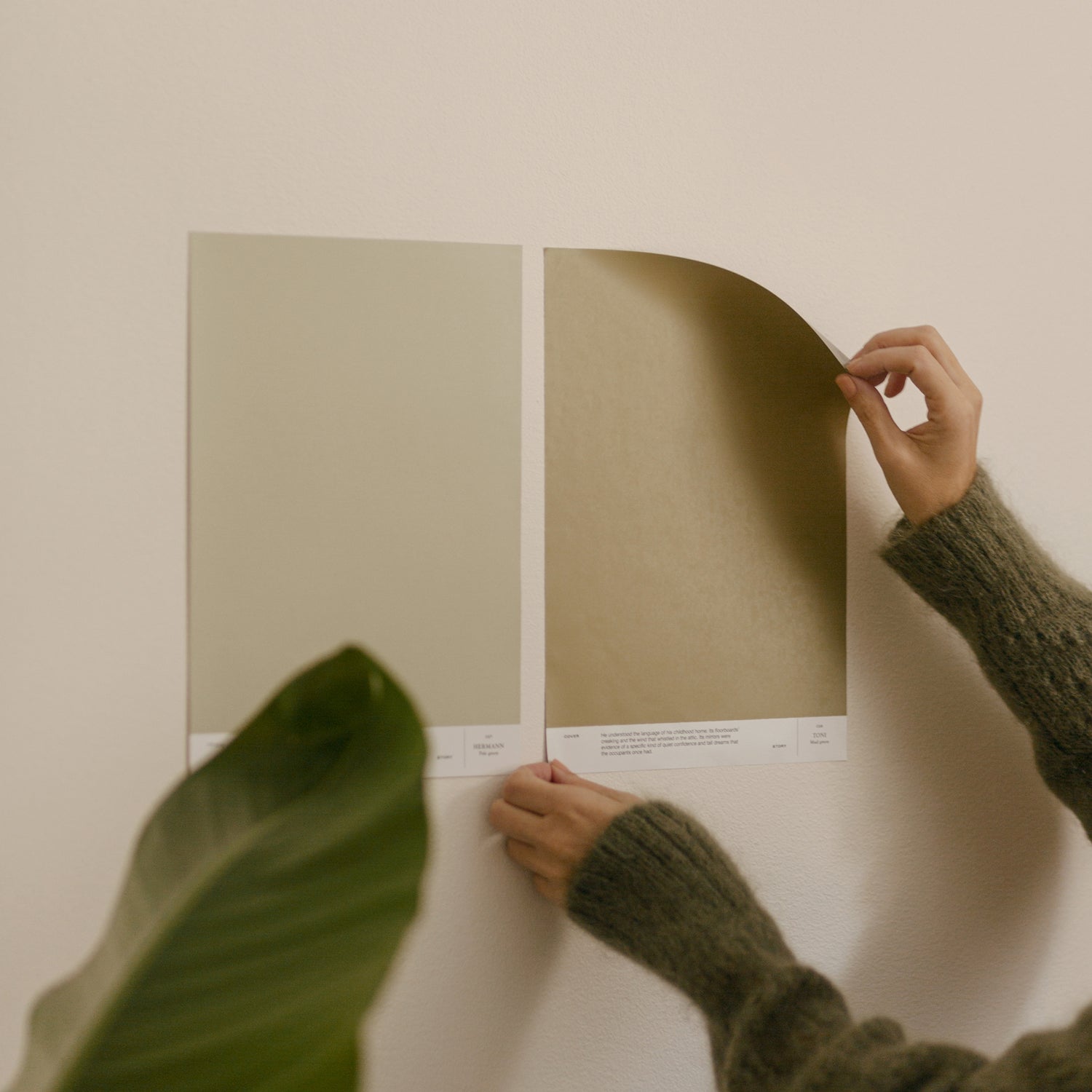
When determining paint borders, I usually try to find the most natural option for each home, taking into account the age of the building, the style, the proportions of the spaces and the materials. For example, in urban stone houses built in the 1920s and earlier, both the roof and the wall surfaces are usually plastered and the roof line often has a so-called 'bottle-roll', which makes the boundary between the wall and roof surfaces disappear. In such spaces, the boundary of the wall paint is naturally set well below the ceiling line, for example at the top edge of a window recess or door trim. Sometimes, setting the border even lower can be a good option, for example if the space is very small and the chosen color is intense. In the color palette I’ve chosen, I’ve done this by using LB1 AUGUST on the wall of the children's room, combined with the white ceiling and upper parts of the walls. The space has an airy feel and the color doesn't overwhelm.
When determining paint borders in a stone house, there is also the question of how to handle window recesses. In the Funkis style, the window recesses are typically white and painted with a glossy paint to maximize light penetration. However, in some older rooms and when using darker shades, it may be more natural and calming to have the wall paint also turned inside the window recess.
If, on the other hand, the ceiling and wall are different materials, for example a paneled or plastered wall combined with a paneled ceiling, I would paint the whole wall surface in one color to keep the overall effect calm.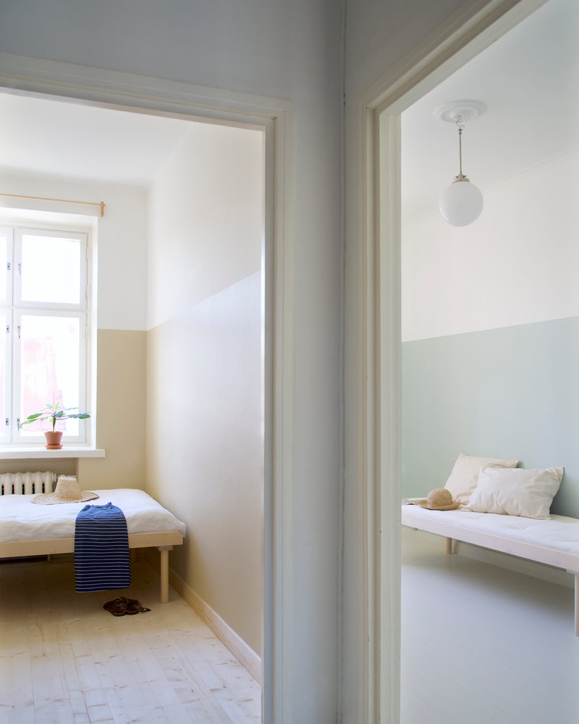
Tell us about your favorite shades at the moment.
I think my favorite shades are quite fixed – usually every design I end up with a shade of green, often with a hint of gray. In my Cover Story color palette, 026 AGATHA is a good example of one of my all-time favorites. I also love beautiful grays, which can be so much more than just different mixtures of black and white. Through Cover Story's shades, I've also discovered beiges. Linda Bergroth's LB6 SIMONE is a perfect, fresh example of it without too much of a red or yellow hint.
As I sketch the colors of the spaces, I find myself returning again and again to the idea of the light blue 'sky ceiling', a recurring theme in church architecture, for example. LB1 AUGUST is just such a perfect shade of sky blue and I recently had the chance to use it on the ceiling of the main room of a flat in Helsinki.
 How can colors influence the sense of space?
Colors can have a big impact on the mood of a space and of course the experience is always personal. However, color choices also affect, for example, the impression of the size of a space – lighter spaces are easily perceived as more spacious than darker ones. However, I don't think that this means that you should always choose white to give a small space a more spacious feel. Again, it's worth thinking about the entirety of spaces in the home and recognising the strengths and characteristics of the different spaces. Personally, I often specify darker and stronger colors for smaller and more intimate spaces and lighter tones for more lively spaces. In a small apartment, where the actual size differences between rooms can be relatively small, this also makes the main room feel relatively more spacious.
I recommend using my favorite shades in a way that fully embraces the way the colors become darker and more intense the smaller and/or more private the space.
Mattila & Merz Color palette for one home:
019 MAYA, LB6 SIMONE, 026 AGATHA

004 JOAN, 006 ENID, LB1 AUGUST
Shop the Mattila & Merz color palette here.
