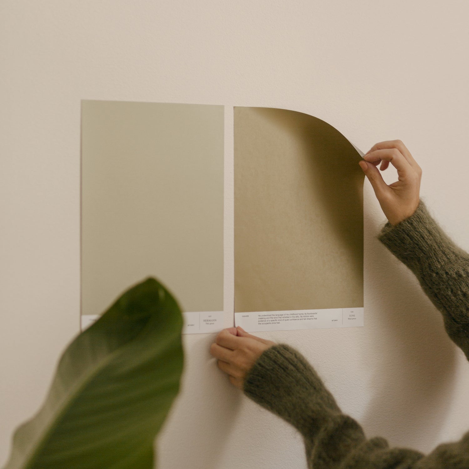
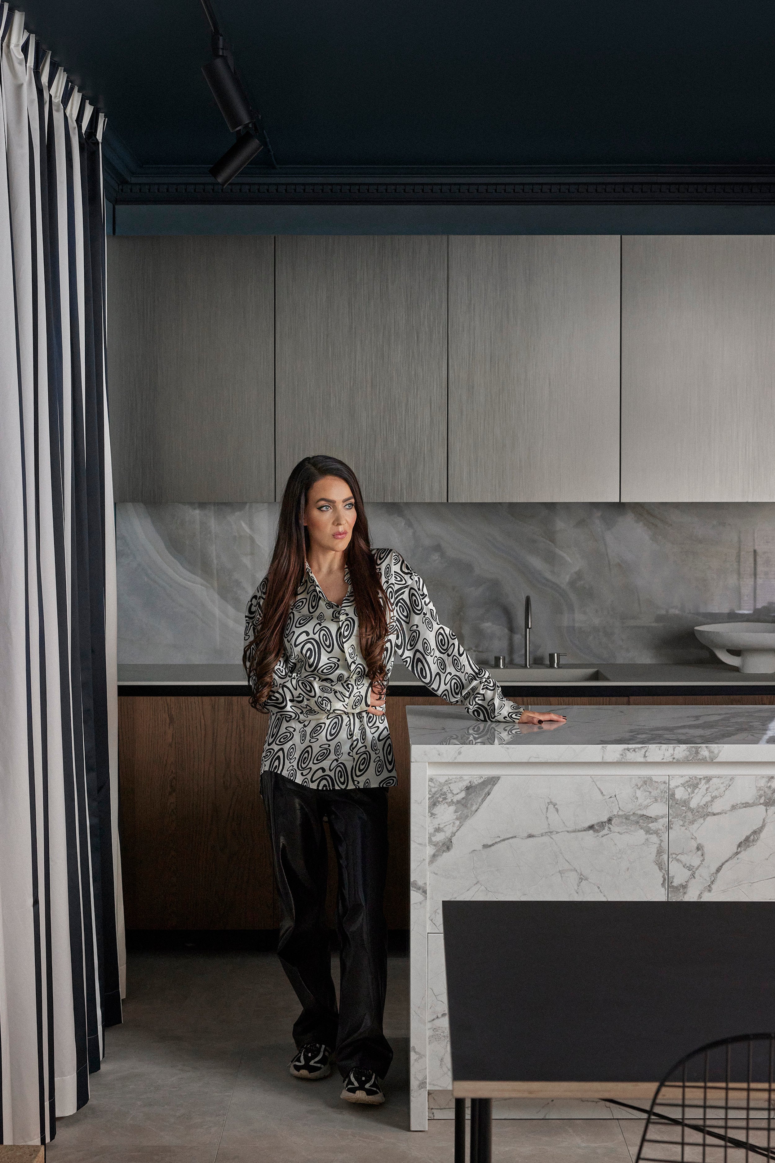
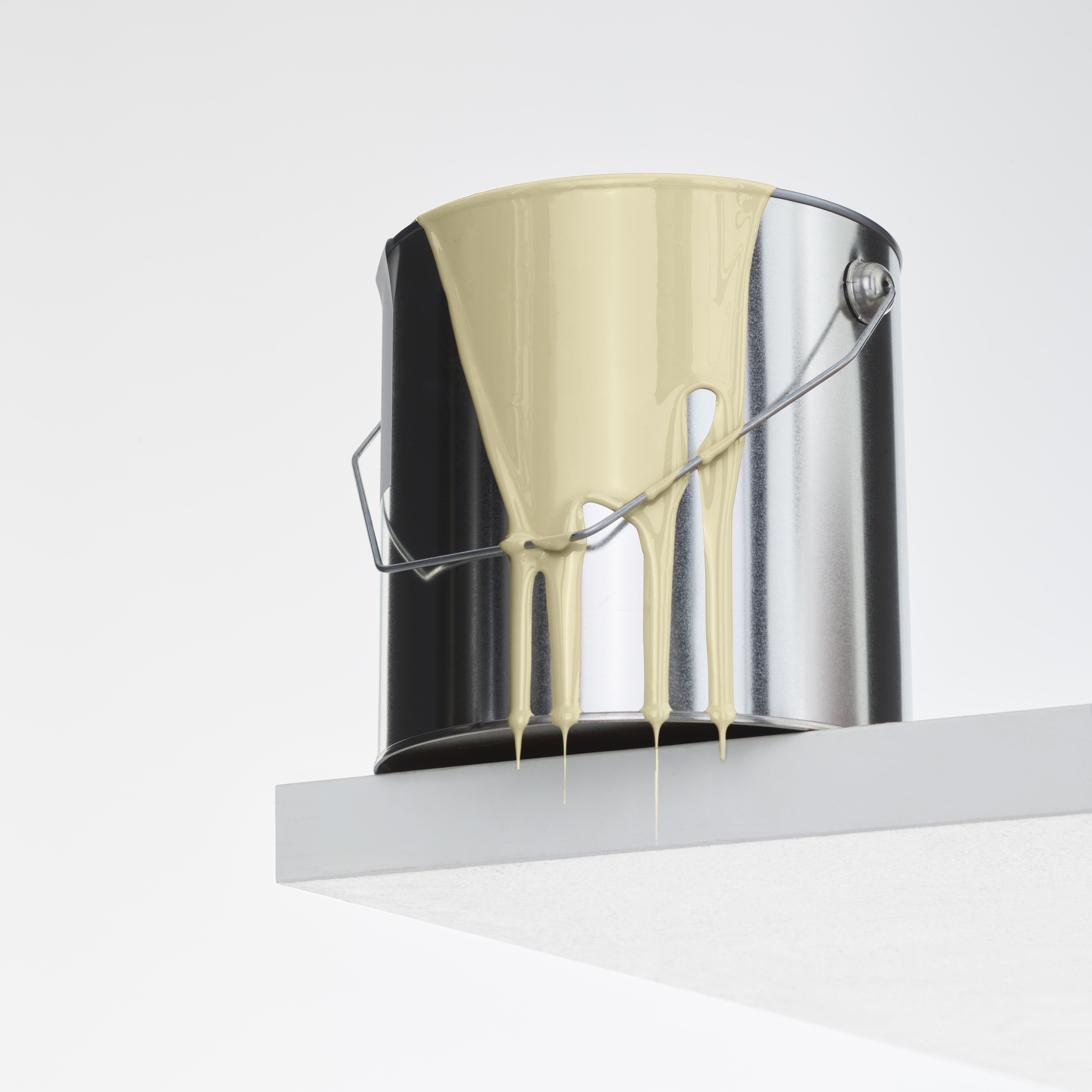
For designer Laura Seppänen, there are two things at the heart of interior design: an effortless atmosphere and people. Laura designed a deep blue interior shade for Cover Story’s Basics Collection as an ode to the blue villages of southern Europe, the sea and the symbolism of cobalt.
Tell us about your background, how did you become an interior designer?
I knew early on what I wanted to do. In that sense, I've been lucky. I grew up in an art school and conservatorium and enjoyed being creative as a child. As a teenager I became interested in spaces, homes and atmospheres, and in the 9th grade I announced I would be an interior designer. At 16, I learned to draw 3D models using software. My friends still remember the collages on my walls in my youth, which I changed according to my mood.
I've apprenticed in a carpentry workshop, built partitions on construction sites, practiced assembling laminate and parquet flooring and styled locations for magazines. I graduated as an interior designer in 2014 and a year later I set up my own office.
Today, I mainly work in spatial and product design. At the moment I have three public spaces, a housing fair in Loviisa and a furniture design on my desk. I'm completely in love with product and furniture design, I want to do even more of it in the future. I have a nice position in the sense that I can do whatever feels good at any given time.

How would you sum up your design philosophy?
At the heart of it all is the desire to design spaces that feel good to be in. I approach design purely through people – the kind of space a client feels good in is very individual. Often people find it hard to describe the atmosphere or the overall feeling they want, but by interviewing them I get to know what their everyday life is like, whether they are neat or open-minded, whether they hoard stuff or are minimalists. Lifestyle influences the demands on any space.
My second core belief is sustainability. A space must be able to withstand practical use and wear and tear, but also the vicissitudes of visual styles. A restaurant or a home that will be around for the rest of your life should be relevant for years to come, but not time-bound. I prefer durable natural materials that look beautiful as they age. There is no such thing as a pristine space. I don't think trendy materials or colors matter when it comes to interior design. At the heart of interior design is functionality and comfort – whatever that entails for its different users.
Ultimately, it is the function of the space that sets the framework for the design. Whether people want to relax and unwind or whether they want to be inspired and energized. I believe that certain objects can convey demands, for example, a wilted houseplant screams: "Do something for me!". If the client's life is very restless I try to minimize these elements and stimuli in the space.

What colors mean to you?
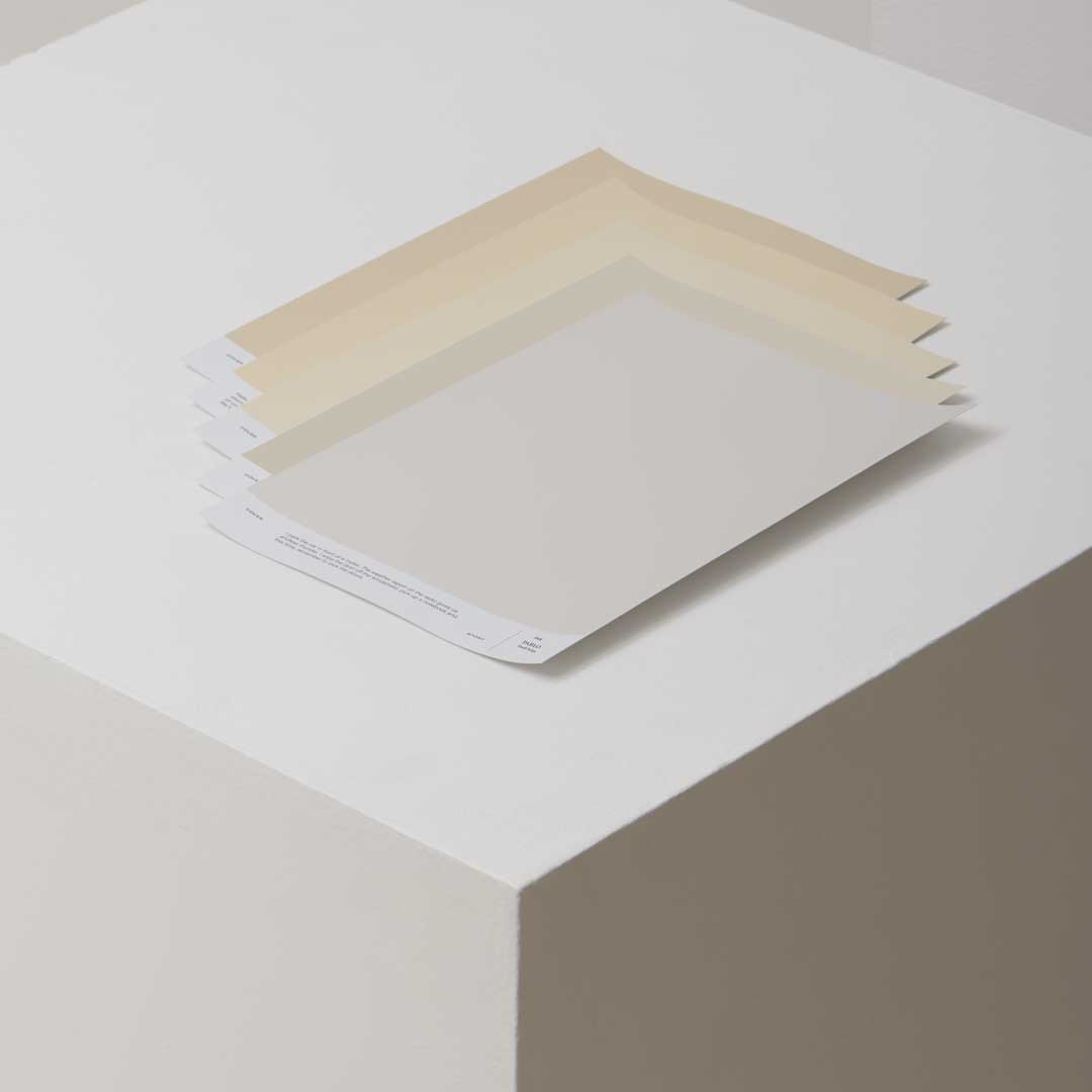
Color is a very personal experience, it varies according to the environment and the perceiver. They are learned things that have symbolic meanings for us which we aren’t always aware of, but may subconsciously associate with our experiences. In interior design, colors are one of my main tools, along with materials, lighting and design. In spatial design, I adapt the use of color to the environment and the observer.
Personally, I wear all black. Black is my favorite color.
Where did the inspiration for this deep blue paint shade come from?
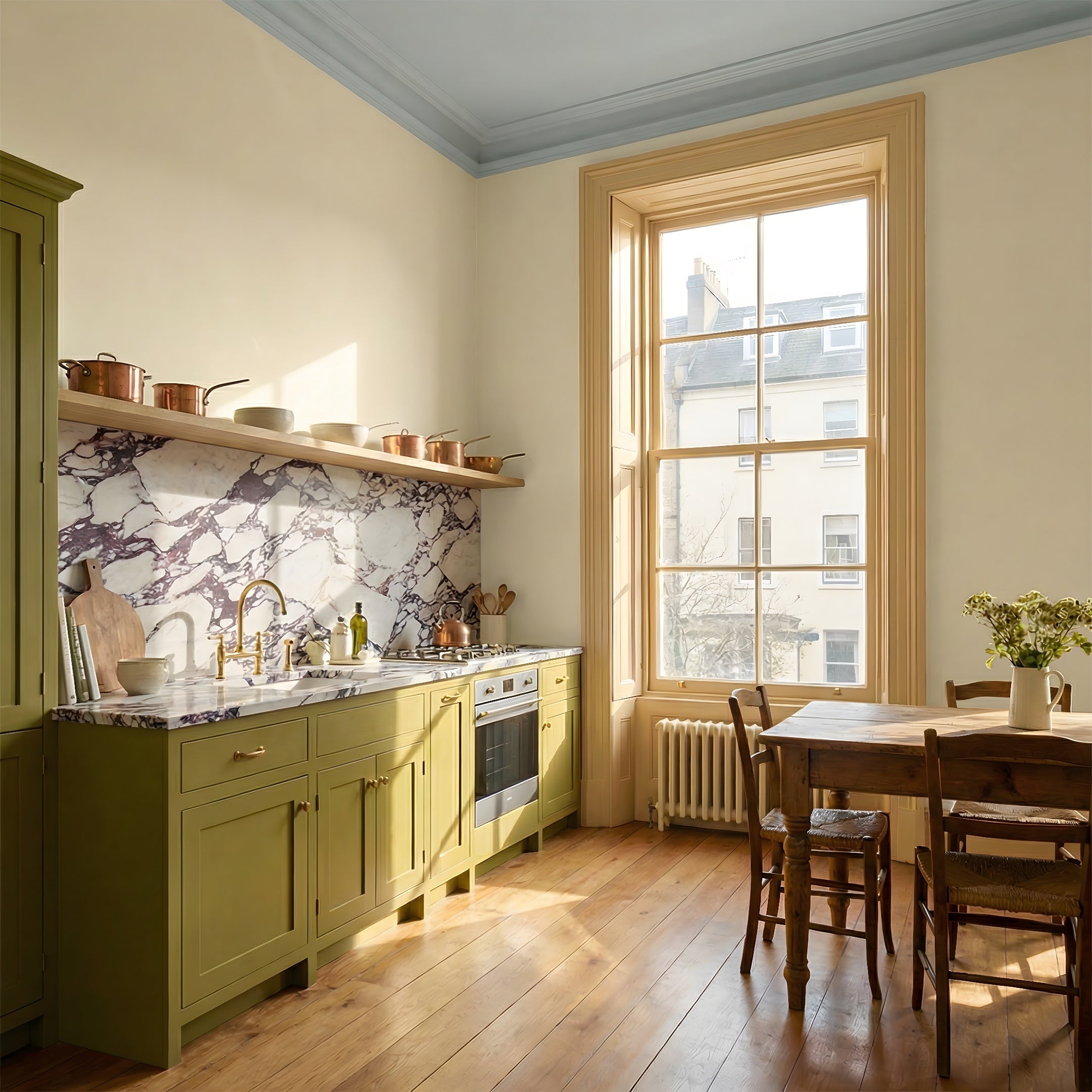
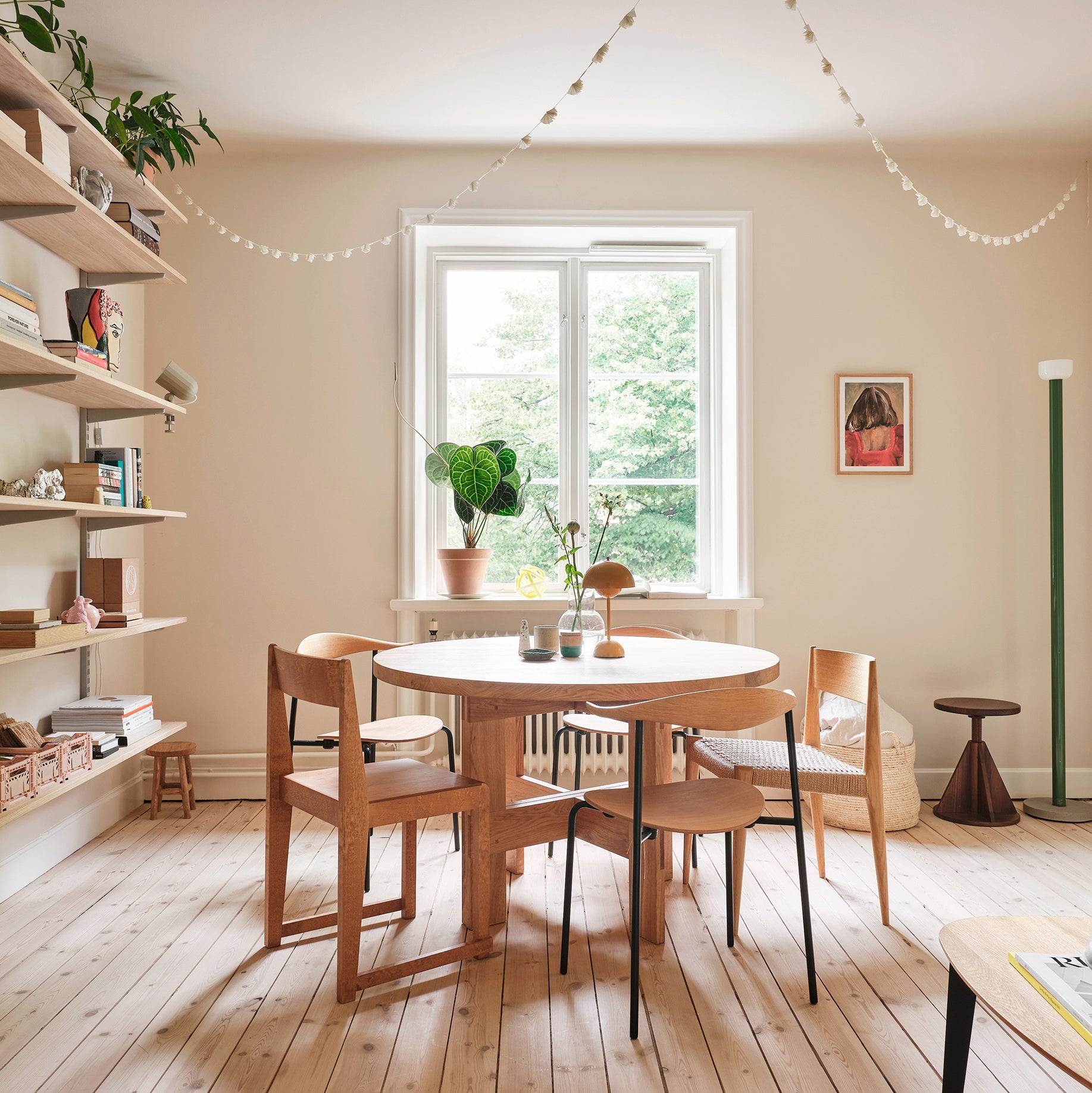
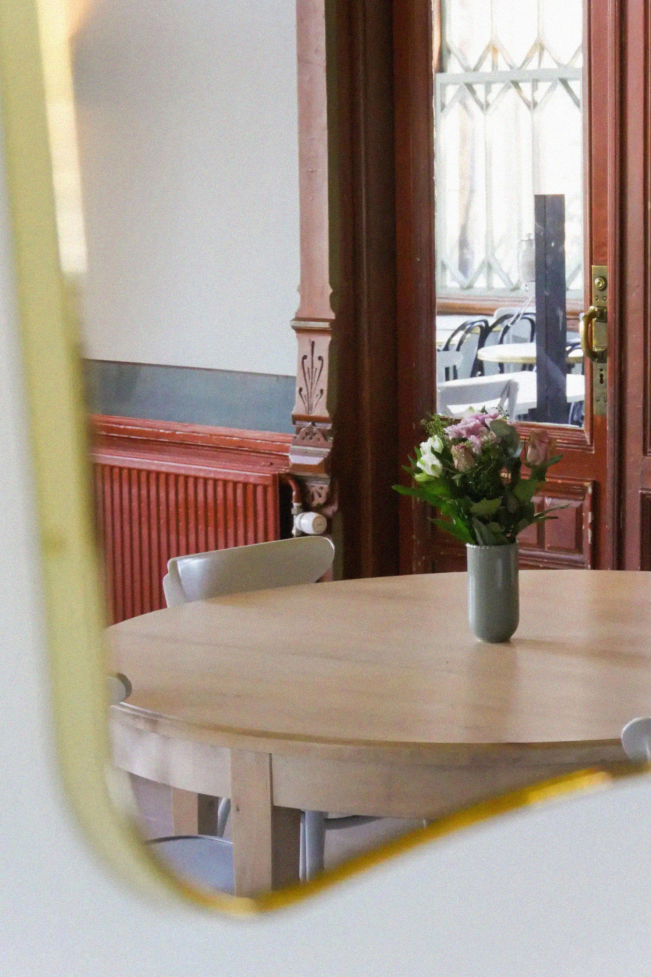
The Skanno Home is my showcase of how Central and Southern Europe meets Scandinavia. Bold blue is used a lot in Greece and continental Europe. Blue symbolizes the sea, and blue-white houses are the white foamy wave crests. I find that charming. Blue is also believed to protect homes from evil, a symbolic meaning I think is lovely.
For me blue is about the sea, it's calming – the best untamed, neutral, natural element there can be.
This blue was created as a part of my design for Skanno’s pop up home. My design was guided by the concept of a muted Bauhaus color palette. I combined a toasted ochre, a burgundy that resembles red and this cobalt blue that I created. I wanted to replicate the familiar blue of Greek villages in a Scandi setting. The result is a vibrant cultural collision!

Give us your tips for using this shade in a home.
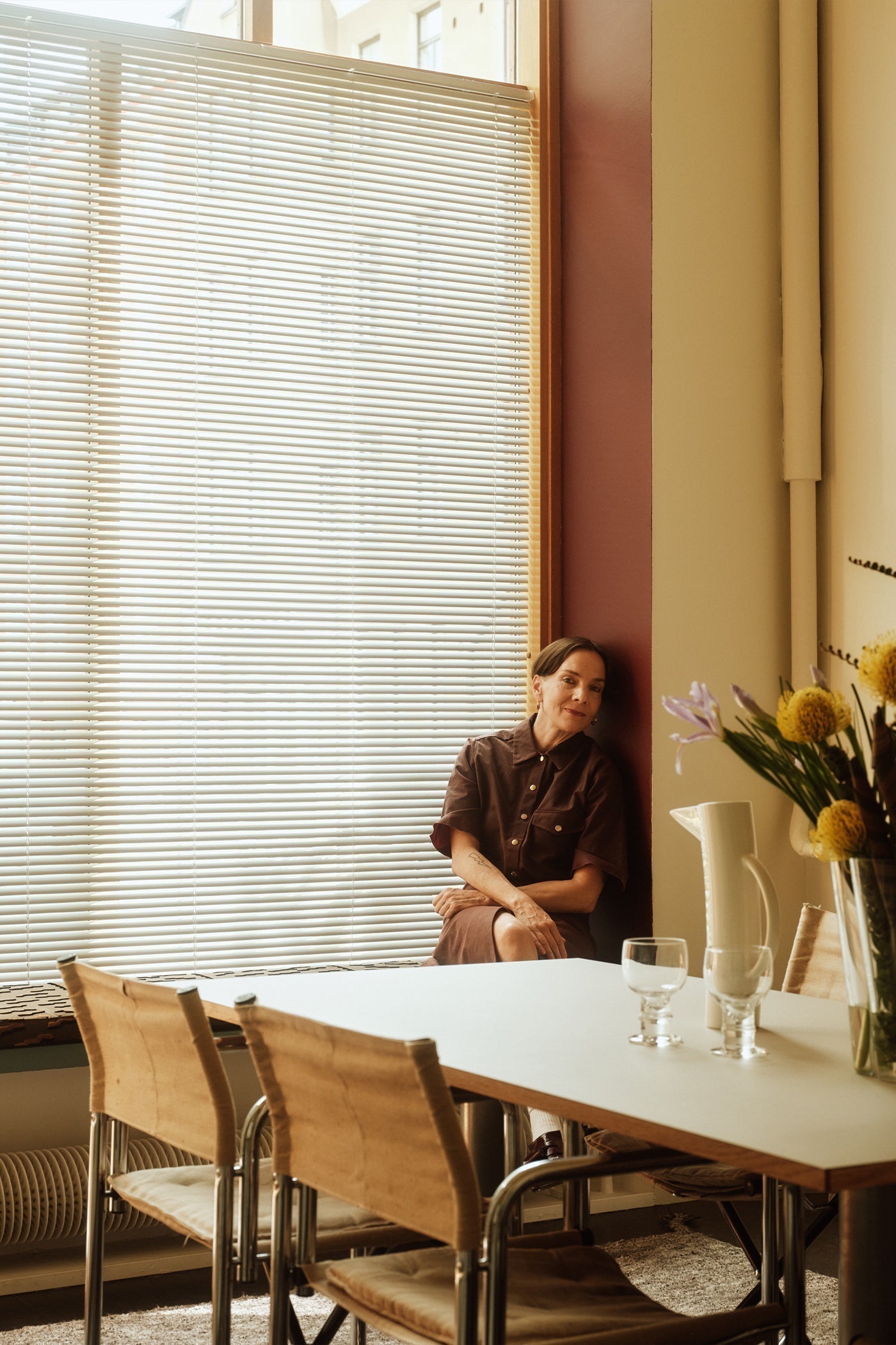
I can't help myself, but again my answer is that it all depends on the environment – who lives there, and what the space is used for. As a general tip, this blue works well paired with light woods, such as oak or even lighter ash or birch. In my Skanno house, I brought in contrasting tones like a white wall and black bed frame. This deep blue also works beautifully with other blues. 
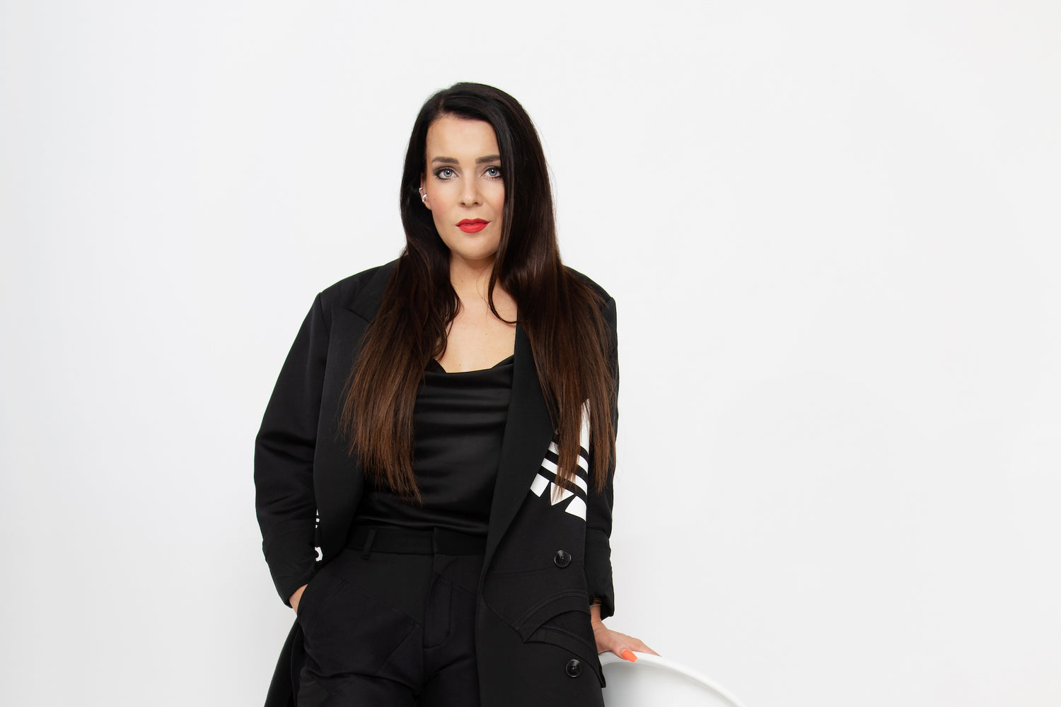
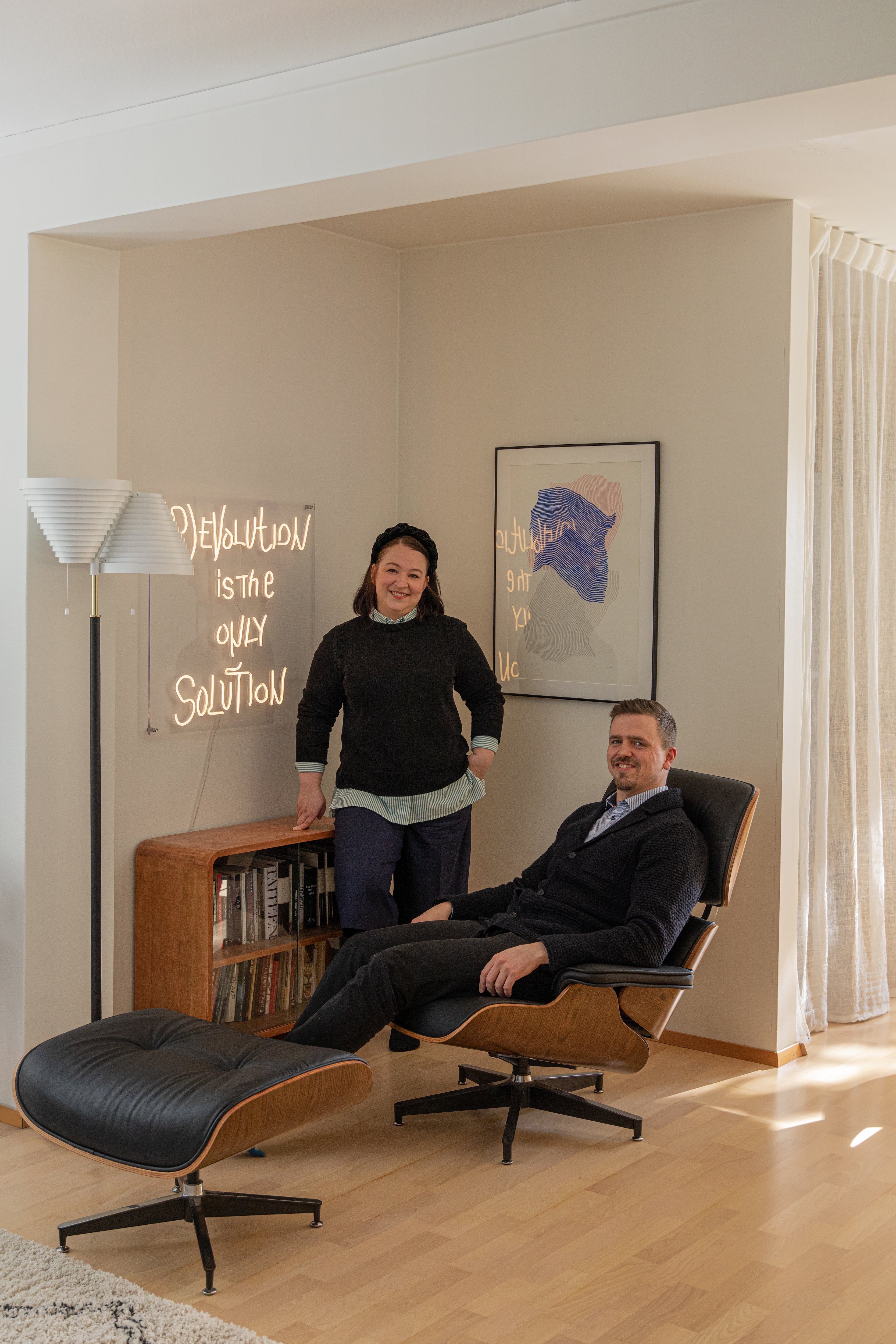
Laura Seppänen is a Helsinki based interior and product designer. Seppänen founded her own L/S design agency in 2015. Seppänen's work at the agency covers a wide range of design, from interior concepts to commercial design and visual communication. L/S design agency creates interiors for both public spaces and private homes in Finland and around the world. Her work has been widely published in both Finnish and international media.