
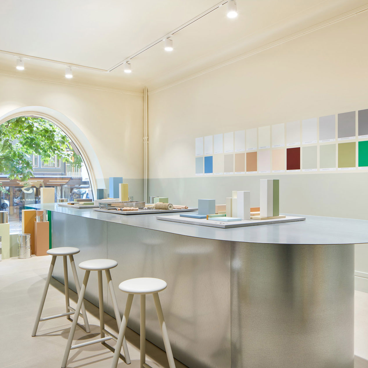


Joanna Amemori, interior designer at Artek, put together her favorite color palette from our color chart, creating a fresh and soothing natural interior. Explore this six shade palette to bring peace and vibrancy to your home.

What is important to you when planning the color palette of a home?
A home should look like the people who live in it. When planning an interior design I start by thinking about who lives in the home and what they want from the dwelling and its different rooms. I think the rooms can be different colors, but I try to maintain a harmonious transition from one space to another. In other words, the colors should blend together aesthetically. The view from one room into another room works wonderfully as a beautiful accent in the space.
How do you create a balanced color palette in a home?
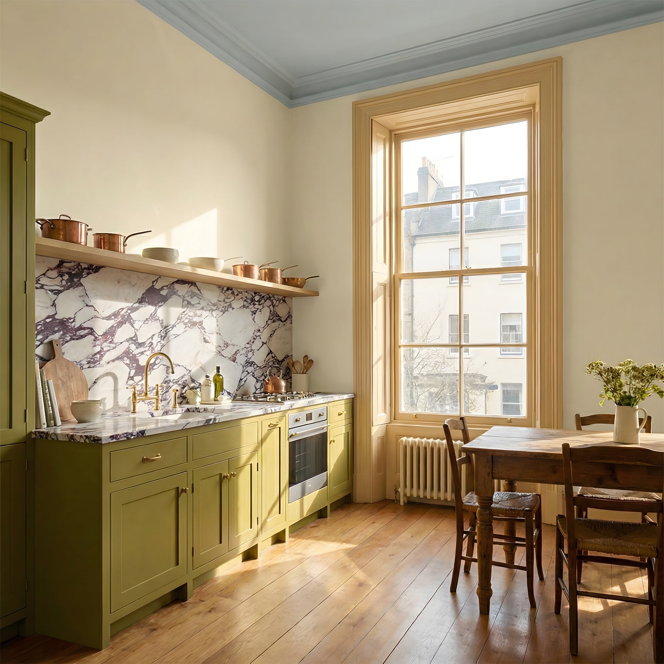
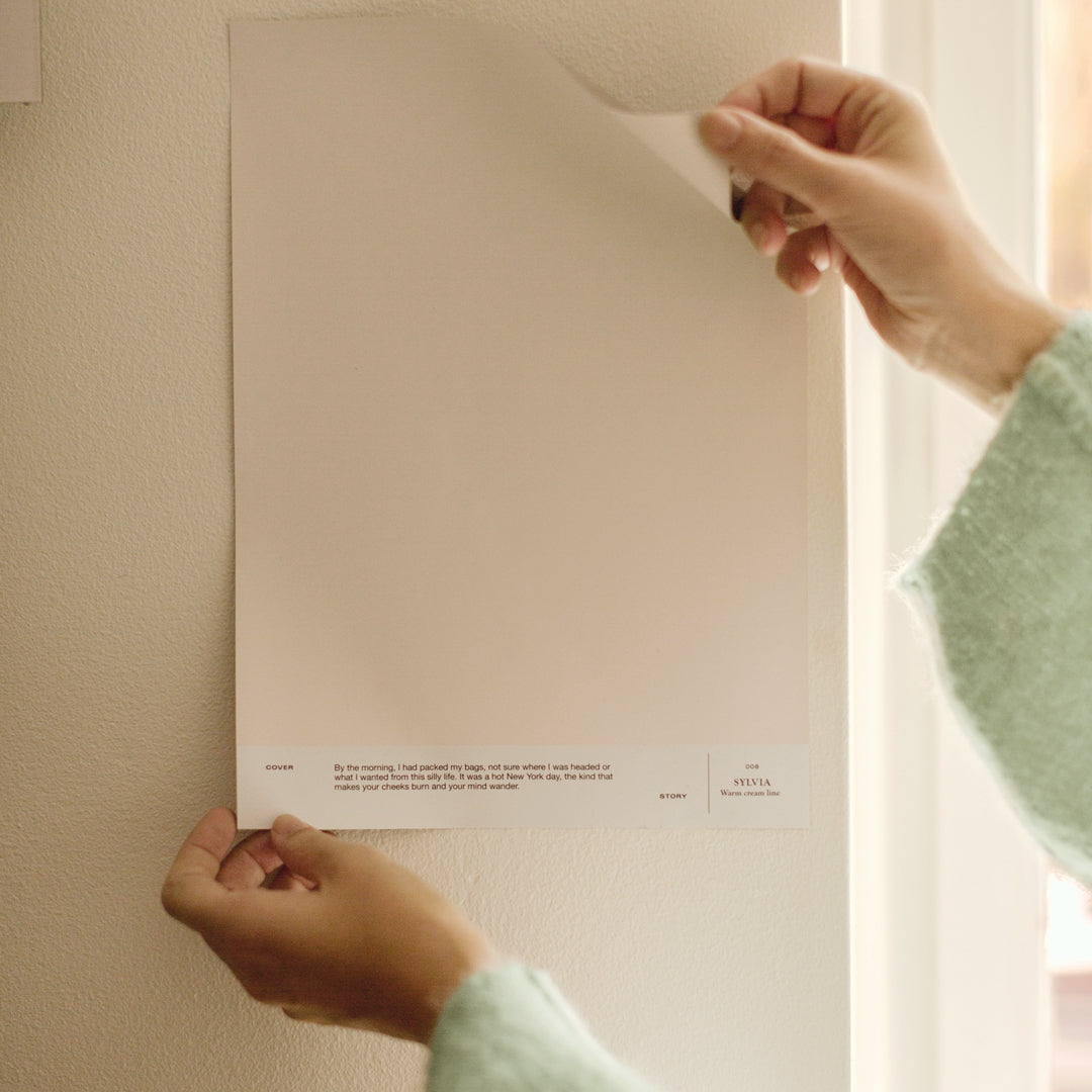
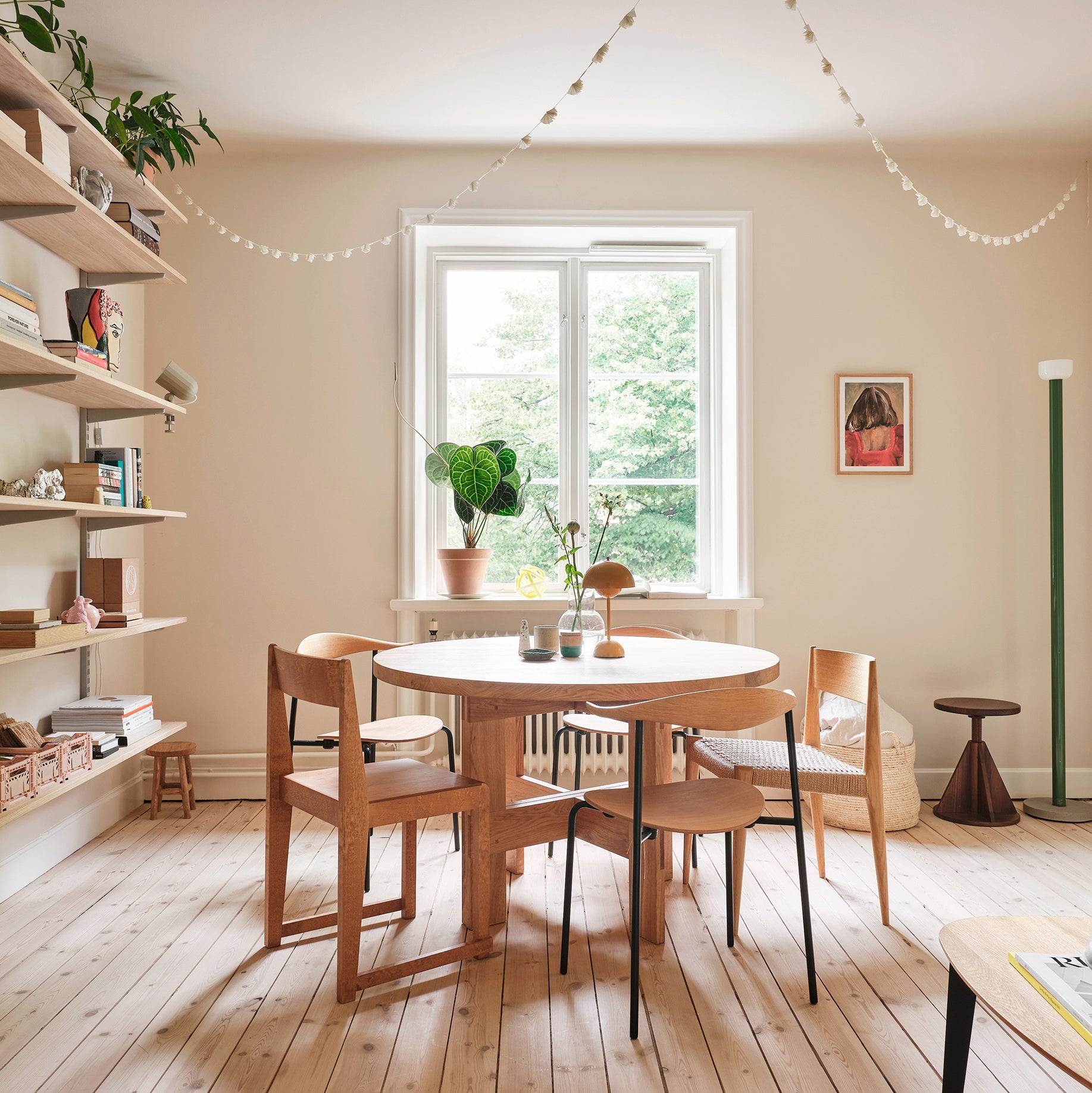
I usually choose one overall neutral for a home. 008 SYLVIA was an obvious choice. It's a lovely, soft shade against which white objects and furniture pop beautifully. I was really excited about this shade, and it was the clearest and easiest choice for my favorite palette. This neutral white doesn't draw attention to itself, but makes the space feel cozy and soft.
030 VIRGINIA – Straw green is another absolute favorite from the Cover Story color palette. The color is embracingly warm and approachable. It blends beautifully with different types of wood and brings softness to a modern ensemble, and also works wonderifully alongside patinated objects.
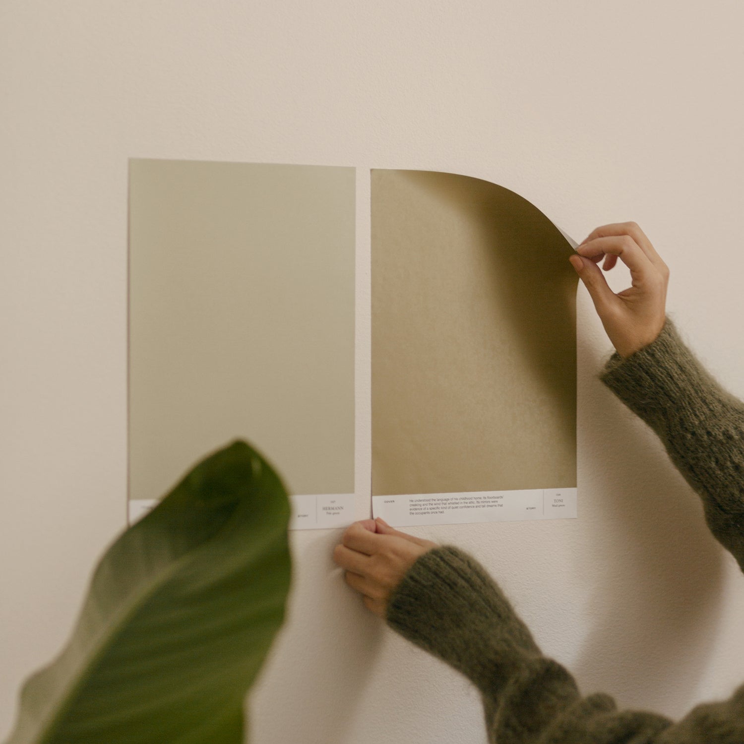
For the children's room I chose 014 HARUKI – Pale gray & 031 CHARLES – Bright cold yellow. The crisp yellow is a fun choice for a play-age room, without being at all childish as the child grows up. I think the gray of HARUKI works really nicely with yellow. For example, the bottom of the room could be gray and the top yellow. Together, these create a calm background for furniture, toys and textiles, even in bright colors.
The mood I want is one of clarity and calm. I find 026 AGATHA – Green-gray a calming shade that is easy to combine with different materials to create a serene ensemble.


How would you combine your chosen shades with other colors in your home, such as textiles?
008 SYLVIA goes well with a wide range of ensembles. Personally, I’d combine the shade with different shades of white, both pure white and off-white. Oak and walnut blend beautifully with this shade and dark details add a touch of poise to the pale ensemble.
030 VIRGINIA provides a lovely backdrop for stark, white furniture, for example. On the other hand, by combining linen, muted lampshades, Akari’s paper lamps and vintage furniture with straw green, you can create a very atmospheric and timeless ensemble.
014 HARUKI & 031 CHARLES - Bright cold yellow I would combine with different shades of birch, bright orange, light blue or shades of greige.
026 AGATHA – Green-gray works delightfully with oak, chrome, flax, terracotta and potted plants.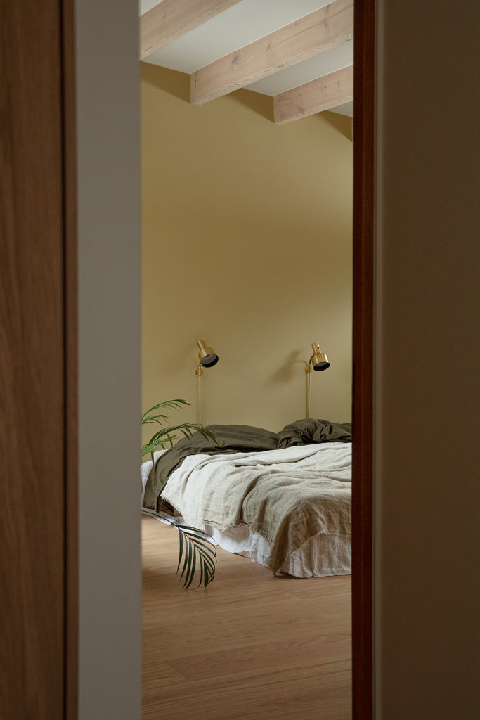
What are your tips on furniture choices for the color palette you've assembled?
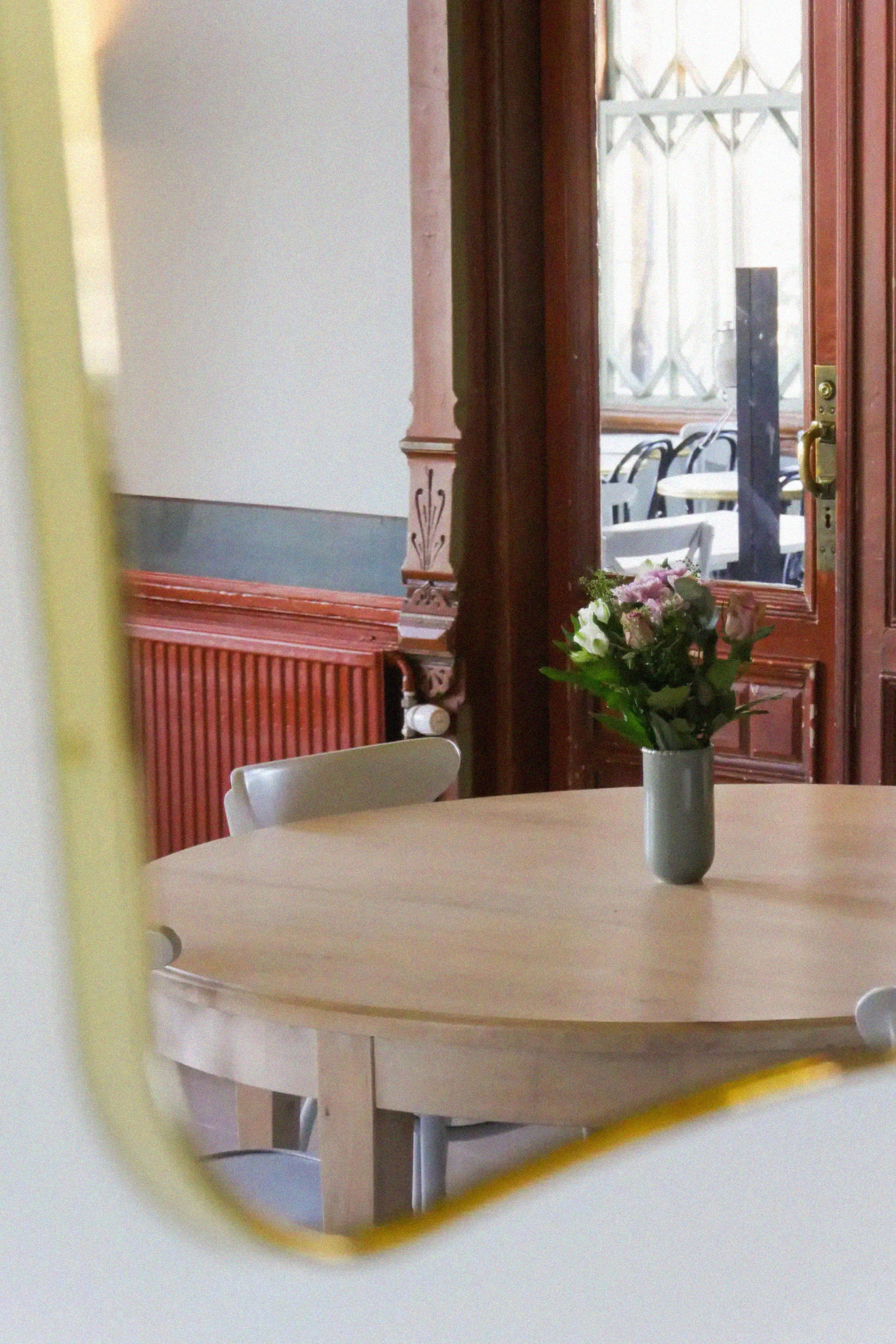
People are often unsure about combining different species of wood in their interiors. That's when I usually point out that in nature and in the forest, the different wood species all live together and we find it a lovely and calming landscape. It follows that within the home, I encourage people to enjoy mixing and matching different types of wood. Also, there are so many different shades of the same wood in terms of texture and patina. 
What are your favorite Artek & Vitra products right now?
What fascinates me about Artek Helsinki products at the moment is the combination of different types of materials to create a varied ensemble. Vitra's cardboard Wiggle chair, Akari's paper lamps, Artek's classic, full plywood furniture like the Paimio chair, all of which, when combined, create a sculptural feel. The furniture I chose is not colorful in the traditional sense, but when complemented with a wall painted in a beautiful shade, the effect is interesting and engaging.

Joanna Amemori Color palette for one home:
001 PATTI, 008 SYLVIA, 014 HARUKI
026 AGATHA, 030 VIRGINIA, 031 CHARLES
Shop the Joanna Amemori color palette here.


