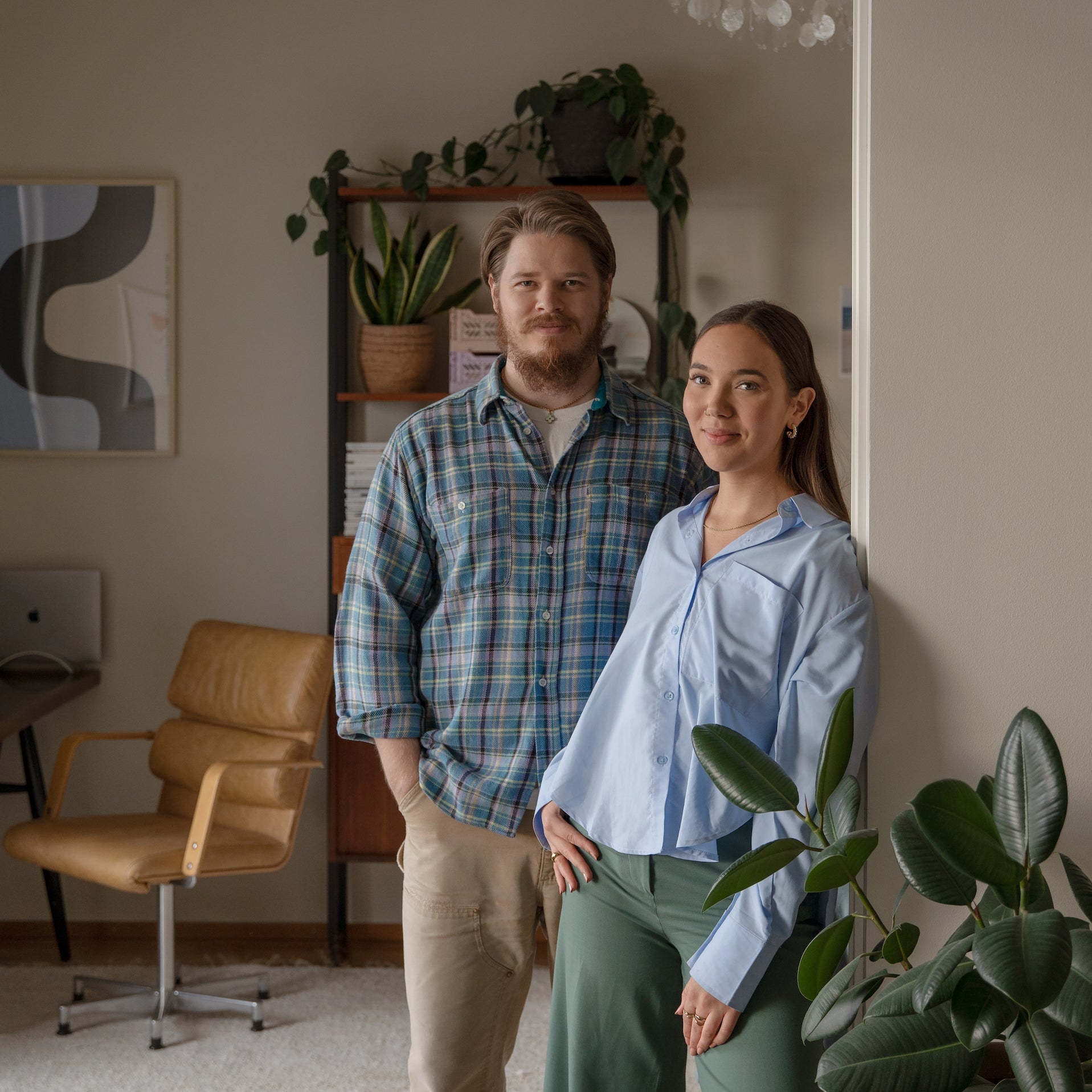
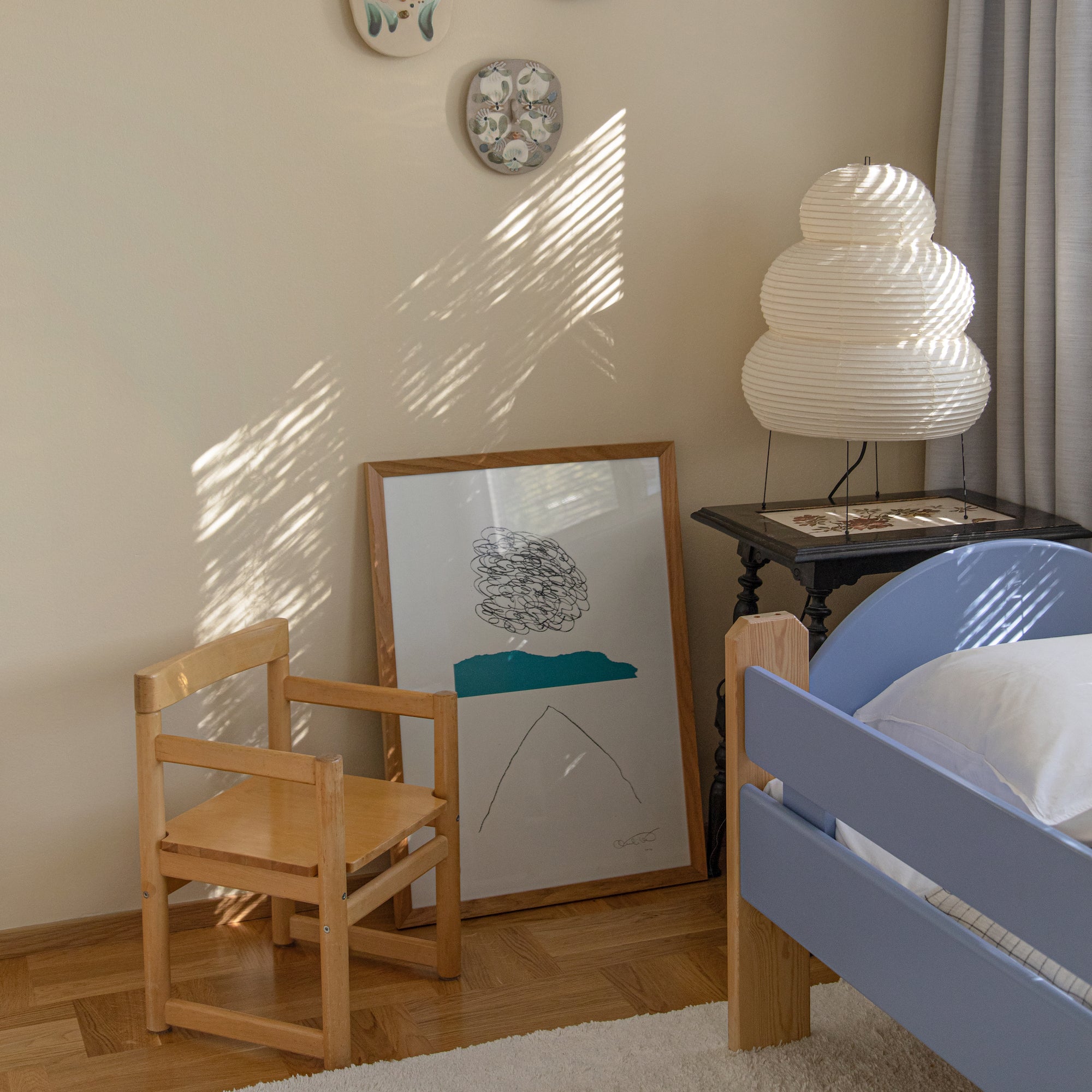
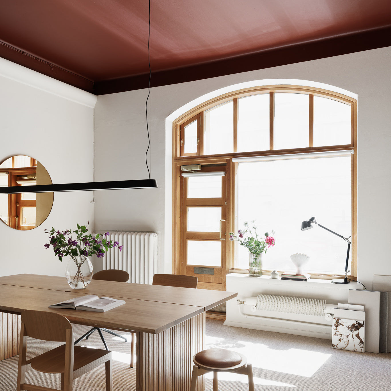
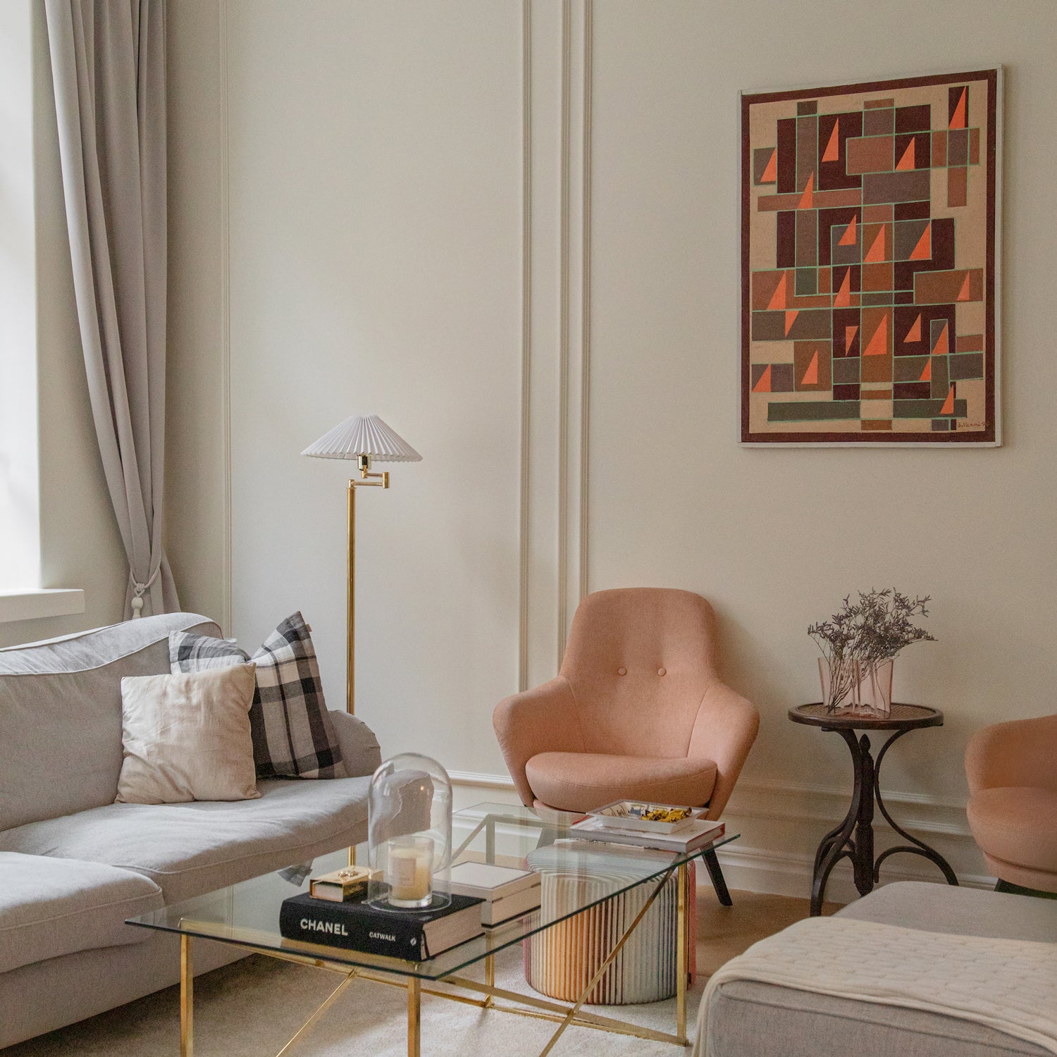
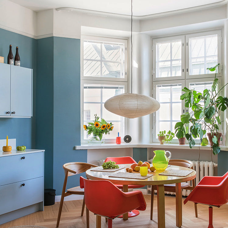
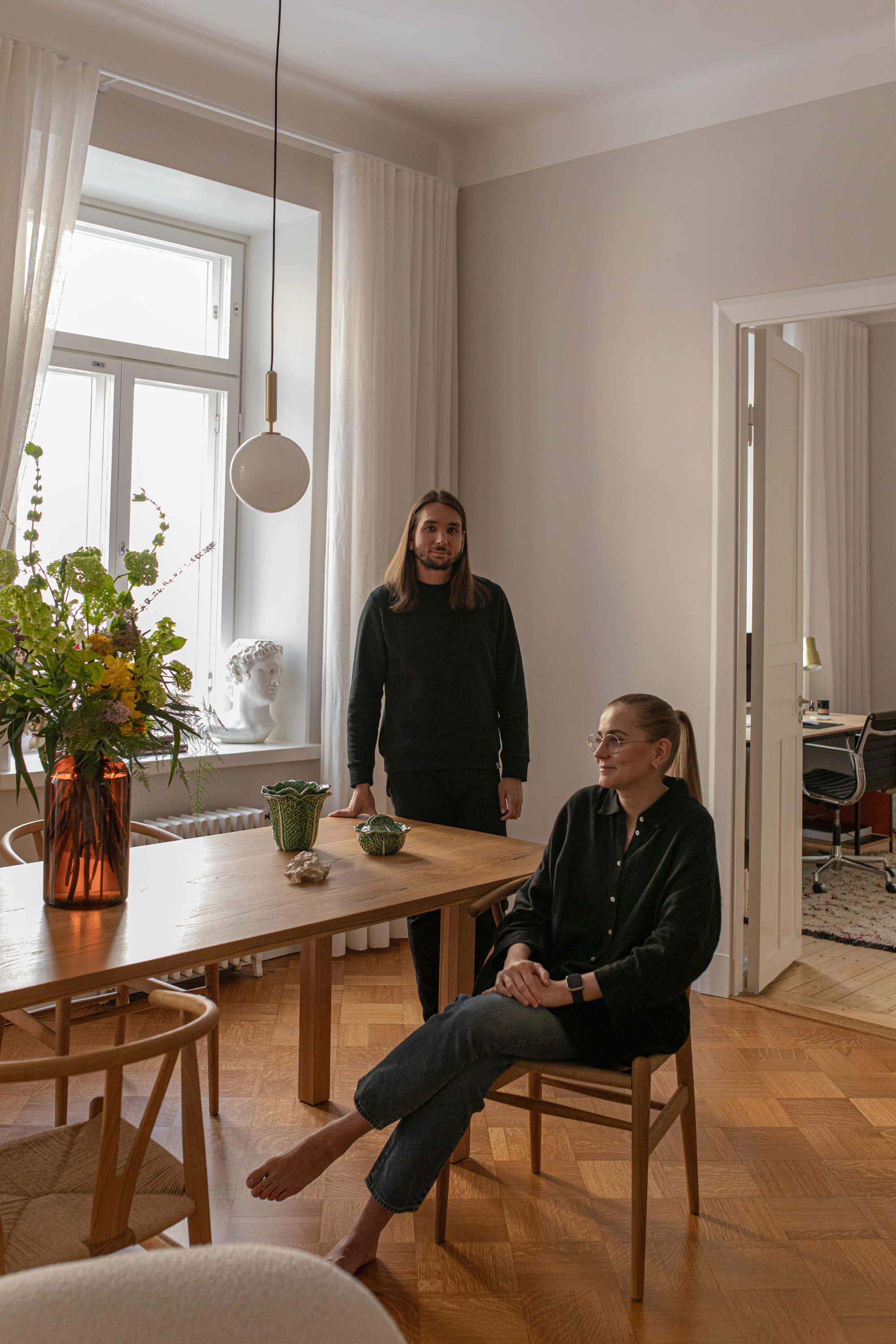
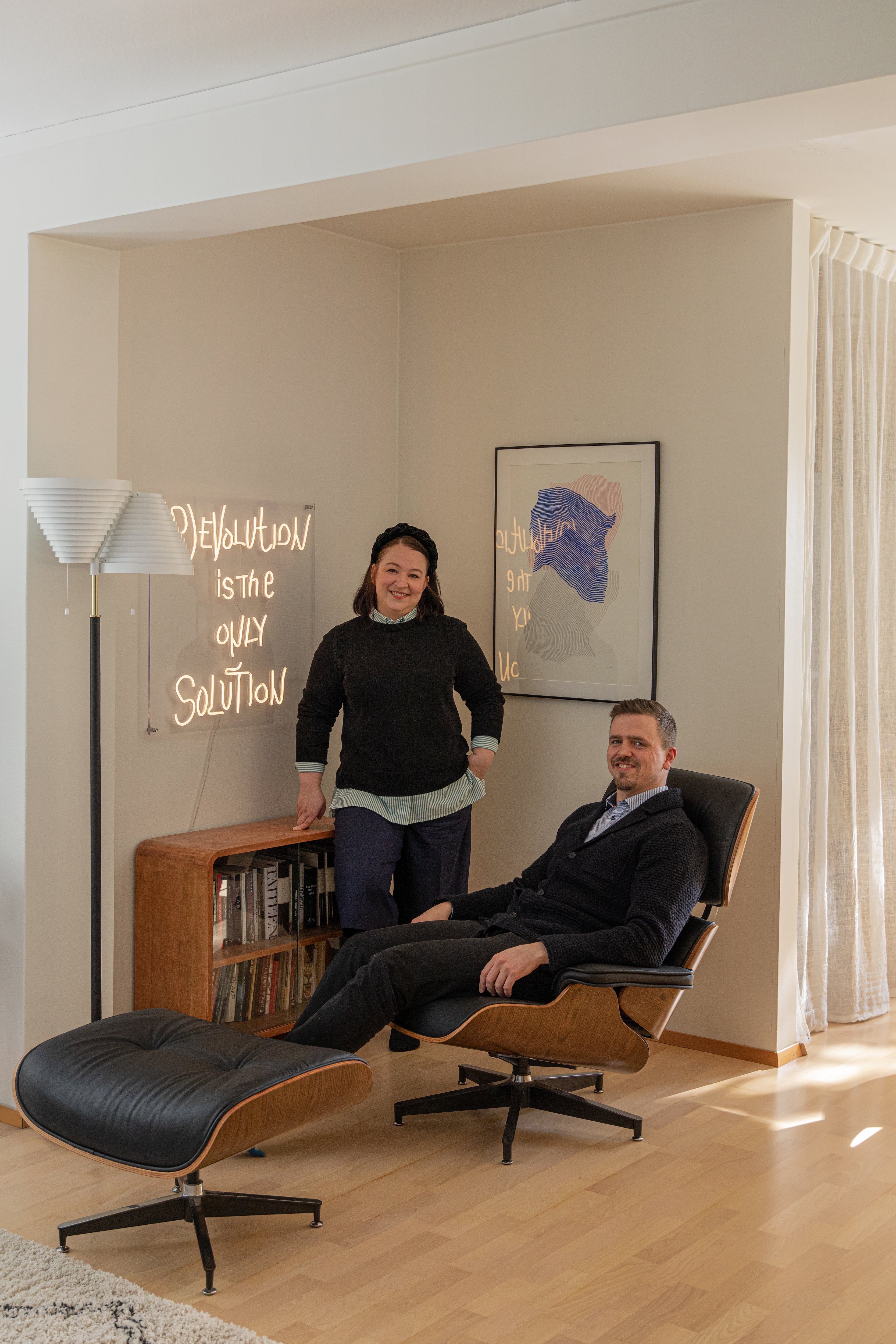
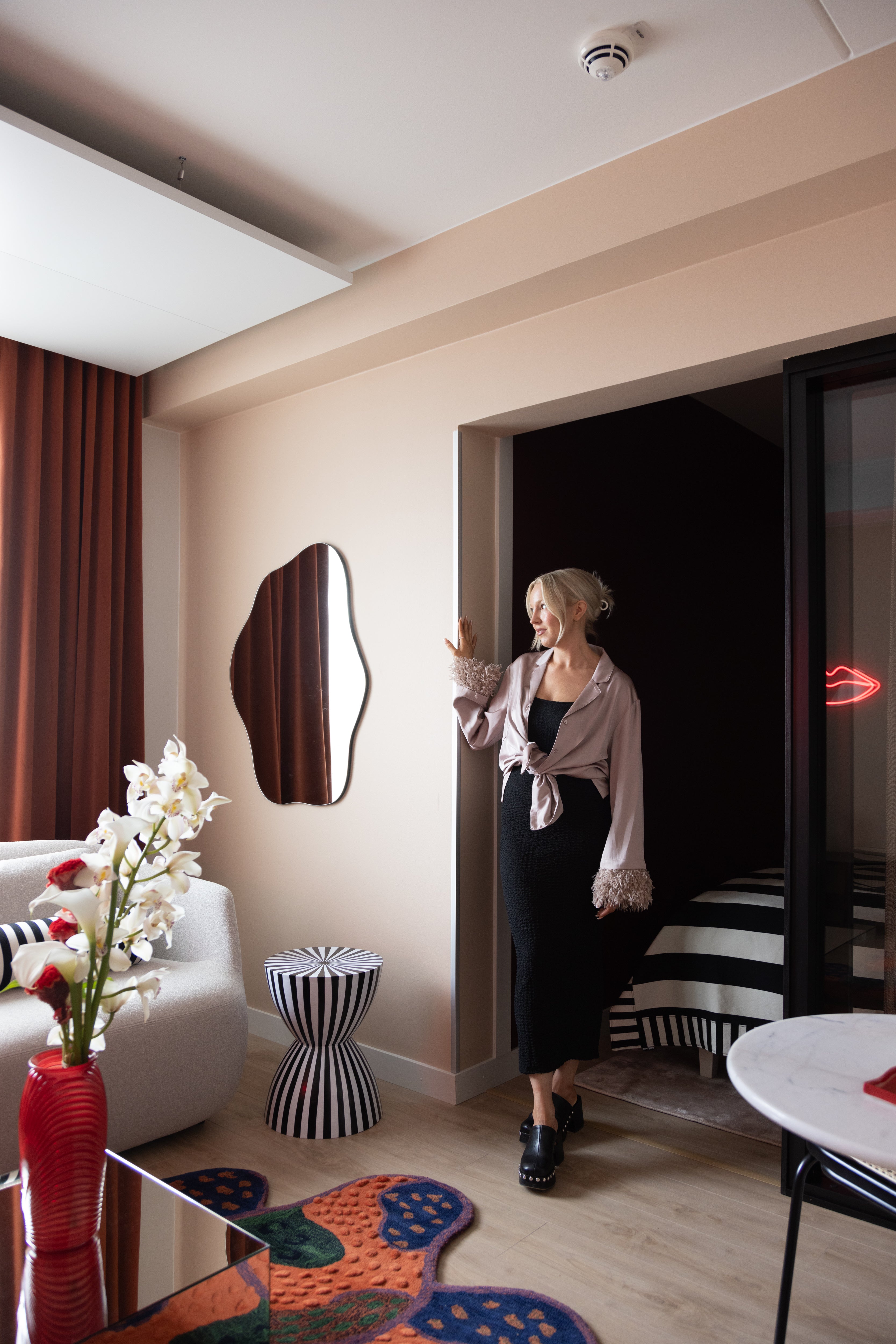
Hazy afternoon light filters through the blocks of Helsinki’s city center, finding its way through wide windows and into the home of Roosa and Mici. Their timeless Art Nouveau building holds a home of colorful clarity, offering the perfect space and atmosphere for entertaining.
A longing for space and an appreciation for downtown architecture is what led Roosa and Mici to fall in love with this stunning 1900s Art Nouveau building in the center of Helsinki. The apartment’s purchase was followed by a long handover period, during which Roosa was able to plan their future home’s color palette. Only she was stumped by the most challenging color, the basic shade that would tie it all together. She wanted color and depth, the warmth and roughness she had experienced abroad. White walls were not an option.
"I wanted to create different atmospheres here. It seems foreign to me, the idea that colors automatically create a restless atmosphere. For me, our bright blue study is really calming," says Roosa.
We were looking at the houses in the old city center and were astonished by the colors of the facades. All the old houses are colorful, so why not have harmonious colors inside the houses as well?
The surrounding houses and the atmosphere of the area also inspired Roosa and Mici. The walls of the three-room apartment now delight in four shades, and each room has its own atmosphere.
"We were looking at the houses in the old city center and were astonished by the colors of the facades. All the old houses are colorful, so why not have harmonious colors inside the houses as well? Colors bring beauty to the eye," says Roosa.

For the couple, the feeling of home is more than the sum of the rooms and interior design. The cozy atmosphere extends to the historic surrounds of the city center. They take great pleasure in the architecture of the old town, the beautiful surroundings that give so much to the passerby. This is a couple who are not impressed by modern or architecturally minimalist suburbs.
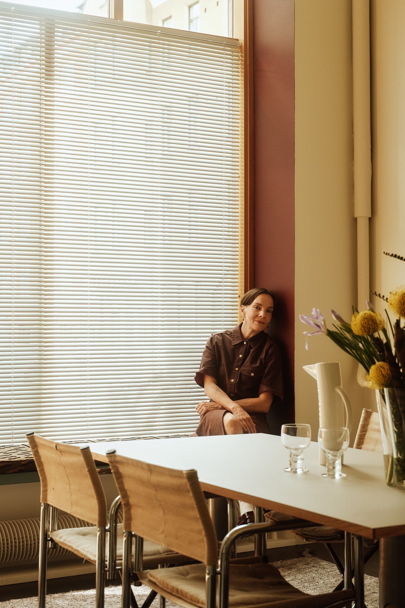
At the apartment showing, they admired the spaciousness and the layout, which had been extensively renovated by its previous occupants. What was once three small rooms had been opened up into a large living room-kitchen, and a long row of windows brought the impressive brick house across the street into the home's interior, strongly centering it in the historic downtown that they adore.
"It was immediately easy for us to imagine what our furniture and life here would look like. I don’t like the idea of moving into a new home and having to replace everything,” says Roosa. “A lot of the same choices had been made in the renovation that we would have made, so it was lovely to be able to focus directly on the interior design."
We thought long and hard about how the view would look from the living room to the hallway and from the other direction. We ended up with green because we wanted a clear, yet neutral enough color so that the overall look wouldn't clash.

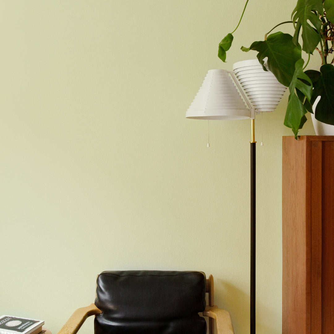
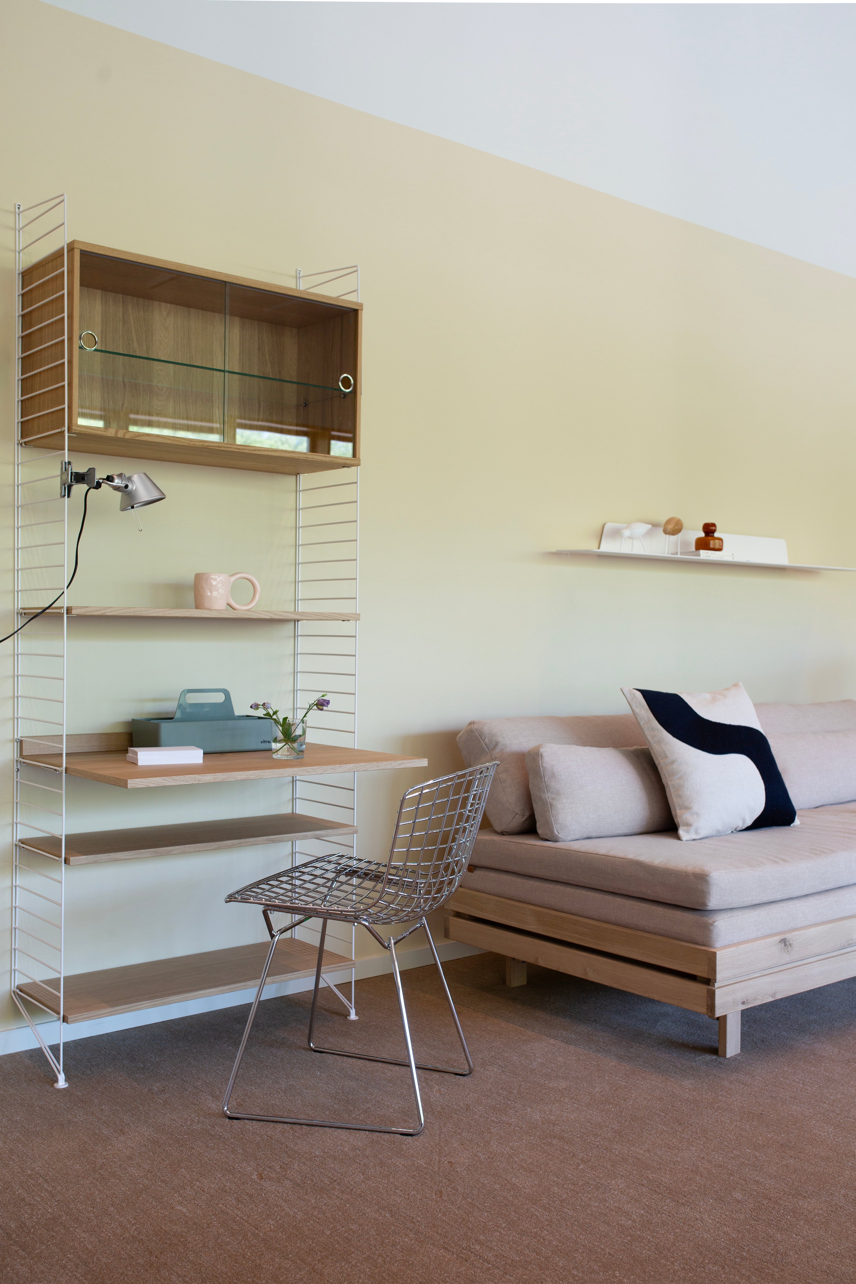
Inspired by interior design magazines and Pinterest, the couple chose a warm blue paint for the study, combined with white trim and eye-catching details. The classic blue and white color pairing brings a soft atmosphere and a touch of luxury to the space. A natural, light green carries through the hallway and entrance hall to the other side of the apartment, into the soft linen feel of the living room-kitchen.
"We ended up painting the hallway space last, as we thought long and hard about how the view would look from the living room to the hallway and from the other direction. We ended up with green because we wanted a clear, yet neutral enough color so that the overall look wouldn't clash," recalls Roosa.
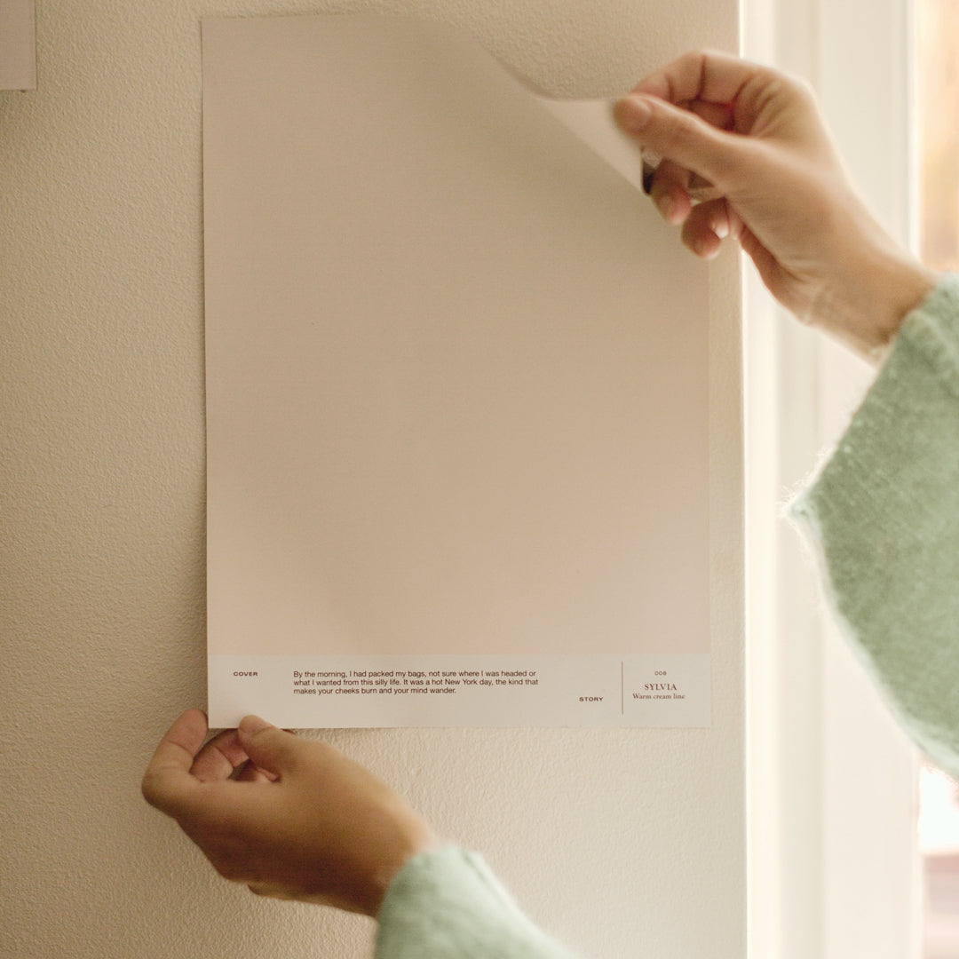
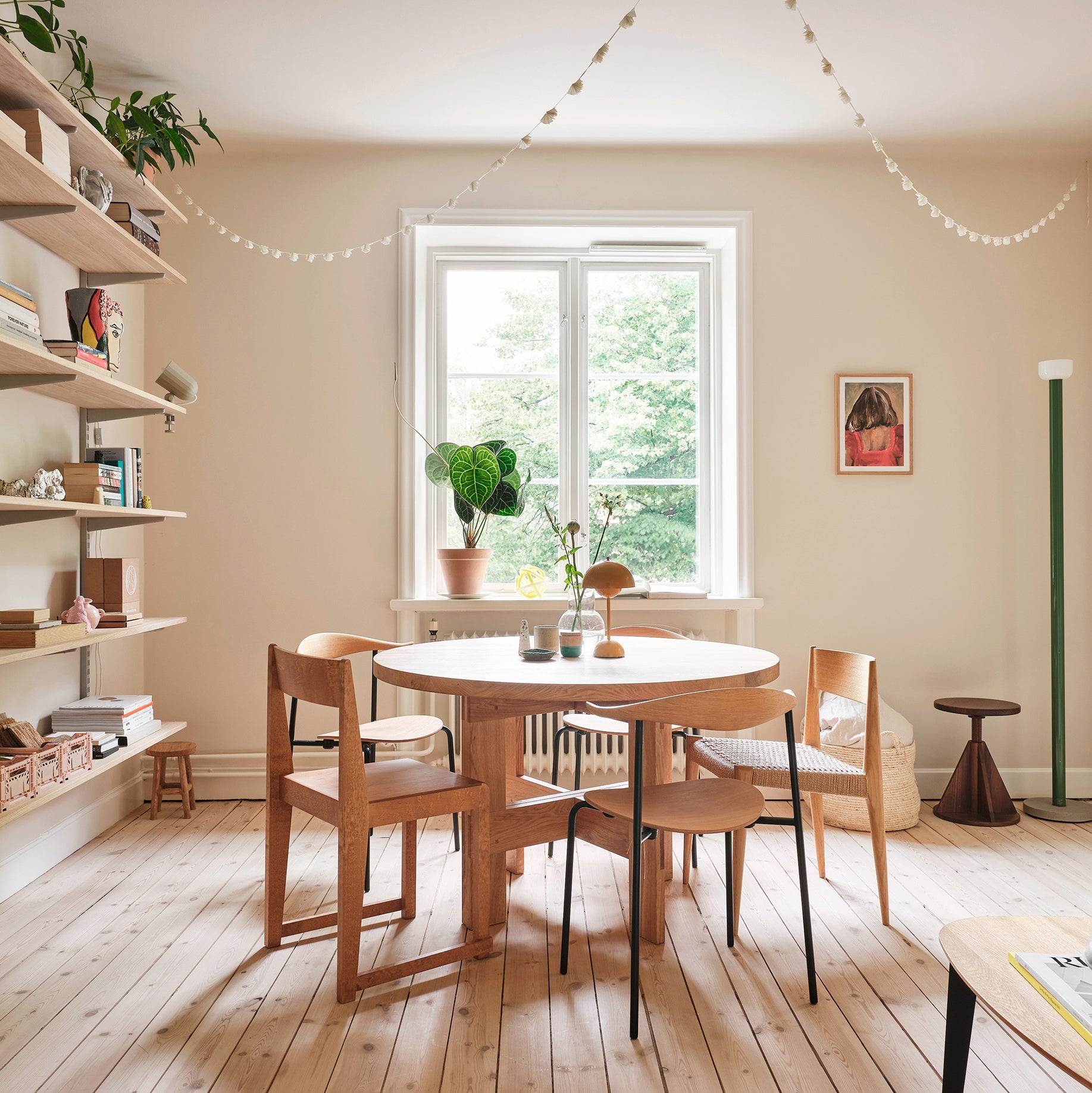
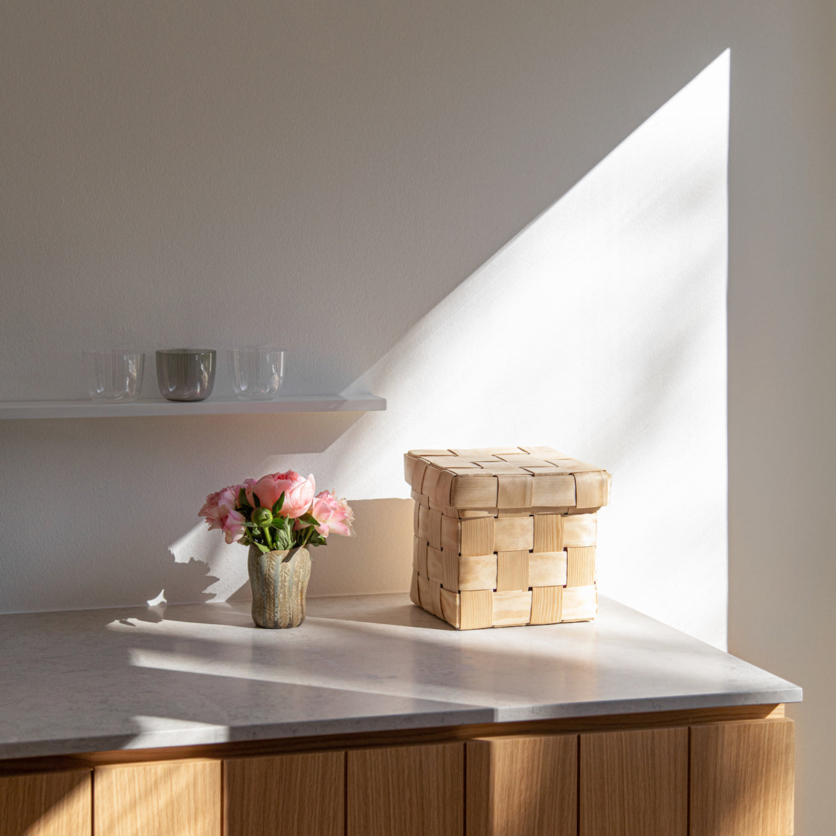
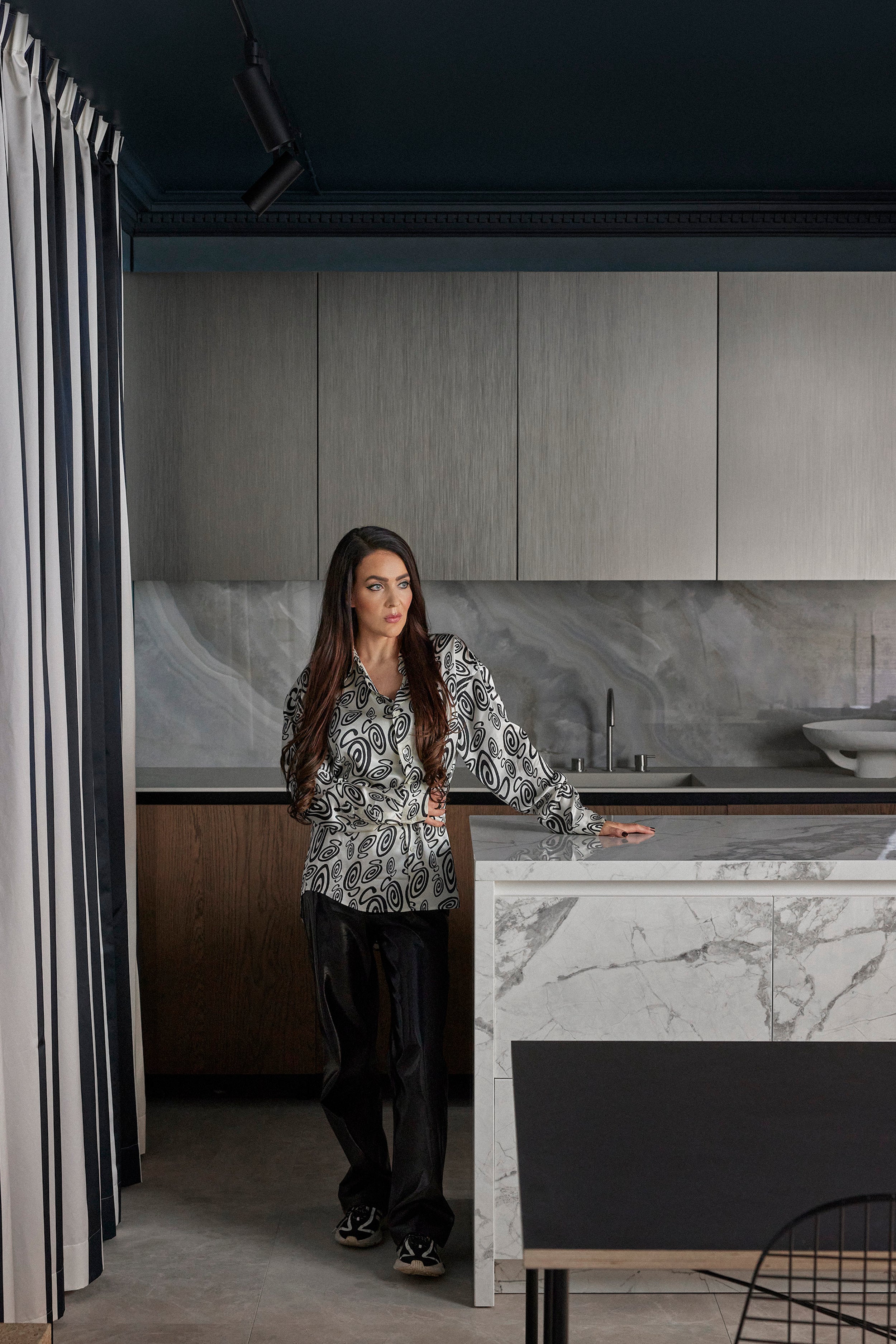
The pale shade in the large space was the most challenging color choice for her, as the space needed softness and warmth, but at the same time the shade needed to complement the gray kitchen cabinets and large island. After careful sampling, a light, delicate beige was chosen, which works beautifully as a backdrop for the other warm interior colors.
I'm not a Scandi minimalist by any means and I like a warm and inviting atmosphere to wrap myself in.
The interior design of the home is also the result of carefully thinking through their own preferences. Paintings inherited from Mici's grandfather are juxtaposed with the latest finds – the style a mix of new and old, meaningful and random – things that bring the couple joy.
"I start out making purchases with a view to what is ‘us’ and will last a decade. Trends are fun to follow, but it's good to remember to ask yourself if it will still be your thing even after the trend changes. Not everything has to carry a story or emotional value," explains Roosa.

The only newly purchased item in the home is a large dining table, which takes pride of place in the spacious living room-kitchen. For the couple, who love cooking, it was a pleasure to make their home a shared space where they can invite friends over for dinners and weekend brunches.
"I'm not a Scandi minimalist by any means and I like a warm and inviting atmosphere to wrap myself in," Roosa smiles.
And, with a thoughtful eye to color and mood, that’s exactly what they’ve created. This is a space where you can see yourself curled up on the sofa with a glass of mulled wine, sharing the latest news well into the night.


