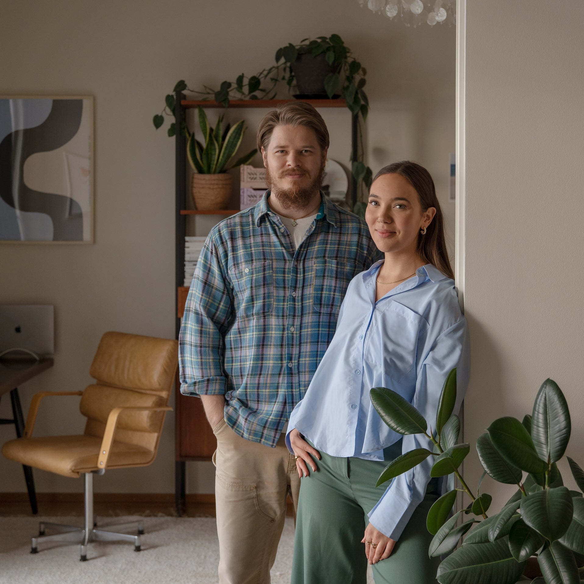
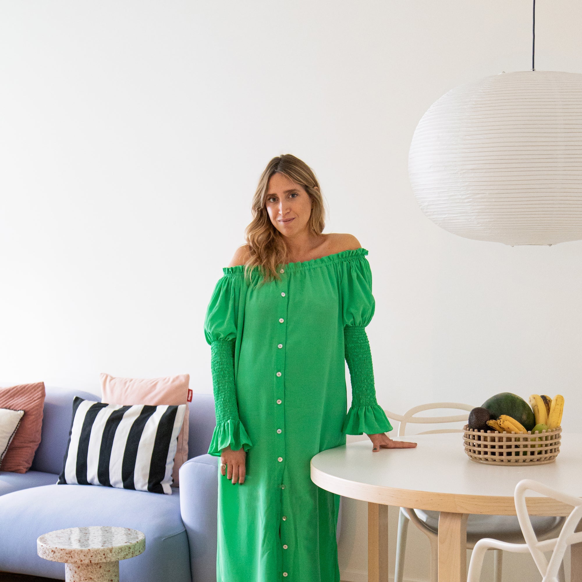
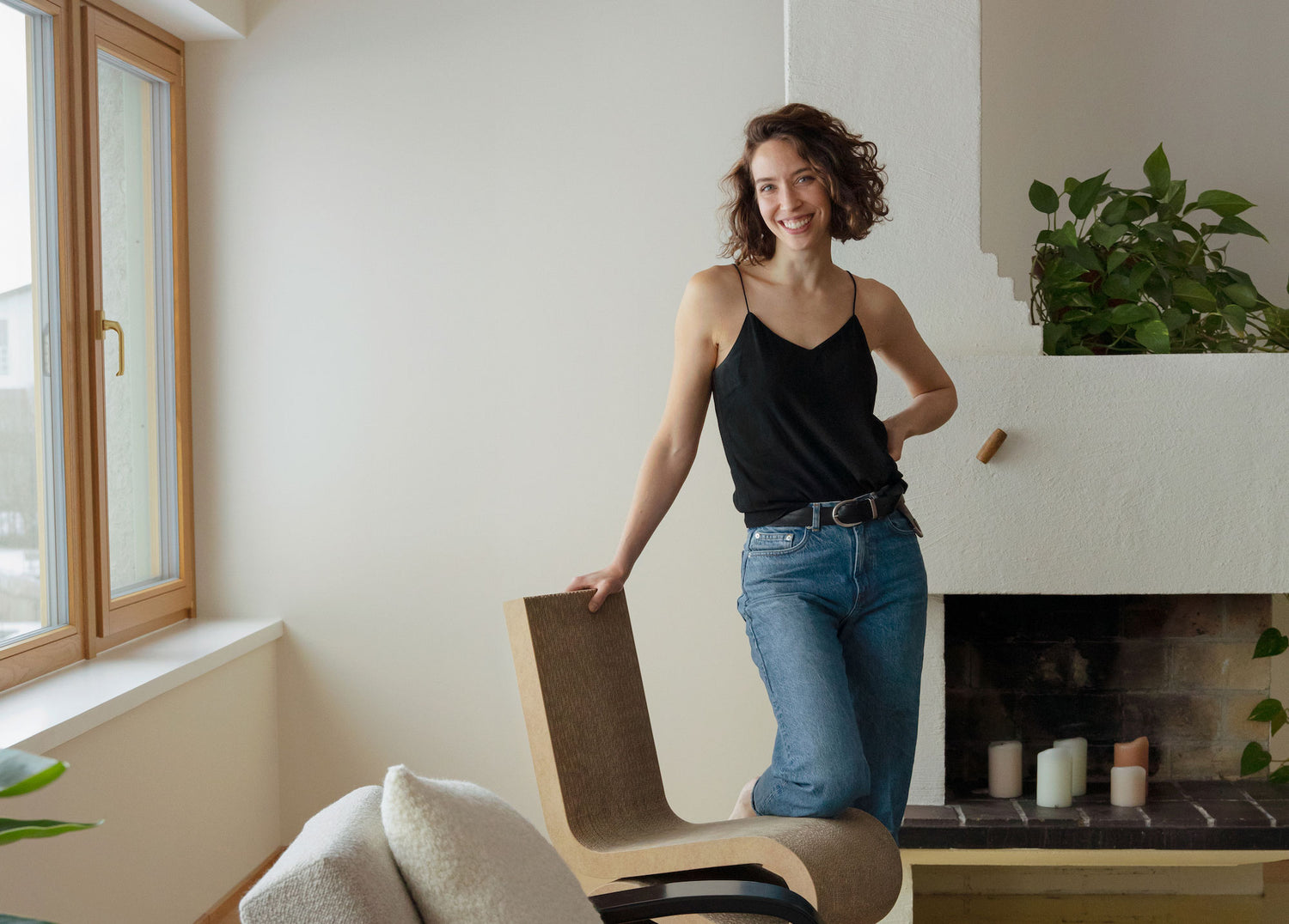
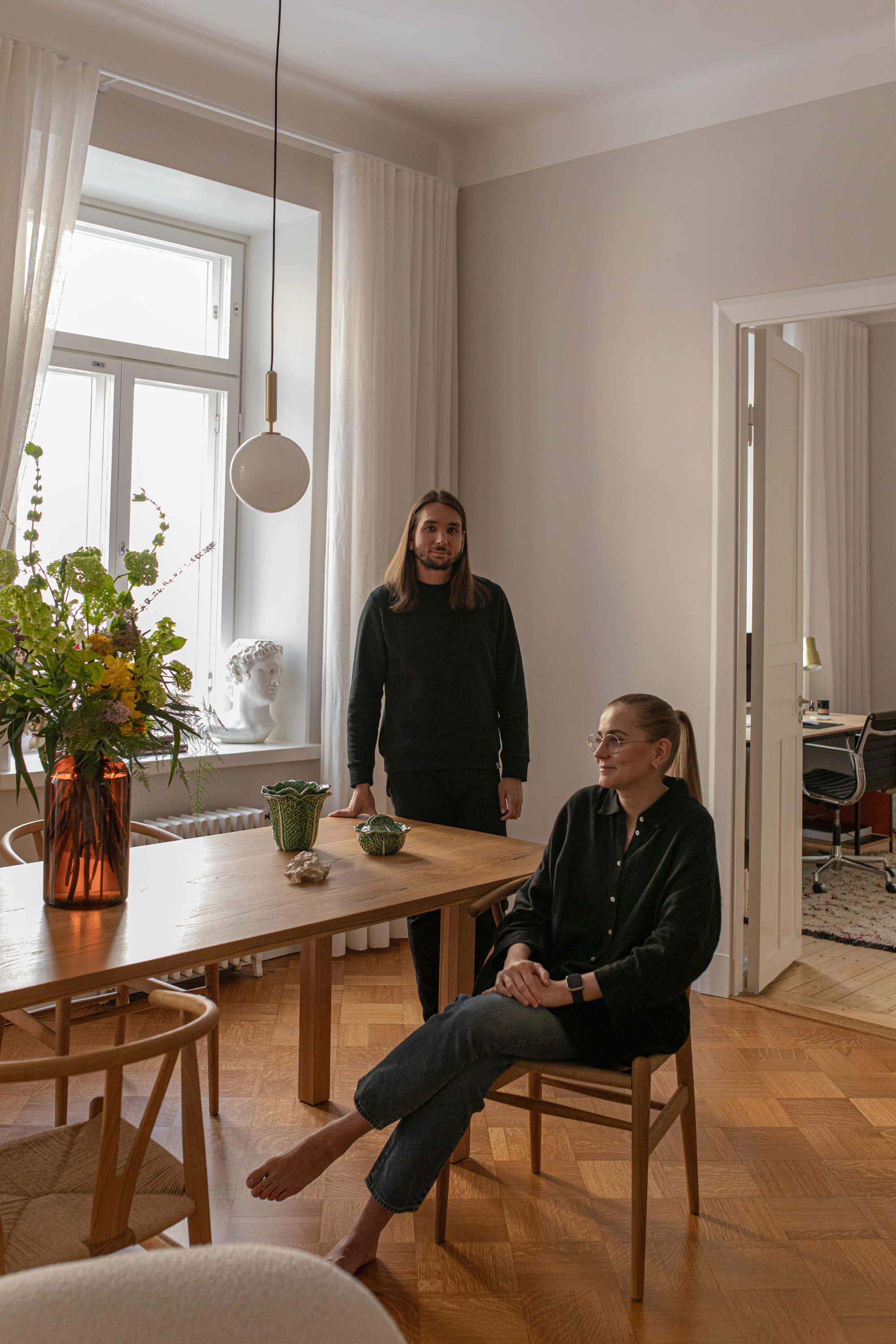
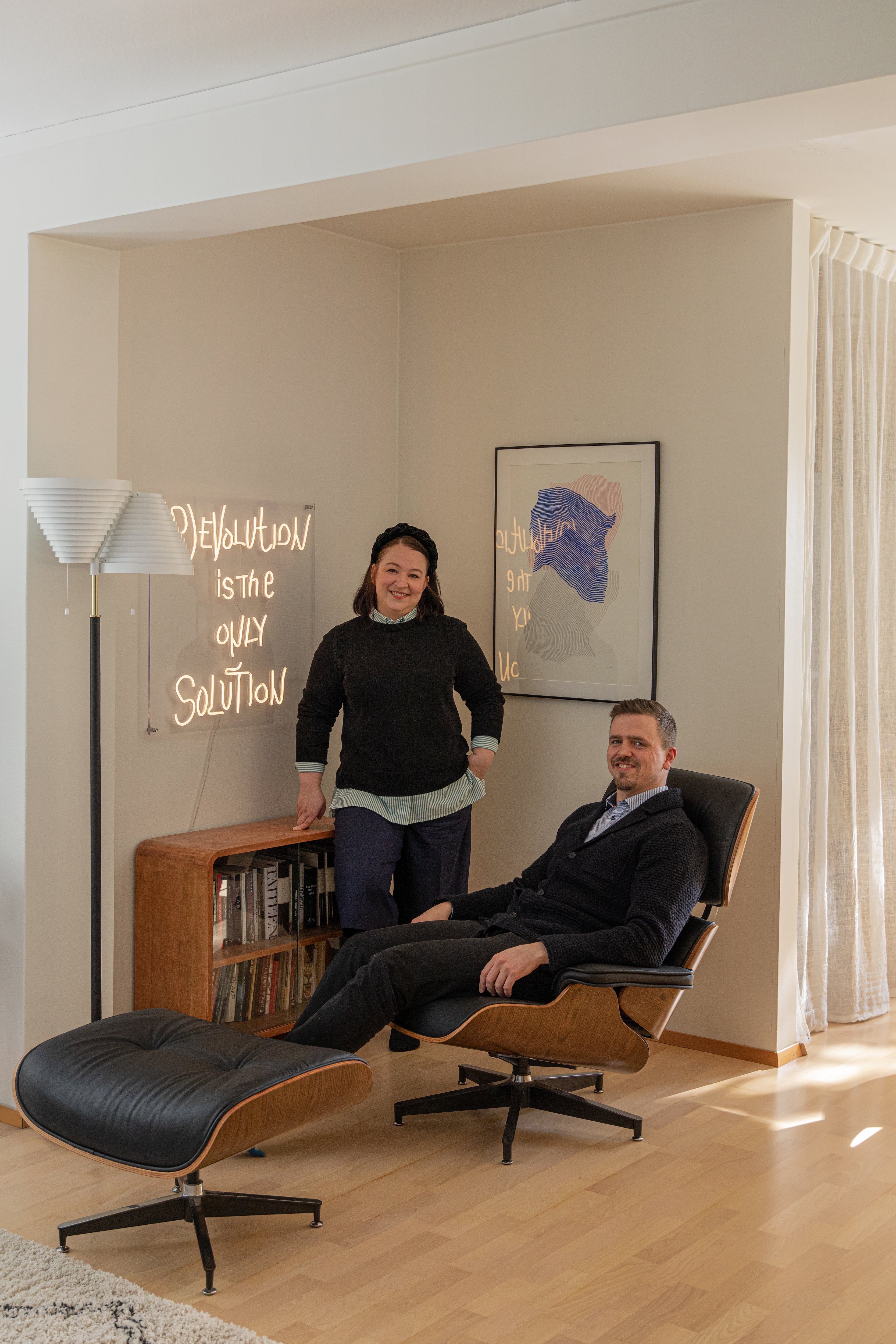
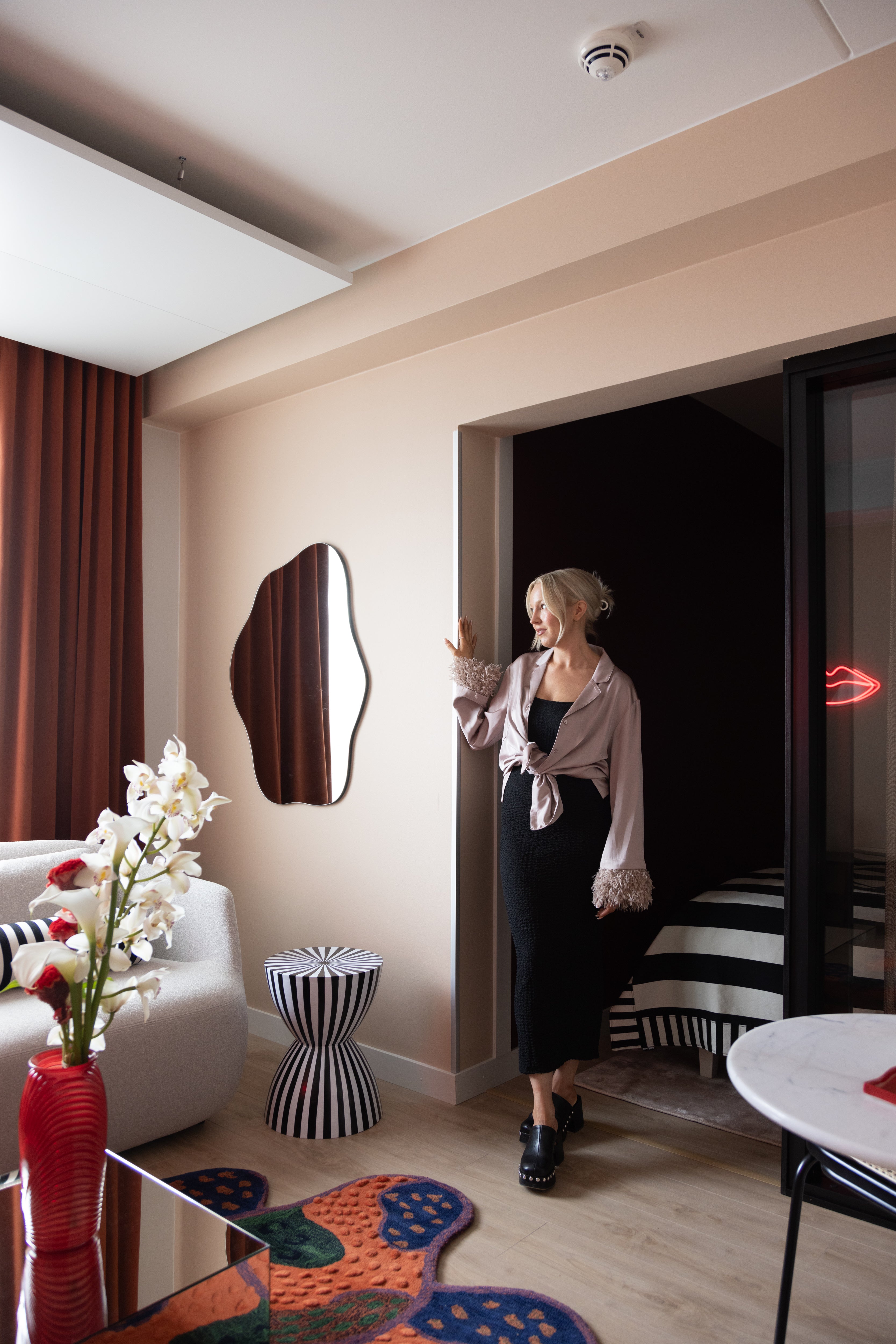
 A picturesque coastal home and a unique architectural gem from the1950s, the family home of Joanna Amemori is truly a renovator’s delight. The interior designer at Artek tells of the labors of love, experimentation and falling for just the right shade of white.
The door of a concrete 50s building is skirted by a wooden grill. Characteristic of the era, narrow windows overlook the street. Yet, this modest exterior hides spacious rooms with large windows that open onto a private courtyard. The final reward for the visitor – a long rectangular window boasting a vista of open sea.  When we bought this house, the back wall and roof were exposed to the elements. It was clear that we had a long renovation project ahead of us. Despite this, from the very first visit, and even after almost two years of unfinished work, I feel at peace here. The house always felt like home, and even visitors often say they don't feel like leaving the site. They are impressed by the wide open landscape – the only thing standing between us and the sea is a heritage protected pine tree.
The exterior of our home is heritage listed by the National Board of Antiquities, and the interior design was also guided by a desire to preserve as much of the original spirit and materials as possible. This has required a lot of work, as the ravages of time have not been kind to the structures.  Perhaps contrary to what one might think, preserving the old is no easier than buying new, in fact, quite the opposite. The beams lining the roof of the house had to be sanded and varnished, the stairs had to be removed and taken to a carpenter for repair, the fireplace has been levelled, and the veneers on the doors have been lovingly patched and resurfaced.
But respecting the spirit of the times is about more than preserving the original. Even the new can seem a natural part of the whole, because new elements brought into the home can support and respect the purpose and the original soul of the building.
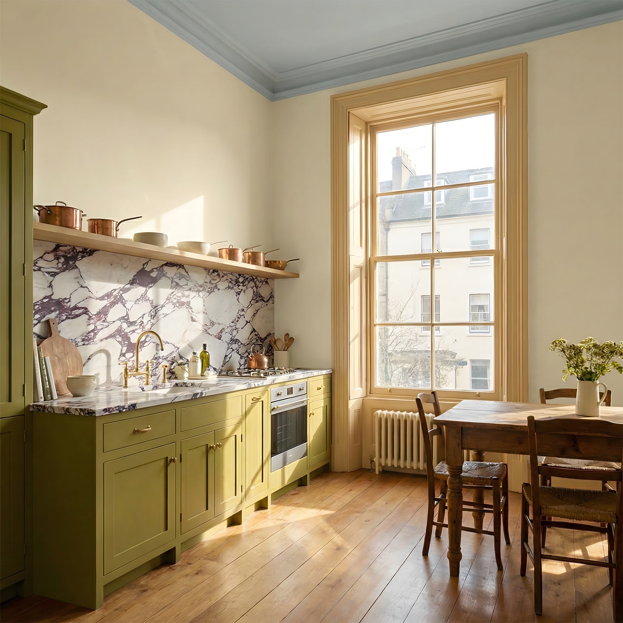
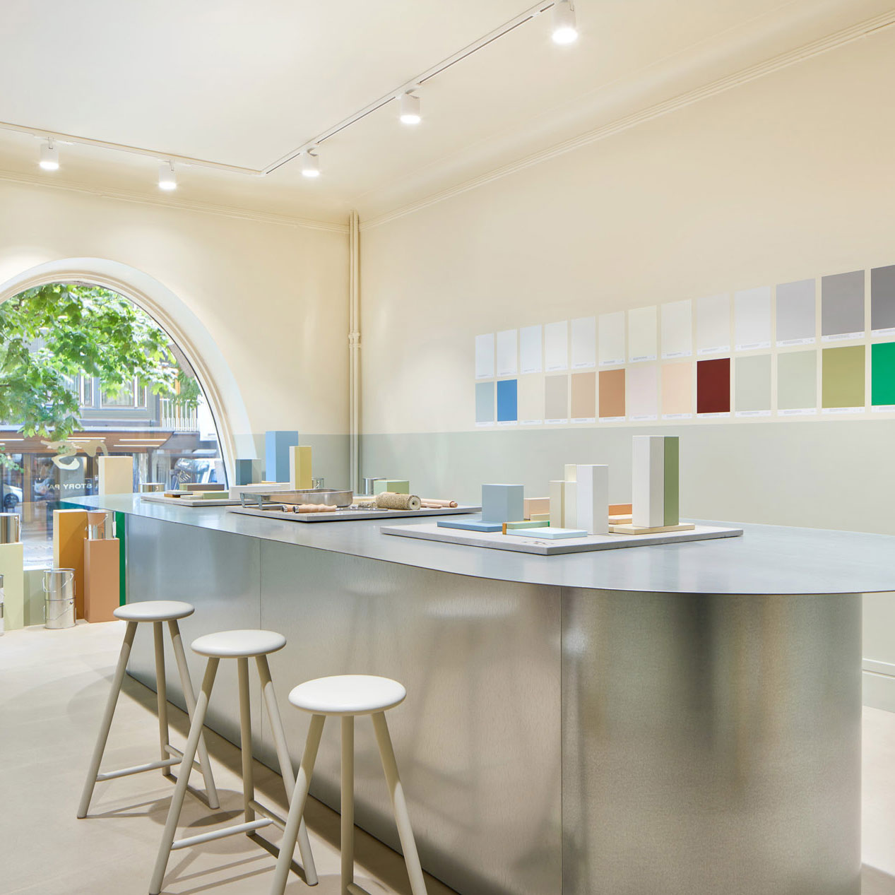
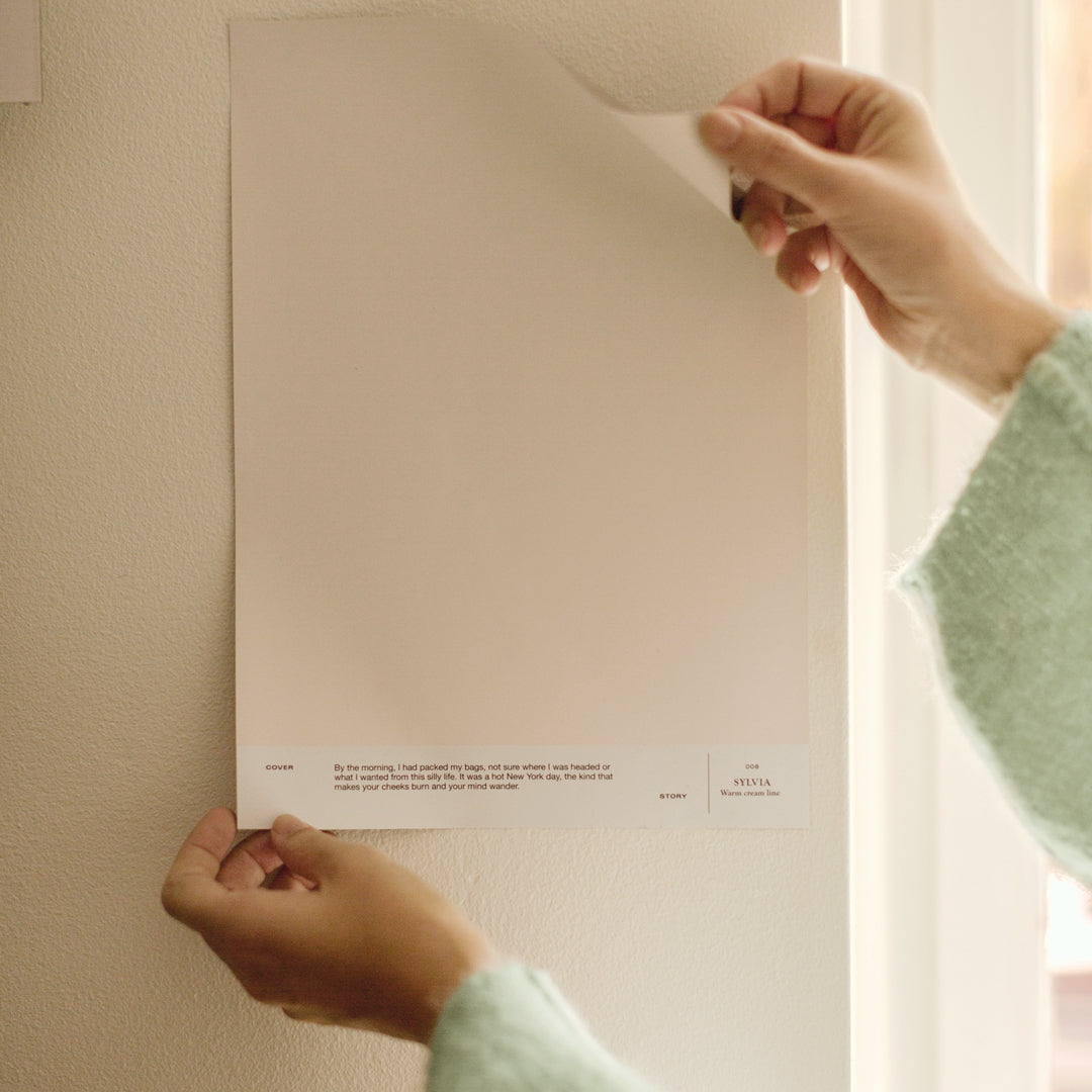
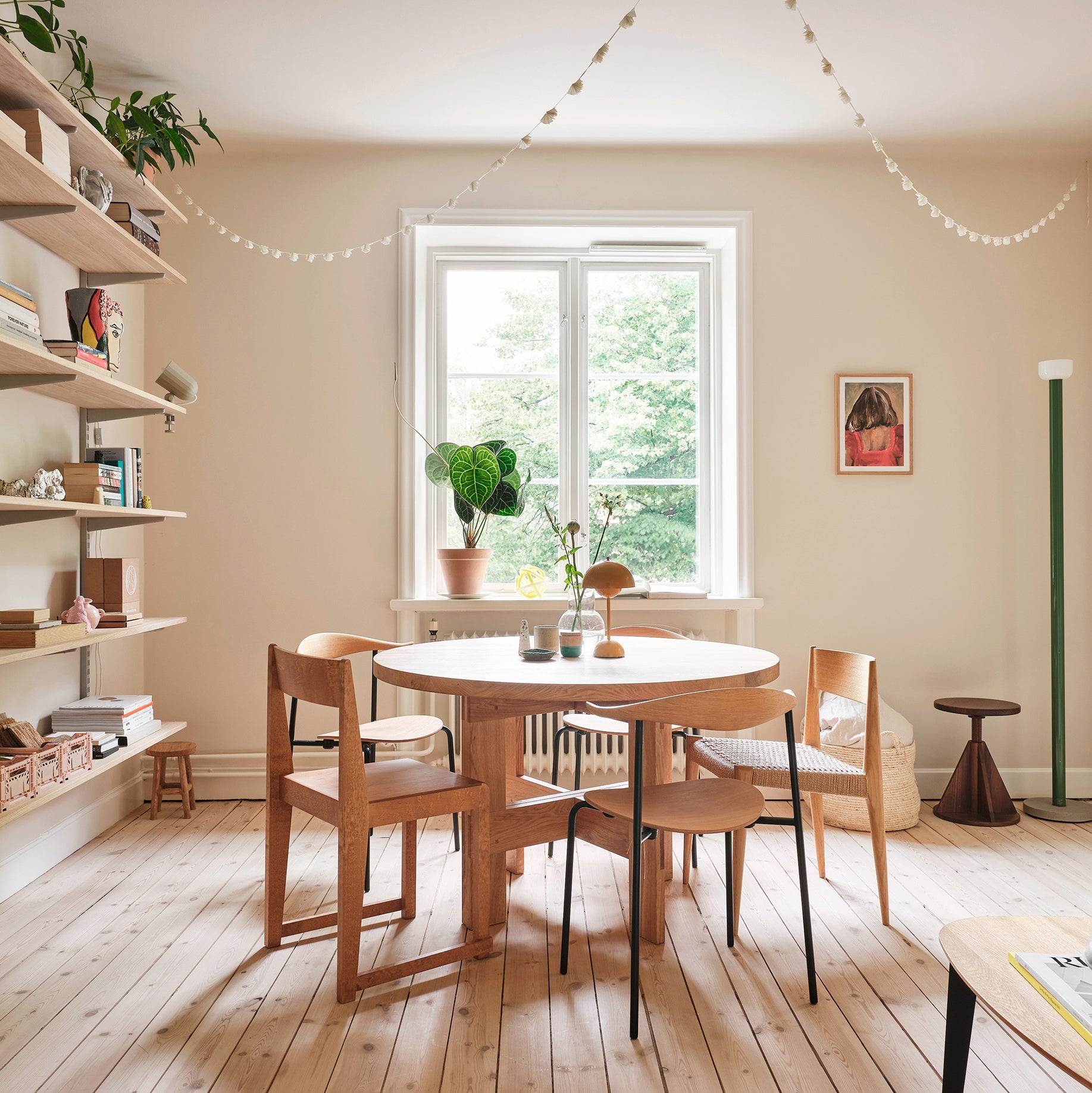
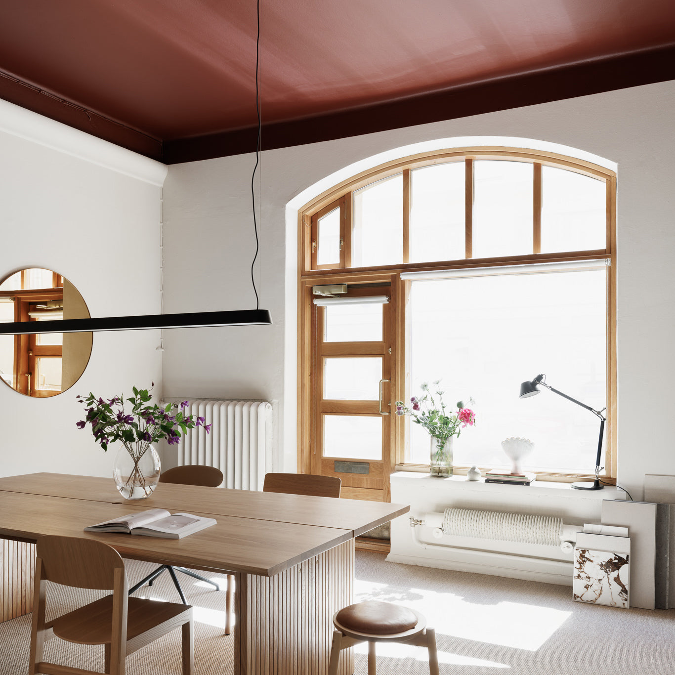
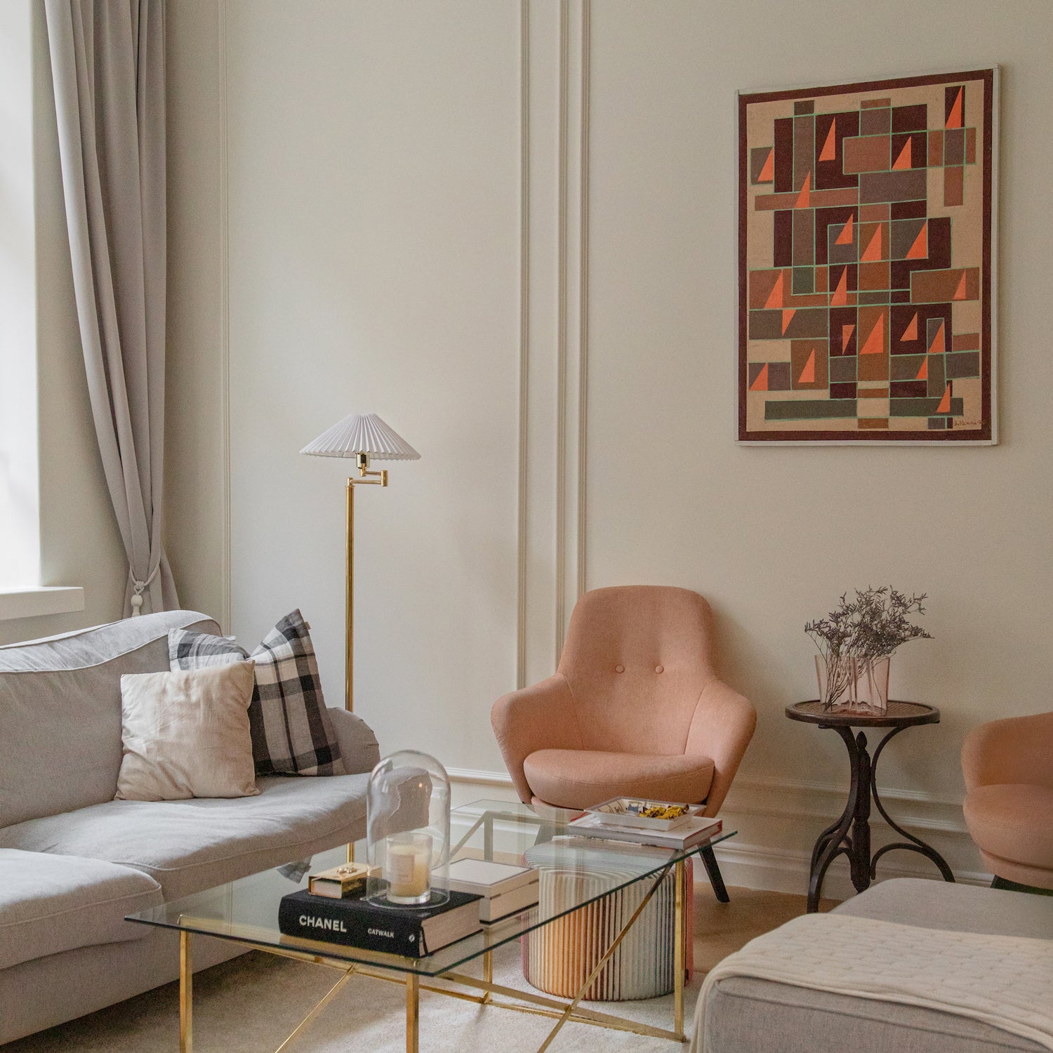
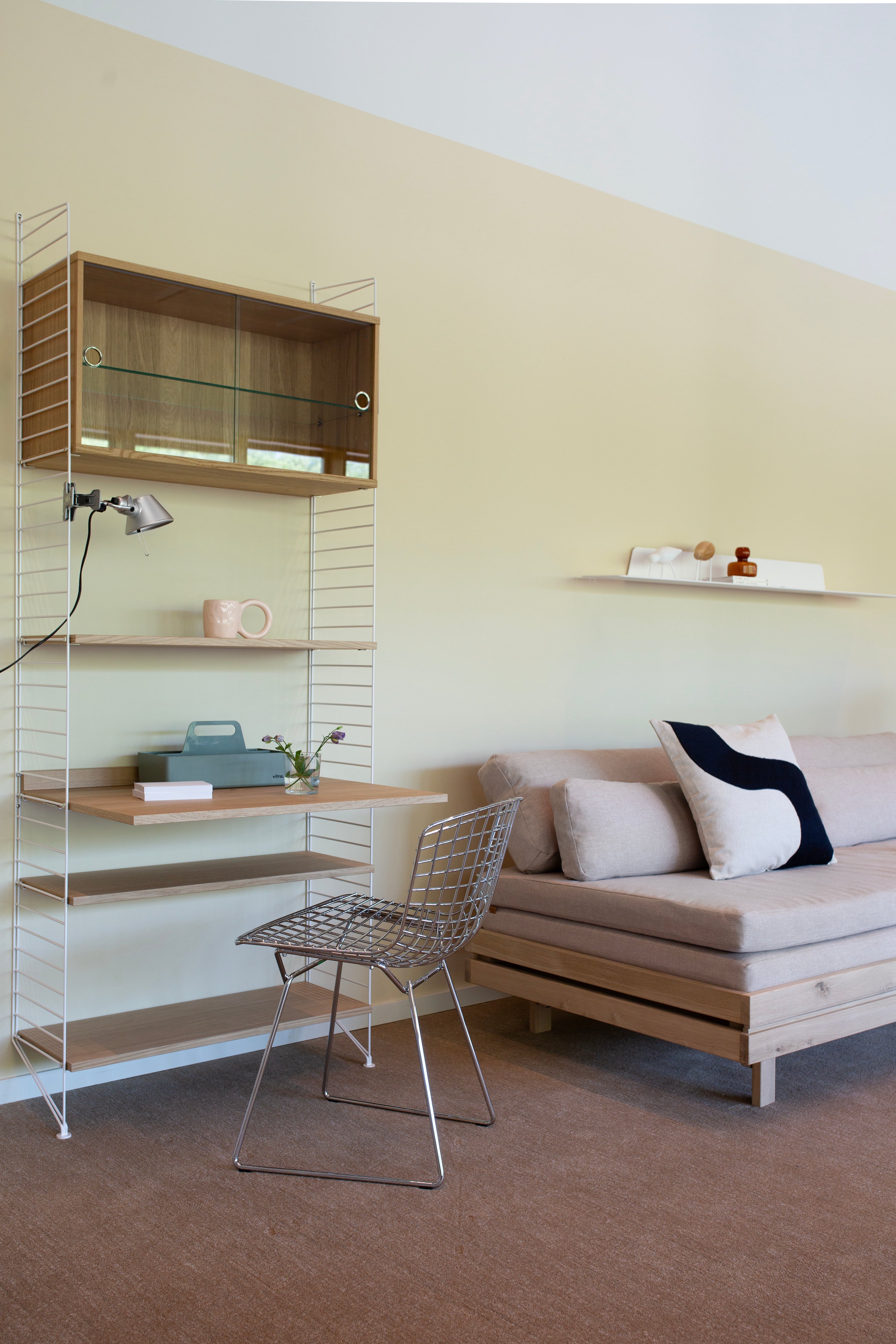
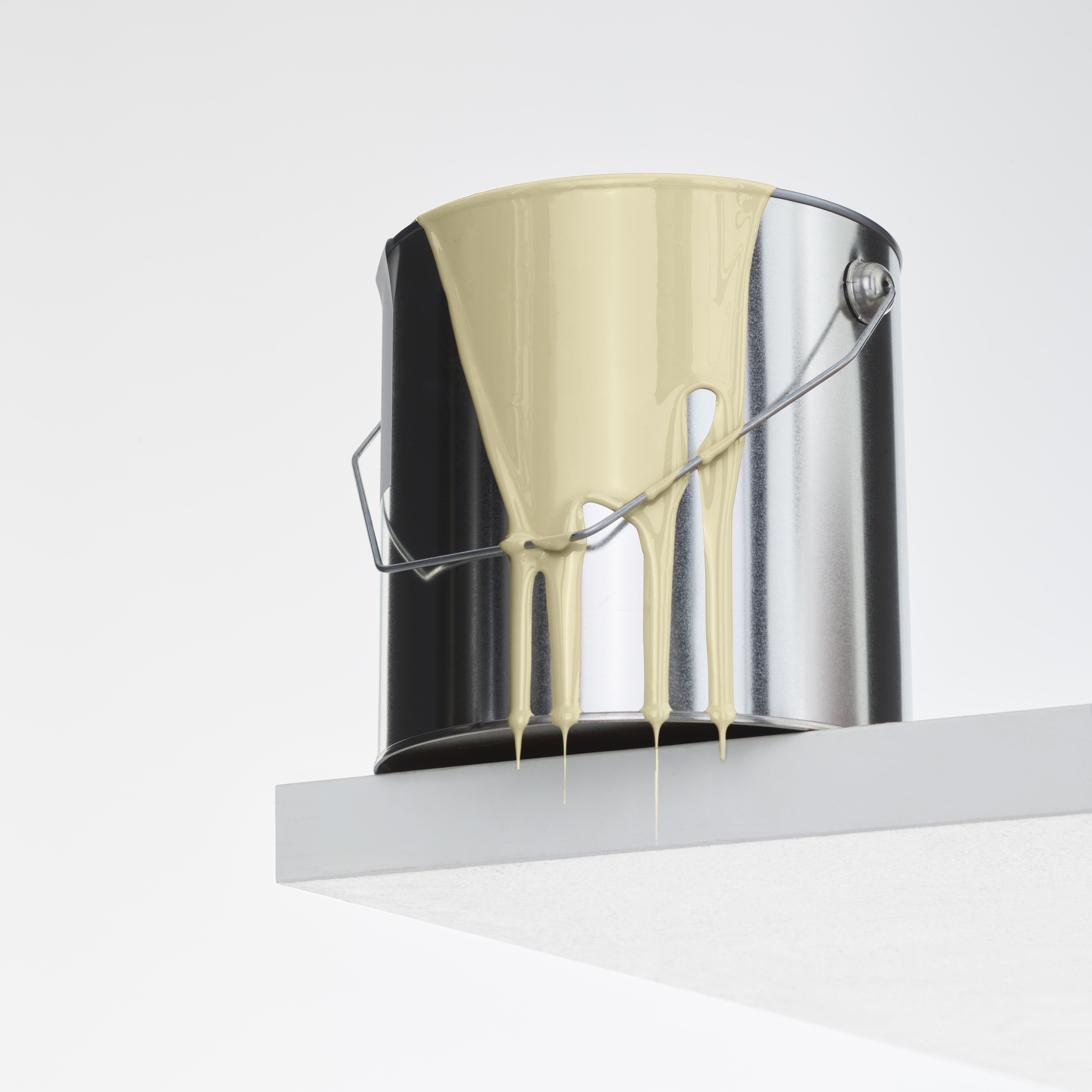
I like the idea of a continuum between exterior and interior. I like the fact that the architecture of the house and the interior speak the same language. I tried to create an interior design that doesn’t make you flinch when you cross the threshold.  Our home has a lot of unified space and it was obvious for me to go for a light shade of wall paint. I like a space that is calm and provides a consistent backdrop for art works. I spent a long time comparing shades of white, as a good neutral white seems to be the hardest choice of all – even for a professional. I finally chose a very light cream and now I can say I'm totally in love with it. The pale hue doesn't bring attention to itself, but gives off a subtle warmth. It's unobtrusive and makes the space feel cozy. I think it brings out the best in white.
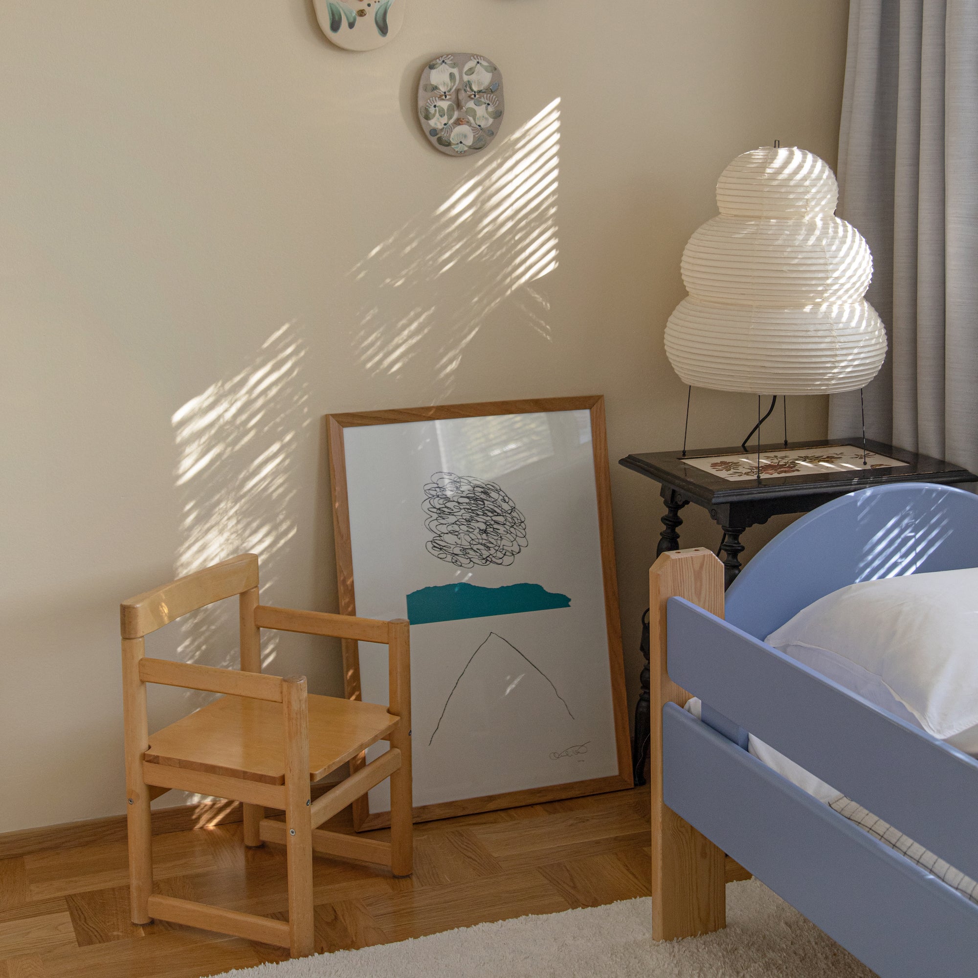
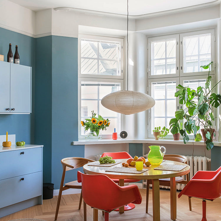
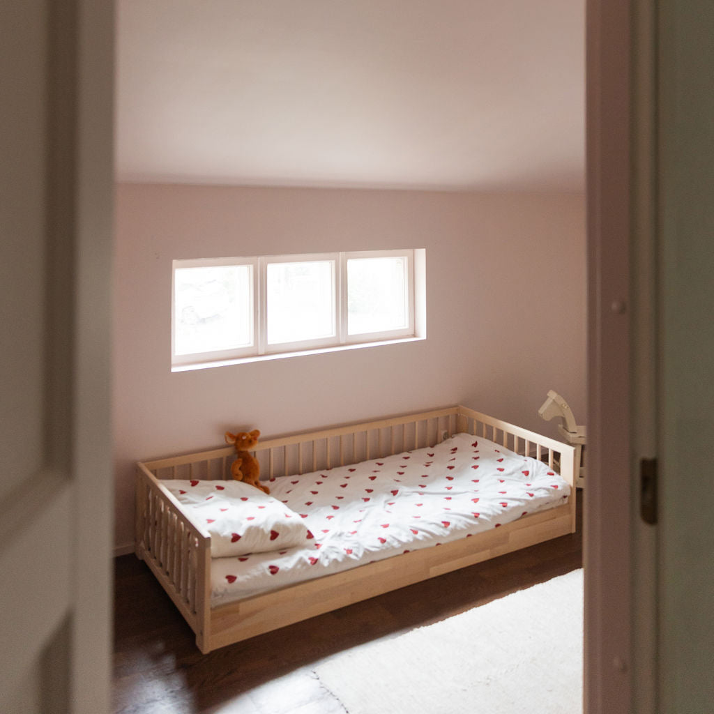
On the other hand, in the smaller bedrooms it was fun to play with color. I mentioned to a friend that all of our bedrooms are different colors and I thought she seemed a little skeptical. But colorful doesn't always mean cacophony, different shades can really add mood to a home. 
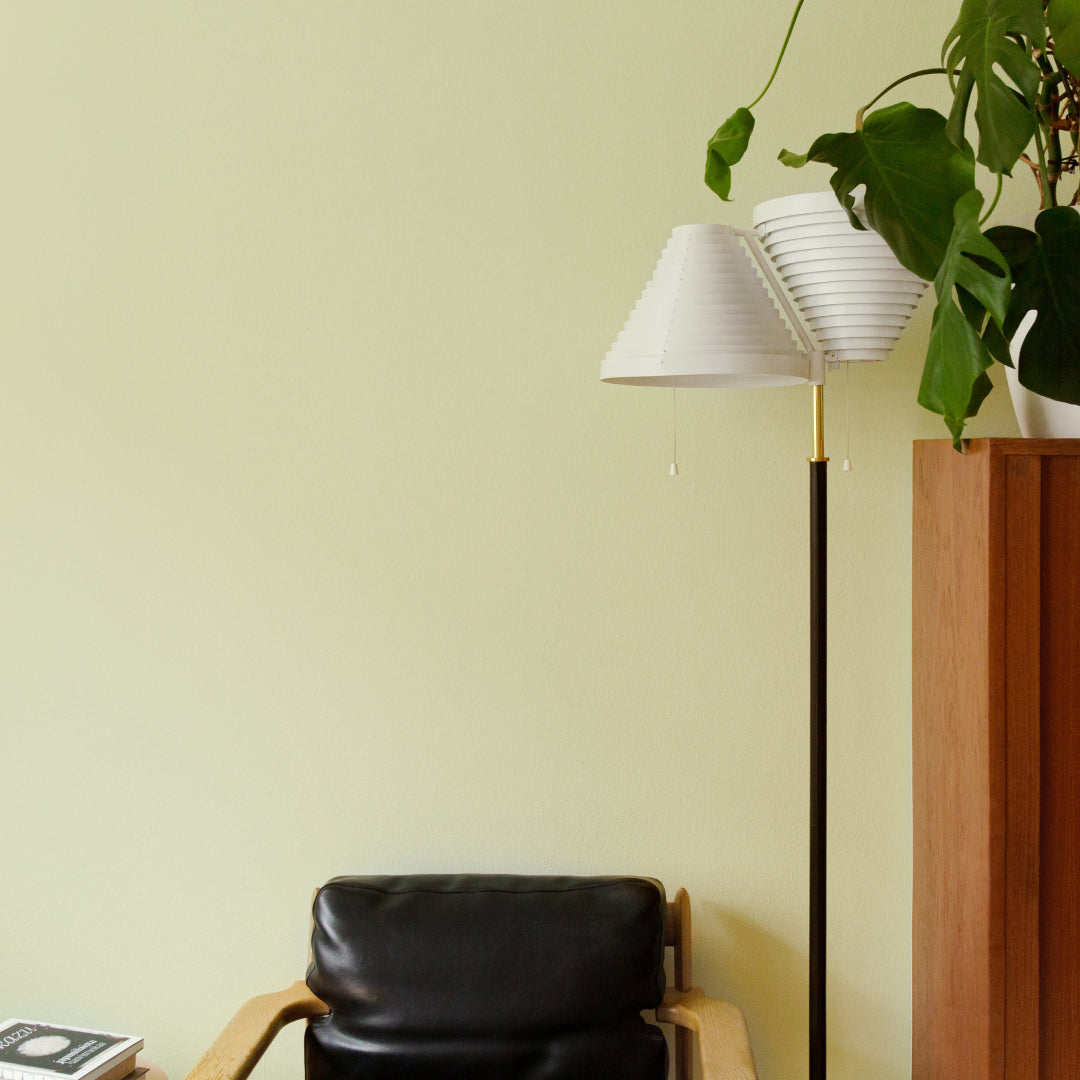
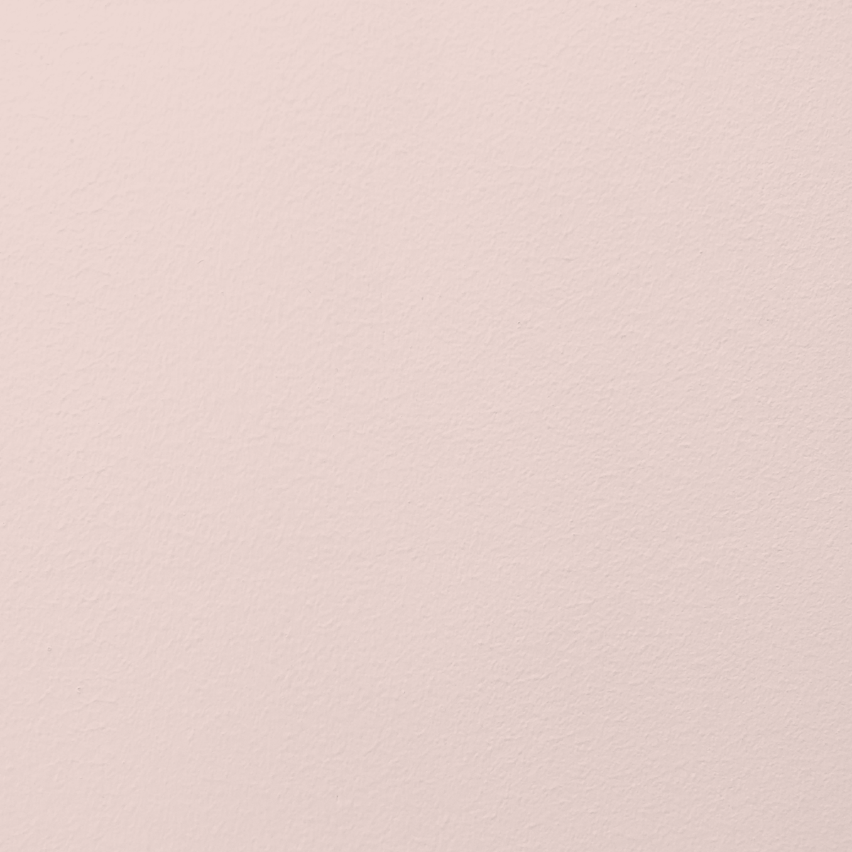
 We often have all the doors open and I like the way the light space experiences splashes of color and playfulness from different rooms. I also like the fact that each room has its own atmosphere and peace. For the bedroom, I chose a straw green that goes well with both vintage furniture and woody tones. For the study, I chose a green gray AGATHA. It relaxes me and creates an atmosphere in which I can focus well. The color choices for the children's rooms were made together with them. They wished for an orange and turquoise but we finally agreed on a peachy powder ANAÏS and light turquoise ALBERT.
Now, I think there's a serene atmosphere here. And although there’s no white apart from the ceilings, the vibe isn’t colorful at all. The ethereal tones inside the room travel through the linear 50s windows and out to the sea. And when the sea unfreezes each year, the whole atmosphere changes.
In the past, I've made some drastic style changes, searching for what I really like. After – or perhaps through – a period of experimentation, I’ve gradually found peace and certainty about the elements, objects and colors that speak to me. My aim is to consider this home as a lifelong project, where everything doesn’t have to be finished. Sometimes, however, I still find myself struggling with the urge to rush things. But I don’t want to compromise for the sake of impatience. It's fun to realize that I've revisited the color palette I loved as a child. I loved muted neutral tones, and it shows in childhood drawings and old photographs of my clothing choices. Later, I reached the stage where I had to splash out. Eventually I realized that multicolored pom pom curtains were no longer my thing.
The renovation and the waiting have made me attached to this home in a completely different way to moving into a new apartment. The hard choices, and the effort and the professionalism of the workers have taught me to respect the house even more. Now the onus is on us to respect and care for it into the future.


